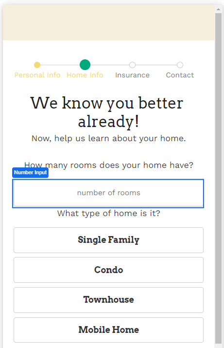
The Number Input Web Control allows app users to input numbers.
General
Control Properties
Placeholder Text
Expects type text.
The text displayed to the app user when no text has been inputted. By default text not encapsulated by string quotes will have this wrapping implied.
Aria Label
Expects type text.
Defines a value to the aria-label of the control for accessibility. For more information see here.
Advanced Control Properties
Numeral Non Negative
If checked, only allows non negative numbers to be inputted. If unchecked, allows both negative and non negative numbers.
Percent
Enabling this will divide the raw value of the Number Input by 100.
Numberal Thousands Group Stlye
Adjusts the style of how numbers are formatted with commas on the input. The default value is 'thousand' where the value of 1000 will be displayed as 1,000. This setting has no effect on the raw value stored.
Numeral Decimal Scale
Expects type number.
Adjusts the level of precision of numbers that can be inputted by the number of digits. If the value of 3 is entered, the number of digits that can be entered after the decimal point will be 3. For example, the value of 5.333 could be entered, but not 5.3333.
Numeral Integer Scale
Expects type number.
Adjusts the scale of numbers that can be inputted by the number of digits. For example, if the value of 4 is set here, the largest number possible will be 9999.
Delimiter
Expects type string (one of: "." "," "-"")
Sets the style of the number delimiter. For example, in many countries, the desired value will be "," which would format 10000 to 10,000.
Prefix
Expects type string.
Sets a value that is displayed as a placeholder and is affixed to the beginning of the value.
No Immediate Prefix
Negates the Prefix setting if set.
Raw Value Trim Prefix
Trims the value set within Prefix, if set, at the beginning of the value. Affects only the raw value stored which is not displayed to the app user.
Style and Layout
The Number Input has a styles for the following states:
Default - When first rendered without state
Focused - when the control is focused
Disabled - When the control is disabled
Check Common style properties of web controls for further details on how to style this control.
Actions
On Blur
Triggers when the user leaves the input field. That is, when changing the focus from the field to some other part of the application.
Value Changed
Triggers with each typed character. That is, with a number input, the Value changes every time a key is pressed, unlike a Checkbox, where its Value changes when the box is selected.
Advanced
State
Is Visible
Expects type boolean.
If TRUE the control will be visible. If FALSE the control will not be displayed. If the field is empty, the control will be visible.
Is Disabled
Expects type boolean.
If TRUE the control will be disabled and the user will not be able to interact with the control. If FALSE the button will be enabled. If the field is empty, the control will be enabled.
Example #1
Data entered into a number input need to be bound to a variable. By default, Airkit automatically creates a Number Variable for the inputted data to be stored, which can be seen within Inspector > Data Binding.
In this example, a variable named number_input_1 has been created.

Example #2
By default, the largest value that can be inputted is 99,999,999,999.
In the case of entering a person's age, this seems excessive. To ensure the desired data is inputted, limit the Numeral Decimal Scale to 0 so that only whole numbers can be entered and set the Numeral Integer Scale to 3. It could also be a good idea to set the Numeral Non Negative property to TRUE to ensure only positive numbers.