The Radio Button Web Control is an Input control that allows the selection of values.
General
Control Properties
Selected
Expects type boolean.
By default, a Variable of type Boolean is generated at the Web Page level to store the data from the input. Users can also edit the Data Binding property and create their own Variables.
Aria Label
Expects type text.
Defines a value to the aria-label of the control for accessibility. For more information see here.
Data Binding
Value
Expects type any.
The value that the bound variable will have when the Radio Button is selected.
Style and Layout
Radio Buttons have styles for the following states:
Default - When first rendered without state
Selected - when the Data Binding evaluates to true
Disabled - When the Radio Button is disabled
Check Common style properties of web controls for further details on how to style your Radio Button Web Control.
Actions
Value Changed
This event is run whenever the radio button is selected or unselected.
Metadata about this event can be accessed through the event namespace.
Advanced
State
Is Visible
Expects type boolean.
If TRUE the Radio Button will be visible. If FALSE the Radio Button will not be displayed. If the field is empty, the Radio Button will be visible.
Is Disabled
Expects type boolean.
If TRUE the Radio Button will be disabled and the user will not be able to interact with the control. If FALSE the Radio Button will be enabled. If the field is empty, the Radio Button will be enabled.
Example
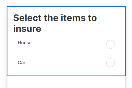
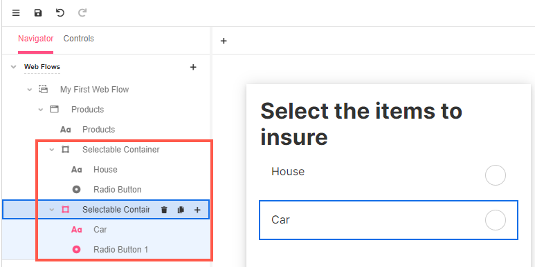
To be able to align the Radio Buttons with lines of text, a Selectable Container Web Control must be added first for each item to be selected. Then add the Radio Buttons and the Labels describing the items.
