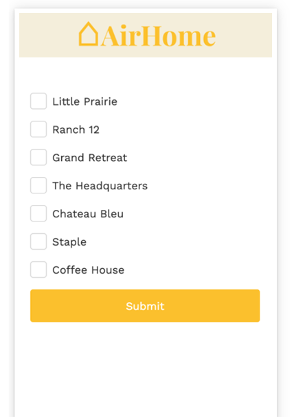
The Checkbox List Web Control is an Input control with a repeating component that allows the user to select one or many items from a list. This differs from a Radio List and a Dropdown in that it is possible to select more than one item from a Checkbox List.
The Checkbox List is composed of a Selectable Container Web Control which includes a Checkbox and a Label.
General
Control Properties
Aria Label
Expects type text.
Defines a value to the aria-label of the control for accessibility. For more information see here.
Data Binding
Value
Expects type any.
By default, a Variable of type Any is generated at the Web Page level to store the data from the input. Users can also edit the Data Binding property and create their own Variables.
Data
Expects type list.
Each item in the list will have its own item in the Checkbox.
Value Text
Expects type any.
If provided, this is the value stored in the selected objects array, provided in the Selected argument. The entire item will be stored in the list when selected if not provided.
Selected
Expects type boolean
This expression is executed on each item in the list to determine whether it is currently selected.
Advanced Properties
Item Name
By default: item. This property is used within the context of the Selectable Container as the current item in the cell.
Index Name
By default: index This is the number value of the current index of the current item. Visible within the context of the Selectable Container.
Collection Name
By default: items. This is a variable referring to the entire collection of objects. With the default values set up, items[index] = item
Style and Layout
Check Common style properties of web controls for further details on how to style your Checkbox Web Control.
Actions
Value Changed
This event is run each time a checkbox within the checkbox list is selected or unselected.
Metadata about this event can be accessed through the event namespace.
Advanced
State
Is Visible
Expects type boolean.
If TRUE the checkbox list will be visible. If FALSE the checkbox list will not be displayed. If the field is empty, the checkbox list will be visible.
# Is Disabled
Expects type boolean.
If TRUE the checkbox list will be disabled and the user will not be able to interact with the control. If FALSE the checkbox list will be enabled. If the field is empty, the checkbox list will be enabled.
Example

This list can be created by inserting a Checkbox List and setting the Data Property to a List of text (in this case, houses). In the Data Binding section, set the Data to the following:
["Little Prarie", "Ranch 12", "Grand Retreat", "The Headquarters", "Chateau Bleu", "Staple", "Coffee House"]The checkbox list will populate with the text values. In Preview, the variable that is bound to the Value property will then populate with the list of items that are selected by the user.