Like a Container, but selectable

The Selectable Container Web control is a Container that has an Event for when any control in the container is selected or clicked. The selectable container is used as a part of the checkbox List and Radio List, and can be used with repeaters.
General
Control Properties
Aria Label
Expects type text.
Defines a value to the aria-label of the control for accessibility. For more information see here.
Data Binding
Selected
Expects type boolean.
The value will evaluate to TRUE if the container is selected. When the container is unselected, the value will evaluate to FALSE. By default, the value is NULL.
Style and Layout
Containers and their elements can be styled. See Common Style Properties of Web Controls.
Actions
Value Changed
Action chain that runs when the Selectable Container is clicked.
Advanced
State
Is Visible
Expects type boolean.
If TRUE the container will be visible. If FALSE the container will not be displayed. If the field is empty, the container will be visible.
Example #1
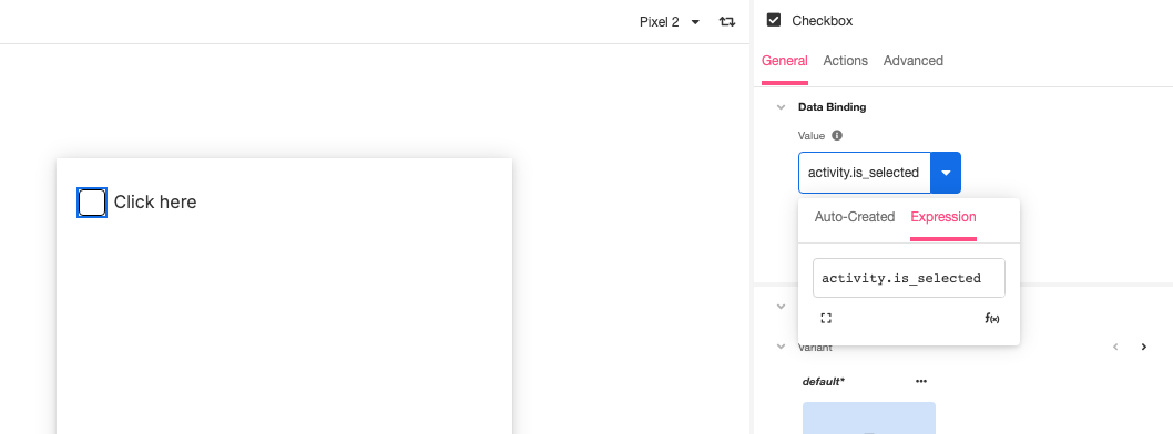
To build a single Checkbox, add a Selectable Container to the Web Page and nested in the Selectable Container, add a Checkbox and a Label. The Label will be used to describe the Checkbox.

Create a Variable as type boolean and add it to the Data Binding value of the Checkbox.

Then on the Value Changed event, set the Variable to the opposite of itself. This will store the value of the state of the Selectable Container to the Variable.

Example #2
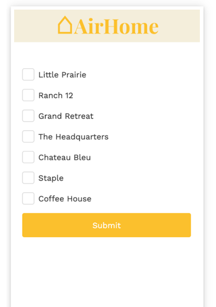
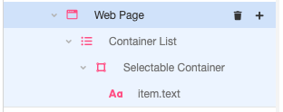
Selectable Containers can be added to Container Lists. First, add the Container List, and then nested underneath add the Selectable Container. Any Web Control can then be added. This example shows an added Label.

Each item in the Container List can then have its own selected state. To do this, create a Variable of type List of Boolean. For this example, the variable is activity.selected_repeater. Then on the Selectable Container, on the Value Changed event, set the Variable to the following:
activity.selected_repeater[index] = NOT(activity.selected_repeater[index])
Each Selectable Container in the list will have access to its own selectable state. Use cases for this can include changing the background of the container when selected or a task list that changes icons when marked as done.