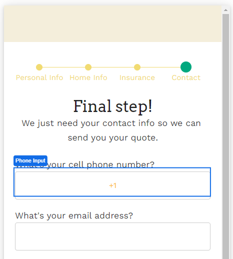
The Phone Input Web Control captures phone numbers. It is similar to the Text Input Web Control, but it has some validation built in: if a value entered into the Phone Input Web Control is not a valid phone number (as defined by the ISPHONE Airscript function), the phone input value will evaluate to NULL.
General
Control Properties
Placeholder Text
Expects type text.
The text that is displayed in the input’s box before the user starts typing. This will only display if the No Immediate Prefix checkbox (see blow) is checked.
Aria Label
Expects type text.
Defines a value to the aria-label of the control for accessibility. For more information see here.
Advanced Control Properties
Delimiter
Displays the symbol that delimits sections of a phone number as it is entered.
For instance, if the "-" symbol is selected from the dropdown, a phone number entered as "+17167762323" will display as "+1-716-776-2323"
Prefix
The prefix that will appear automatically in the displayed input box.
Most commonly, this is used to automate the insertion of the relevant country code, which is necessary in order for Airscript to correctly parse phone numbers.
No Immediate Prefix
If checked, no prefix will appear in the displayed input box, regardless of what is entered in the Prefix section above.
By default, this checkbox is not selected.
Right Icon
Displays the icon that will appear on the right of the input box.
The default option, "-", dictates that no icon will be visible.
AutoComplete
Determines whether the user's device is allowed to autocomplete the field. Guidance can be provided to the app user's browsing environment by using one of the pre-determined autocomplete options such as tel-country-codeor tel-locale. For more information, see the HTML autocomplete attribute.
Data Binding
Value
Expects type phone.
By default, this Data Binding property auto-generates a Variable of type Phone at the Web Page level to store the data from the input. Users can also edit the Data Binding property and create their own Variables.
Style and Layout
This control Variant has styles for the following states:
Default - When first rendered without state
Focused - when the Phone Input is focused
Disabled - When the Phone Input is disabled
Check Common style properties of web controls for further details on how to style this control.
Actions
On Blur
Triggers when the user leaves the input field. That is, when changing the focus from the field to some other part of the application.
Value Changed
Triggers with each typed character. That is, with an phone input, the Value changes every time a key is pressed, unlike a Checkbox, where its Value changes when the box is selected.
On Enter
Triggers upon pressing Enter.
Check out Action Builder to find all the available actions.
Advanced
State
Is Visible
Expects type boolean.
If TRUE the phone input will be visible. If FALSE the phone input will not be displayed. If the field is empty, the phone input will be visible.
Is Disabled
Expects type boolean.
If TRUE the phone input will be disabled and the user will not be able to interact with the control. If FALSE the phone input will be enabled. If the field is empty, the phone input will be enabled.
Example
To collect phone numbers from users around the globe, select the '+' icon in Prefix to indicate that country code is expected.
