Web Controls can be personalized using the Style Properties in the General tab of the Inspector section. Even if some Web Controls have unique Style Properties, most of them share the following:
Layout
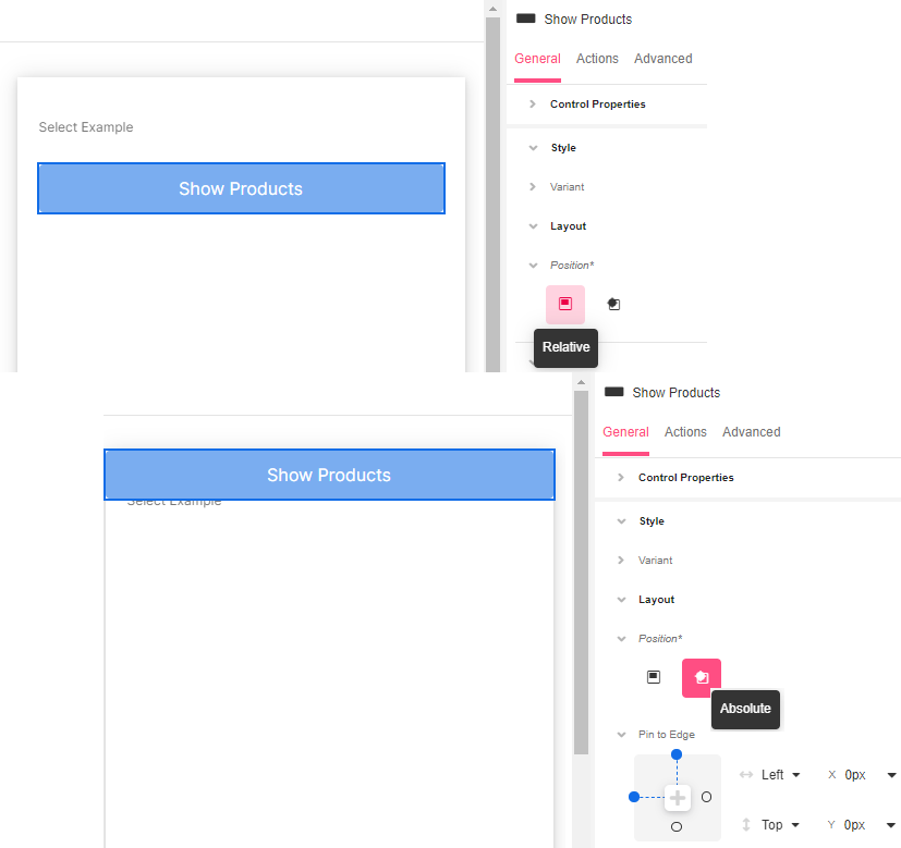
Position
Relative - Places an element relative to its current position without changing the layout around it.
Absolute - Places an element relative to its parent’s position and changes the layout around it. When this position is used, the Pin to Edge options are displayed to adjust the Web Control in the desired quadrant.
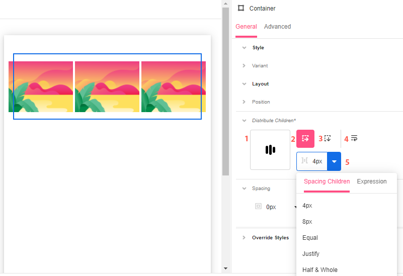
Distribute Children
Available for Container-type Web Controls such as Simple Cell and File Upload
1. Distribution Box - Shows how children Controls are distributed by default and allows you to quickly change their position as a block within the Container.
2. Stack Horizontal - Aligns all children Web Controls horizontally.
3. Stack Vertical - Aligns all children Web Controls vertically.
4. Wrap - Specifies whether all children Web Controls should be wrapped inside the Parent or not.
5. Spacing Children - Configures how much space is taken around each child Web Control. Possible choices are to provide a Theme Variable, or an Airscript Expression. If providing an Airscript Expression, it must result in a string with a valid size.
Spacing
Margin - Configures how much space is taken around the outside of the Control's bounding box.
Padding - Configures how much space is taken around the inside of the Control's bounding box.
In both cases, spacing on the top, bottom, left, and right can be configured separately. Possible choices are to provide a Theme Variable, or an Airscript Expression. If providing an Airscript Expression, it must result in a string with a valid size.
Override Styles
Dimensions
Height - Configures the vertical size of the Control's bounding box.
Width - Configures the horizonal size of the Control's bounding box.
In both cases, the value auto will cause the Control to take up enough space to accommodate the displayed content. Possible choices are to provide a Size or Theme Variable, or an Airscript Expression. If providing an Airscript Expression, it must result in a string that is a valid size.
Clip Content - Configures how the content is displayed when it would take more space than is available within the Control's bounding box. By default, the content will be scrollable within the bounding box. However, if this property is enabled, the content will be clipped to the Control's bounding box.
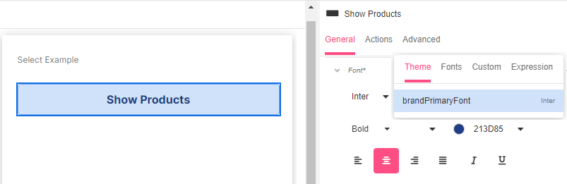
Font
Configures the font of the text on the Web Control. Possible choices are to use a Theme Variable, to select one from the available fonts, to use a custom font by uploading a font file, or to provide an Airscript Expression. If providing an Airscript Expression, it must result in a string that identifies a font, and cannot reference any Variable.
Once the font is decided, you can show the text as bold or regular, choose the color, and alignment and whether it will be underlined or in italics.
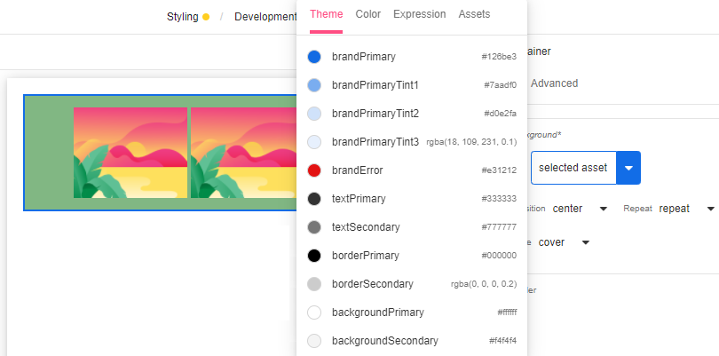
Background
Configures the color of the background of the Control's bounding box. Possible choices are to use a Theme Variable, to use the Color Picker, to provide an Airscript Expression, or to use an uploaded Asset. If providing an Airscript Expression, it must result in a string that identifies a Color, and cannot reference any Variable. When choosing to use an uploaded Asset, its position, size, and repeatability are also configurable.
Border
Border Stroke Style - Configures how the border around the Control is displayed. Possible options are "none", "dotted", "dashed", "solid", "double", "groove", "ridge", "inset", or "outset".
Border Color - Configures the color of the border around the Control bounding box. Possible choices are to provide a Theme Variable, or an Airscript Expression. If providing an Airscript Expression, it must result in a string with a valid size and may not reference any Variables.
Border Width - Configures the width of the border stroke around the Control's bounding box. Possible choices are to provide a Theme Variable, or an Airscript Expression.
Border Sides - Configures which sides of the border should be displayed. The visibility of the top, left, right, and bottom sides can be configured separately.
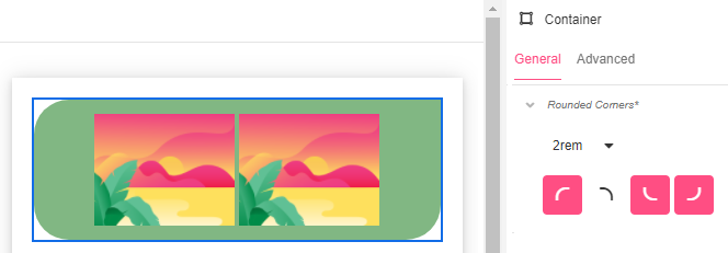
Rounded Corners
Corner Radius - Configures whether the corners of the bounds of the Control are rounded. This setting is typically only useful if either the Background Color or Border Color of the Control are visible against the parent Control. Possible choices are to provide a Theme Variable, or an Airscript Expression. If providing an Airscript Expression, it must result in a string with a valid size.
Rounded Corners - Configures which of the Control's bounds corners are rounded and which ones are not.
Shadow
Shadow Horizontal Offset - Configures the distance that the shadow is offset from the Control's bounds in the horizontal direction. The value can be positive or be negative.
Shadow Vertical Offset - Configures the distance that the shadow is offset from the Control's bounds in the vertical direction,. The value can be positive or be negative.
Shadow Blur Radius - Configures how blurred the shadow of the Control's bounding box is.
Shadow Color- Configures the color of the shadow of the Control's bounding box.
Shadow Spread Radius - Configures the size of the shadow of the Control's bounding box. A value of zero causes the size of the shadow to be the same as that of the Control's bounding box, while a positive value will increase the size, and a negative value will decrease the size.
In all cases, possible choices are to provide a Theme Variable, or an Airscript Expression. If providing an Airscript Expression, it must result in a string with a valid size.
Shadow Inset - Configures whether the shadow of the Control's bounding box is displayed on the outside and blurred out FALSE, or on the inside and blurred in TRUE.