Overview
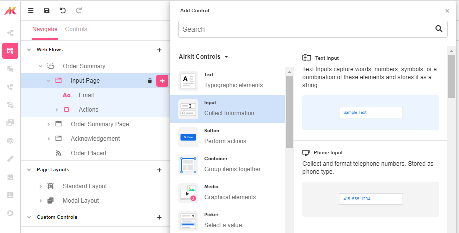
The Text Input Web Control inserts boxes that allow App users to input text data.
Control Properties
Placeholder Text
The text displayed to the app user when no text has been inputted. This field expects to return text, by default text not encapsulated by string quotes will have this wrapping implied.

Advanced Control Properties
Maximum Length
Sets the maximum number of characters that can be inputted. The app user will not be able to type more than this number of characters. This field may accept an expression and expects a number.
Input mode
Determines the input-style primarily on mobile devices. For example, if tel is selected, most mobile devices will show only a number-pad to enter a phone number. Keep in mind, this does not strictly limit the type of characters that can be entered, use Format for this enforcement.

Format
Determines the type of characters that can be inputted. For example, if phone is selected, only numerals can be entered. The selection of this field will also change the Type of data that the input box will expect and give the app builder specific options catered to the input type.
Prefix
Adds a prefix to the beginning of the user's input. The Prefix value must be a string.
No Immediate Prefix
Removes the prefix set under the Prefix field.
Raw Value Trim prefix
Trims or removes the prefixed part of the String that has been entered in the Prefix field. This only removes the prefix within the variable where the input is stored, the app user will still see the prefix displayed.
Right Icon
Allows the display of icons to the right-hand-side of the input box.
Auto Complete
Determines whether the user's device is allowed to autocomplete the field. Guidance can be provided to the app user's browsing environment by using one of the pre-determined autocomplete options such as name or street-address. For more information, see the autocomplete attribute.
Styling
Text Inputs can be styled with these controls. For more information, see Common Style Properties of Web Controls.
Further customization is possible with different Variants, font types, sizing and spacing being editable on the Inspector. Click on the desired Variant and the element on the Stage will change to match. Further information on Themes and Variants found here.
Example 1: Controlling what happens with the inputted data

Data entered into text inputs need to be bound to a variable. By default, Airkit automatically creates a Text Variable for the inputted data to be stored which can be seen within Inspector > Data Binding.
In this example, a text_input variable has been created which can be used to pass data across web pages, events, data flows and more.