Overview
Use the Date Picker Web Control to collect a specific date from the user.

Control Properties
Minimum Days Out
Determines the minimum number of displayed days from which a user can pick a date taking today's date as the starting point.
Maximum Days Out
Determines the maximum number of displayed days from which a user can pick a date taking today's date as the starting point.
Date Picker Layout
Determines how many days the Date Picker presents. Options are:
- 1 Week
- 2 Weeks
- 1 Month
Date Range
Determines the date range from which the user can pick a date. Options are:
- all - allows both dates in the past and the future to be selected
- past - allows only dates in the past to be selected
- future - allows only dates in the future to be selected
Calendar
Presents all TCPA calendars available per US state.
Data Binding
By default, this Data Binding property auto-generates a Variable of type Date at the Web Page level to store the data from the input.
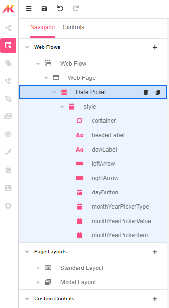
Style
The Date Picker is a compound Web Control. You can style each Control separately. See Common Style Properties of Web Controls.
Actions
Value Changed
Triggers the set actions whenever the user selects a date in the picker.
Examples
Example 1: Using the Date Picker to select a date for a future home inspection
Add the Date Control to a Web Flow. Set the Date Picker Layout to two weeks and make sure the Date Range is set to Future.