Overview
Use the Signature Control to collect a user-drawn signature. It is also possible to gather a typed signature with this control.

Note: the Asset that automatically stores the entered signature will be available throughout the duration of a user's Journey but not beyond.
Control Properties
Value
It is an asset variable where the signature image will be stored.
Init Mode
The initial mode in which the control should be presented. Options are:
- draw - finger drawn signature
- type - typed signature
Signature
A Text Variable Data Type will hold the typed version of the signature.
Top Margin Typed Signature
A CSS value for the top margin of the text input in the type mode.
Left Margin Typed Signature
A CSS value for the left margin of the text input in the type mode.
Control Actions
Value Changed
It happens every time the type selection buttons are clicked. Value changed is also fired when the Signature Asset has finished uploading.
Configuring Type Signature
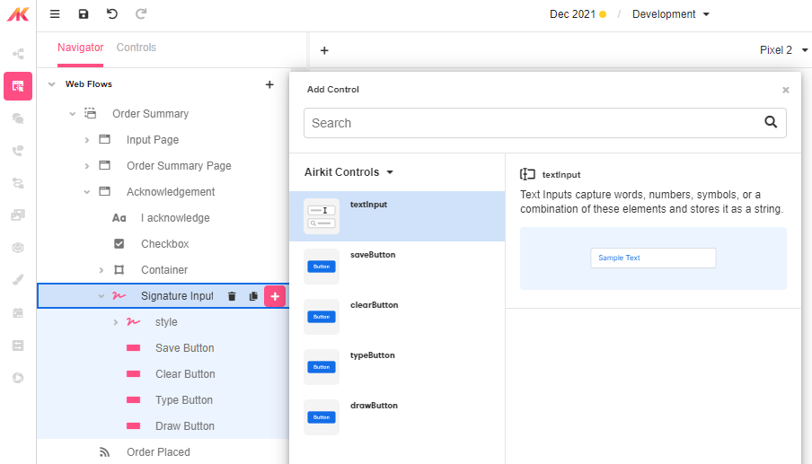
Several steps must be taken on the default Signature Input to enable the typed signature.
On the Web Page that will hold the signature input, create two additional variables. Create typed_signature of type text where the typed signature value will reside. Create a mode variable of type text which will contain the current mode of the signature input control. This variable will be used to toggle the appearance of the text input box.
Add the Signature Input to the web page. In the Advanced Control Properties section of the signature, set the Signaturevalue to typed_signature. Next, click the + icon next to the Signature input and add the Text Input to the control.

Change the Data Binding on the Text Input to typed_signature. Select the Advanced tab in the Inspector for the Text Input and set the Is Visible value to:
activity.mode = "type"On the Signature Input, select the Actions Tab in the Inspector and set a Set Variable Action on the Value Changed to set activity.mode to event.mode. The mode will either be "draw" or "type."
This configuration will allow the user to type in a signature instead of requiring the drawn signature.
Styling and Theming
The Signature Control is a compound control. To style the individual components within the Signature Control, under the style section on the Signature Input, select each component, and the style properties will pop up.

Example 1: Signing a Legal Document
The signature control can collect a signature at the end of a legal document.

Add a Signature control to a Web Page. Create an Asset on the Web Page. On the Signature control, set the Signature value to the asset created.