Overview
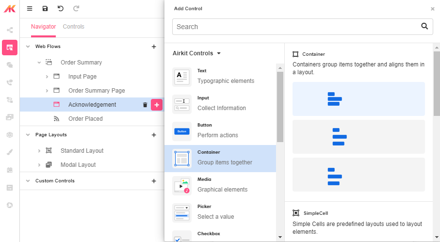
The Container Web Control creates a container that can be used to segment or separate elements on a Web Page. Containers can be added to Web Pages or nested within many other Web Controls such as repeaters and other Containers.
Control Details
Styles
Containers and their elements can be styled. For more information, see Common Style Properties of Web Controls.
Distribute Children
Unique to some controls, are the ability to distribute the children elements within a container control. This provides the ability to distribute the elements evenly in the container, based off of the selected setting.
Stacking settings include:
- Stack Horizontal
- Stack Vertical
Distribution settings include:
- Top Left
- Top Center
- Top Right
- Center Left
- Center
- Center Right
- Bottom Left
- Bottom Center
- Bottom Right
Alignment of the items settings include:
- Equal
- Justify
- Half & Whole
Advanced Control Details
Is Visible
This allows the app builder to set conditions as to whether the container and its elements are visible. This field expects an expression that evaluates to either a True or False. If the value is True, the container will display, otherwise it will not. By default, containers are visible unless otherwise specified in this setting.

Example 1
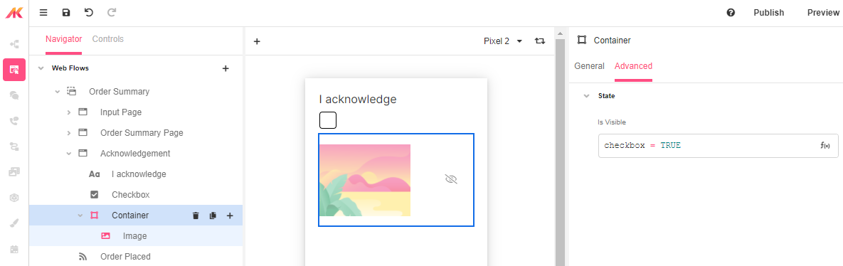
The app builder may want to only display a set of elements if an app user has acknowledged a set of terms and conditions. Change the IsVisible property of the container to evaluate to true if checkbox is equal to TRUE.