Overview
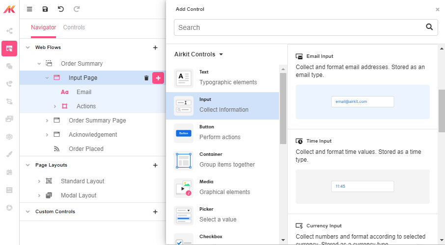
The Email Input Web Control can be used to capture email addresses. The email input value also evaluates to null if an invalid email is entered. This can help with building out a validation experience.
Control Properties
Placeholder Text
The text that is displayed in the input’s box before the user starts typing.
Advanced Control Properties
Right Icon
Allows the display of icons to the right-hand-side of the input box.
AutoComplete
Determines whether the user's device is allowed to autocomplete the field. Guidance can be provided to the App user's browsing environment by using one of the predetermined autocomplete options.
Data Binding
Value
By default, this Data Binding property auto-generates a Variable of type Email at the Web Page level to store the data from the input.

Users can also edit the Data Binding property and create their own Variables.
Style and Theming
This component has style Variants for the following states:
- Default - When first rendered without a state.
- Focused - When the Email Input is focused.
- Disabled - When the Email Input is disabled.
Most Web Controls have a common set of styling properties.
Control Actions
In the Actions Tab of the Inspector section, the Email Input actions can be defined.
On Blur
Triggers when the user leaves the input field. That is, when changing the focus from the field to some other part of the application.
Value Changed
Triggers with each typed character. That is, with an email input, the Value changes every time a key is pressed, unlike a Checkbox, where its Value changes when the box is selected.
On Enter
Triggers upon pressing Enter.
Please check out Action Builder to find all the available actions.
Advanced
In the Advanced Tab of the Inspector section, the conditions under which this Web Control is visible can be defined by setting a specific parameter.
Is Visible
This property is a conditional field, which allows to show or hide the field depending on whether the set condition is met. The condition will always evaluate to a Boolean.
Is Disabled
This property is a conditional field, which allows to enable or disable the field depending on whether the set condition is met. The condition will always evaluate to a Boolean.
Example 1:
In this example, the Email Input includes a condition based on the input validity. If the app user enters a value other than an email address, when pressing enter, a label asking the user to enter a correct input is displayed.
