Creating an App Header
Overview
The app header sits at the top of your application and is viewable on each page. Adding a customized app header is a way to brand your entire experience. You can also provide help resources to your customers by including an assistance button to the app header.
Uploading images for the app header and assistance button
First, upload the images that will be later used as the header and assistant of the application. To do so, go to Media Library and click on Upload.
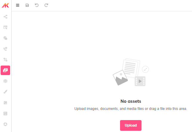
After dragging and dropping -or uploading from your computer- the images, you will see them listed on the Stage sector.

Adding the app header
In the Tree section of Web Builder, go to Page Layouts > Standard Layout > Mobile > Container. Click on the '+' icon next to the Container and add a new Container. Rename it to 'App Header'.
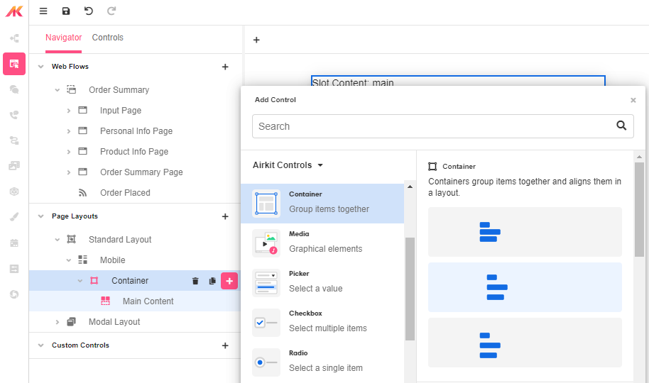
Click on the '+' icon next to the App Header Container and select Image as a Media control. Then change the name to 'Header Image'. Drag and drop App Header Container to be above Main Content in the Treen so that it sits above the content of the application.
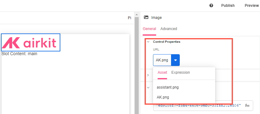
In the Inspector section, go to Control Properties and use the split control to select the image you need from the Asset dropdown. This way, the image will show up in the Stage.
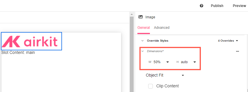
In the Inspector section, go to Style > Override Styles and set the Dimensions to 50% width to leave space for the assistant. This will ensure the content inside the container to sit side by side.
Adding the assistance button
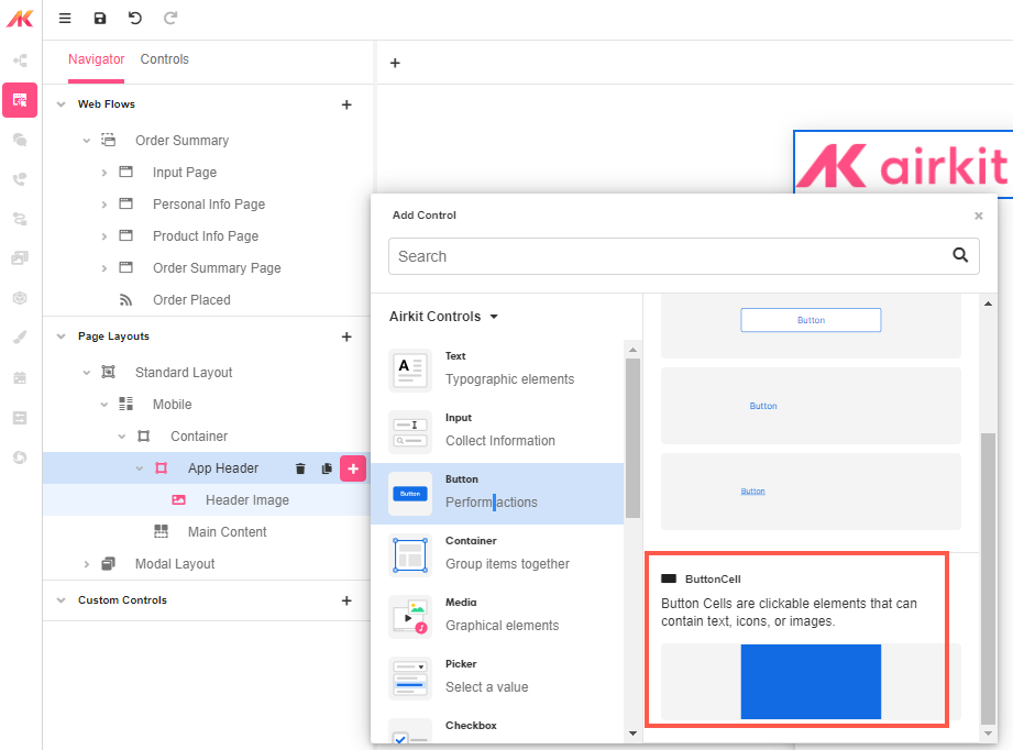
The assistant will be a clickable logo of an agent. Therefore, a Button Cell and an Image controls will be added to the App Header Container.
Click on the '+' icon next to the App Header Container and select the Button Cell from the Button controls. A Button Cell Container acts like a normal Container but it has a click action for users to interact with the app.
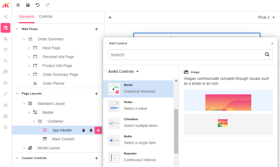
Rename the button to 'Assistance Button' and click on the '+' icon next to it to add Image as a Media control.
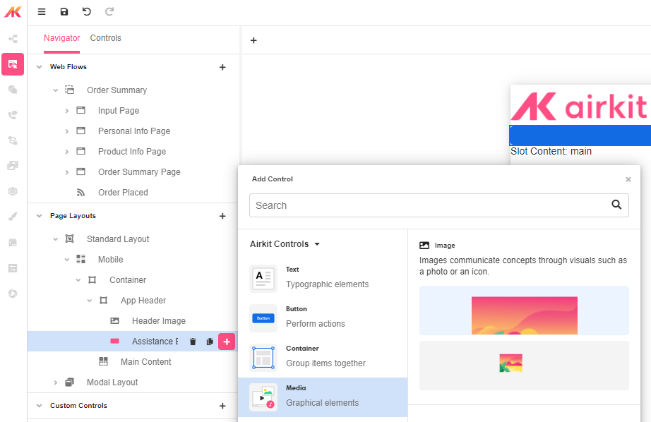
Rename it to 'Assistance Image' and from Control Properties select the corresponding asset:

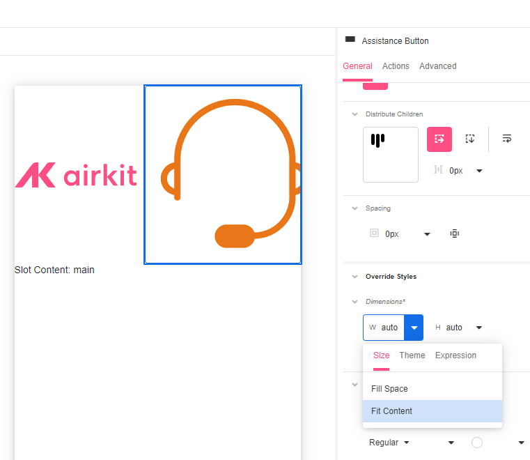
Now with the Assistance Button selected, go to Inspector section and in Dimensions select Fit Content. This way, the assistant will be displayed over the Button Cell.
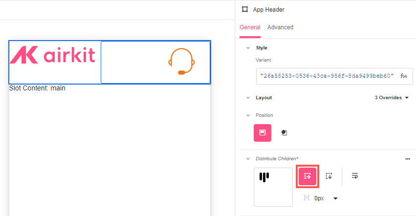
Finally, with the App Header Container selected, go to the Inspector section and in Distribute Children click on Stack Horizontal so that the components of the app header sit side by side. To further style the app header, see Common Style Properties of Web Controls.
You've now finished configuring the look and feel of your app header. Clicking on your Web Pages will show you how the app header and assistance button display in relation to the rest of your content.
Configuring the assistance button
While you can configure the assistant to perform any Airkit action, a typical workflow is to have an 'Needs Assistance' Web Flow that provides resources to users.
First, in Web Builder, create a new Web Flow with a 'Assistance' Web Page. This Web Page can include, for example, FAQs.
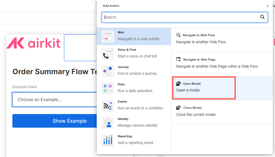
Go back to the 'Assistance Button' and in the Inspector section, go to the Actions tab. Then, click on the '+' icon and add an Open Modal action.
Then select the Needs Assistance Web Flow.
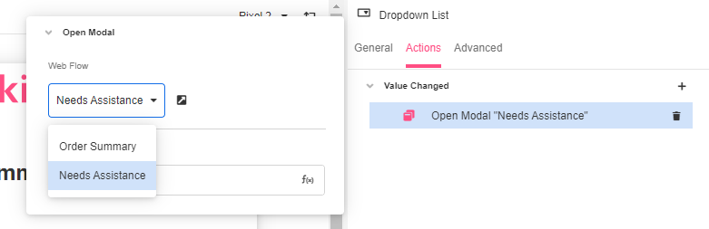
This way, when users click on the assistance button in the header, the Needs Assistance Web Page will open as a modal.
Updated 3 months ago