The Button Web Control creates a button or text that when clicked can run Actions. This control differs from the Hyperlink in that it does not allow for navigating outside of Airkit's Web Flows.
Properties
General
Text
Expects type text.
The text that is displayed on the Button.
Accessibility
Aria Label
Expects type text.
Defines a value to the aria-label of the control for accessibility. For more information see here.
State
Is Visible
Expects type boolean.
If TRUE the button will be visible. If FALSE the button will not be displayed. If the field is empty, the button will be visible.
Is Disabled
Expects type boolean.
If TRUE the button will be disabled and the user will not be able to interact with the control. If FALSE the button will be enabled. If the field is empty, the button will be enabled.
Style
The Button Variants have styles for the following states:
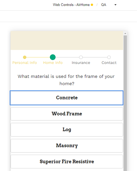
Default - When first rendered without state
Pressed - when the Button is being pressed
Disabled - When the Button is disabled
Focused - when the Button is focused
If the Text on the Button is a phrase, it can be adjusted to one or multiple lines from Override Styles > Text Overflow
Check Common style properties of web controls for further details on how to style your Button Web Control.
Actions
Clicked
This event is run each time the button is clicked.
Metadata about this event can be accessed through the event namespace.
Example #1
This example shows a Button with the default style displaying the static text "Click Me".

Example #3
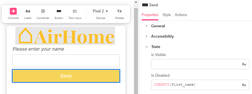
This example shows a Text Input Control that is bound to the variable first_name and the button is either enabled or disabled based on whether a value has been entered into the text field.
To do this, use the Is Disabled property with an Airscript expression to check if there's a value.
ISEMPTY(
  first_name
)- If
first_nameis empty, then Is Disabled = TRUE - If
first_namehas a value, then Is Disabled = FALSE

See more useful tips and functions to check for empty and null values