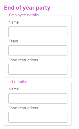
The Fieldset Container Web Control creates a container that groups related controls in a form. Grouping controls help make forms more understandable for users and make related controls easier to identify. For more information, see here.
The Fieldset Container is composed of two child Controls: Legend and Fieldset, which can be styled independently of the main parent Control.
General
Control Properties
Legend Text
Expects type text.
Defines a heading for the controls in the Fieldset container.
Style
It has one default Variant. However, child Controls Legend and Fieldset can be customized as most Web Controls. For more information, see Common Style Properties of Web Controls.
Advanced
State
Is Visible
Expects type boolean.
If TRUE the Control will be visible. If FALSE the Control will not be displayed. If the field is empty, the Control will be visible.
Is Disabled
Expects type boolean.
If TRUE the Control will be disabled and the user will not be able to interact with it. If FALSE the Control will be enabled. If the field is empty, the Control will be enabled.
Example
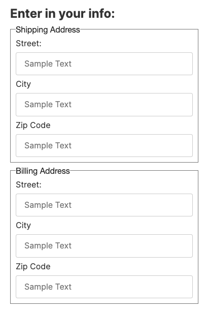
Fieldset containers can be used to help distinguish form fields by groups. In the example below there are two fieldset containers that separate "Shipping Address" and "Billing Address" which have the same form fields.
