
The Container Web Control creates a container that can be used to segment or separate elements on a Web Page. Containers can be added to Web Pages or nested within many other Web Controls such as repeaters.
Properties
Accessibility
Aria Label
Expects type text.
Defines a value to the aria-label of the control for accessibility. For more information see here.
State
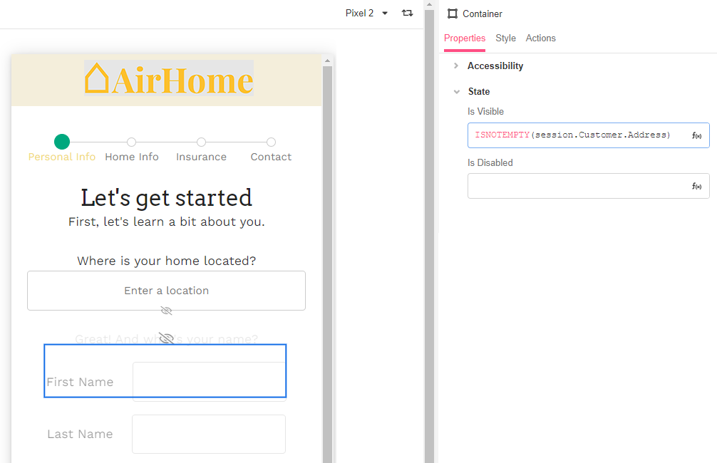
Is Visible
Expects type boolean.
If TRUE the Container will be visible. If FALSE the container will not be displayed. If the field is empty, the container will be visible.
Is Disabled
Expects type boolean.
If TRUE, the Container will be disabled and the user will not be able to interact with the Control. If FALSE, it will be enabled. If the field is empty, it will be enabled.
Style
Distribute Children
This provides the ability to distribute the elements evenly in the container, based off of the selected setting.
-
Distribution Box - Shows how children Controls are distributed by default and allows you to quickly change their position as a block within the Container.
-
Stack Horizontal - Aligns all children Web Controls horizontally.
-
Stack Vertical - Aligns all children Web Controls vertically.
-
Wrap - Specifies whether all children Web Controls should be wrapped inside the Parent or not.
-
Spacing Children - Configures how much space is taken around each child Web Control. Possible choices are to provide a Theme Variable, or an Airscript Expression. If providing an Airscript Expression, it must result in a string with a valid size.
For more information, see Common Style Properties of Web Controls or watch this Building Bytevideo about Container layout options:
Actions
Clicked
This event is run each time the container is clicked.
Example
The app builder may want to only display a set of elements if an app user has completed a previous field. Change the Is Visible property of the Container to evaluate to ISNOTEMPTY