Changing the header
In order to personalize the app, we’ll change the template’s header. This template comes out of the box with a single Image for a header, which we're going to change for a different Image and Label, corresponding to our company “AirCo”.
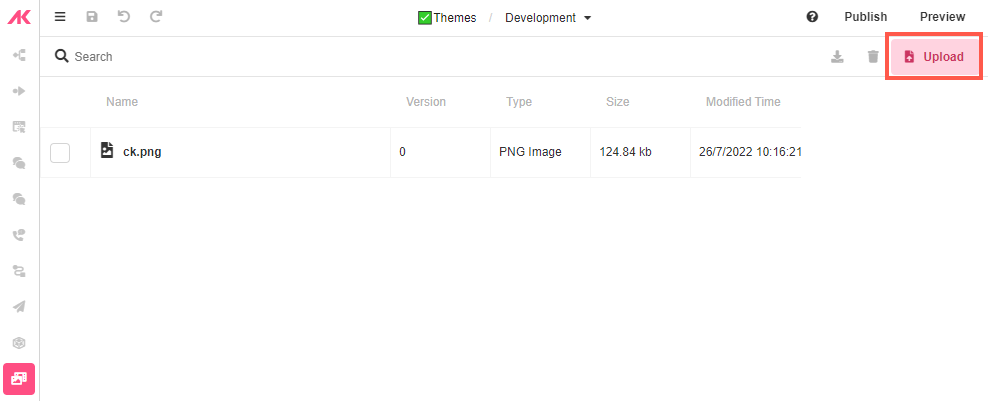
- Go to Media Builder and click on Upload at the top right corner of the Studio.
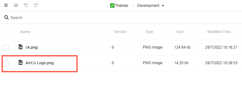
- Drag and drop the desired company logo. It will show up below the default one:
Defining Layouts
In Web Flows Builder, go to Page Layout > Standard Layouts. Here we’ll define how the header will appear in both the Mobile and Desktop Layouts.
What are Mobile and Desktop Layouts?
Page Layouts
Page Layouts consist of nested Containers, including a special one designated Main Content. This is the Container that holds the contents of the Web Page. Navigating to a new Web Page changes what Main Content is displayed, but will otherwise not change any aspect of the Page Layout, which is applied to the application universally.
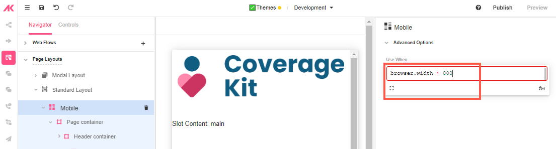
The Mobile Layout defines the layout of Web Pages opened on mobile devices. By default, this is defined by screens less than or equal to 800 pixels wide, although this is customizable. The Desktop Layout defines the layout of Web Pages opened in browser windows. By default, this is defined by screens more 800 pixels wide, although this is customizable.
For more information on Page Layouts, see Page Layouts.
Mobile Layout
- Go to Mobile and check the dimensions in the Inspector. By default, the browser width is defined in 800px, but this can be customized depending on our use case.
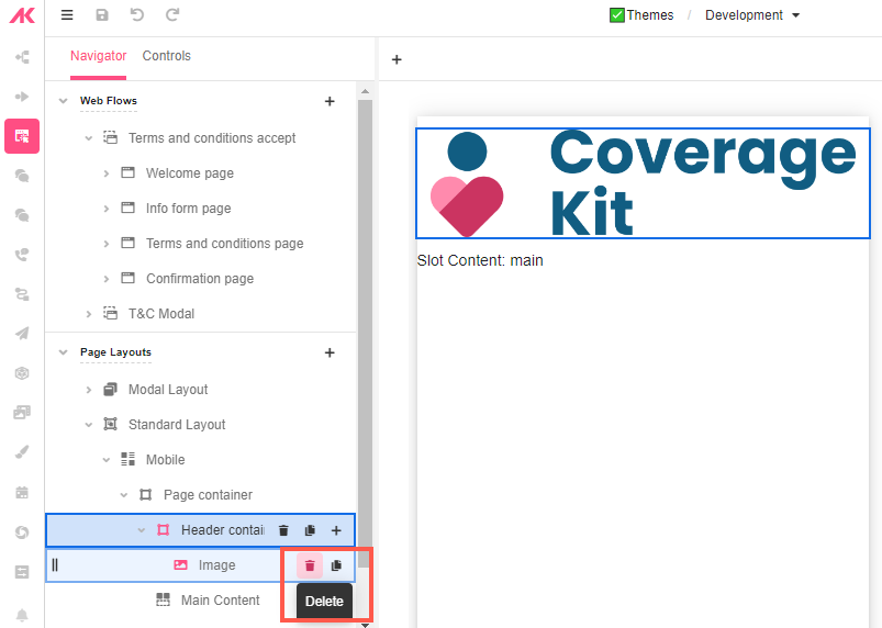
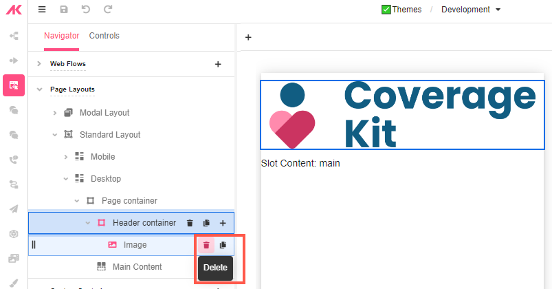
- Go to Page Container > Header Container and delete the default image.
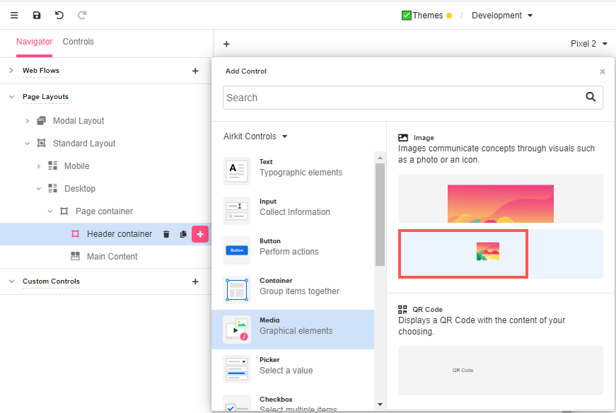
- Click on the ‘+’ icon next to the Header Container to add an Image Control from Media.
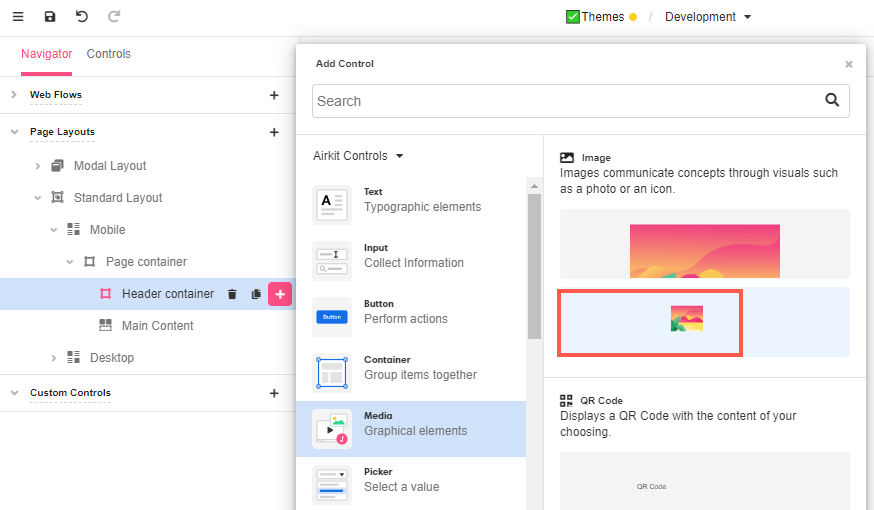
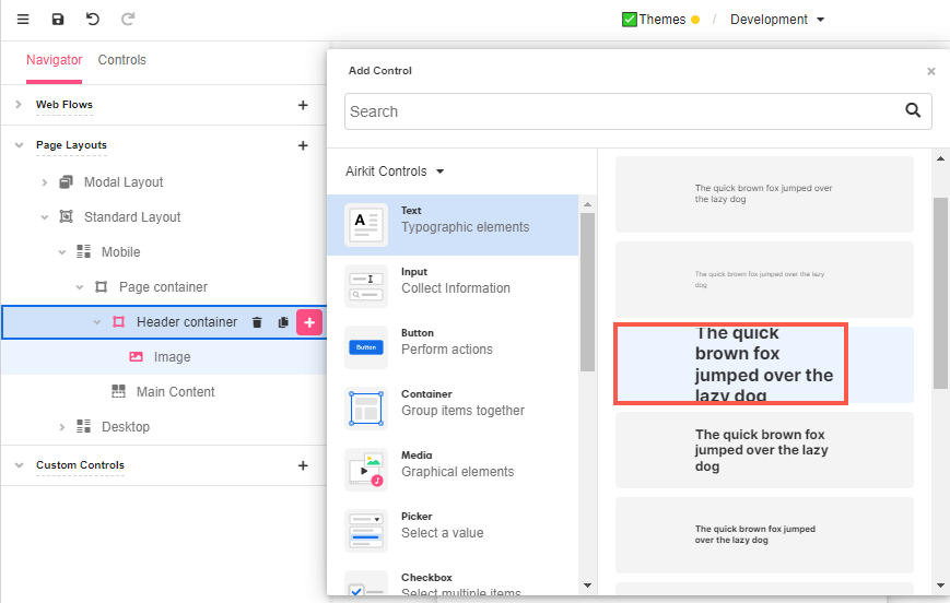
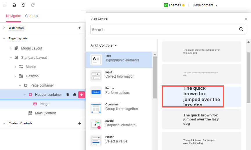
- Add a Label to the same Container.
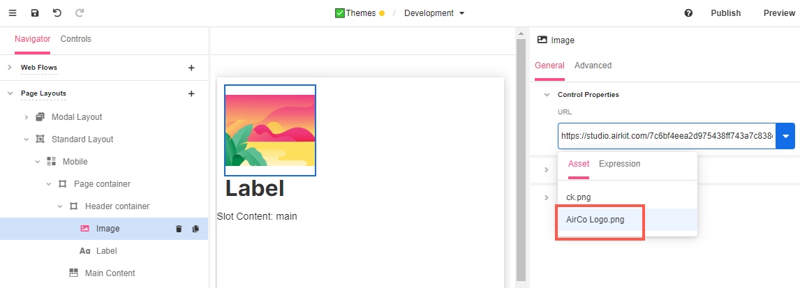
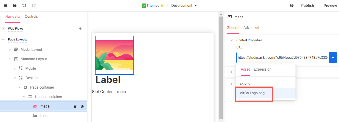
- With the Image Control selected, go to the General tab of the Inspector and, in Control Properties > URL, you’ll find the newly uploaded image listed in Assets for you to select.
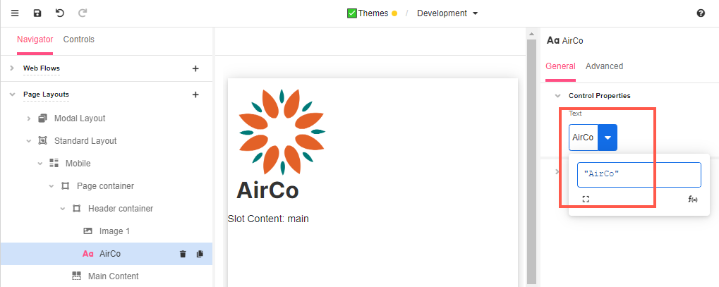
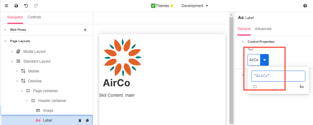
- With the Label Control selected, go to the General tab of the Inspector and, in Control Properties > Text, add the company name “AirCo”.
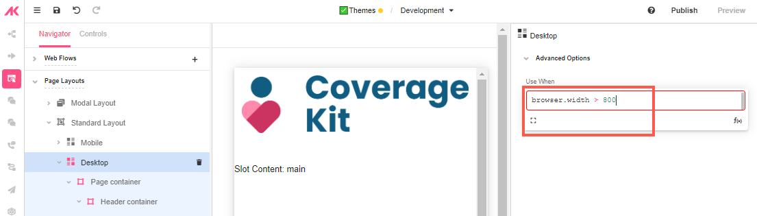
Desktop Layout
- Go to Desktop and check the dimensions in the Inspector. By default, the browser width is defined in 800px but it can be changed so that it better fits a desktop screen.
The Mobile Layout takes precedence over the Desktop layout. If the Use When value is
TRUEfor both the Mobile and Desktop layout, the Mobile layout will be the one used. To avoid confusion, define the Use When values the Mobile and Desktop layouts as mutually exclusive.
- Go to Page Container > Header Container and delete the default image.
- Click on the ‘+’ icon next to the Header Container to add an Image Control from Media.
- Add a Label to the same Container.
- With the Image Control selected, go to the General tab of the Inspector and, in Control Properties > URL, select the image of the logo from Assets.
- With the Label Control selected, go to the General tab of the Inspector and, in Control Properties > Text, add our fake company’s name “AirCo”.
Styling the header
Let’s make some adjustments so that the logo and the company name are better distributed in the header.
Make sure you make the following changes to the Header Containers both in the Mobile Layout and the Desktop Layout, as changes made to one will not be applied to the other. You might also find that you want to style one slightly differently from the other, as styling conventions that look good on small mobile screens might not look as good on larger desktop screens.
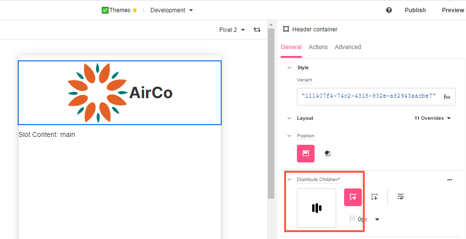
- With the Header Container selected, go to Distribute Children and select Stack Horizontal. This way, both elements will sit side by side.
- Align the Header Container so that it looks well centered.
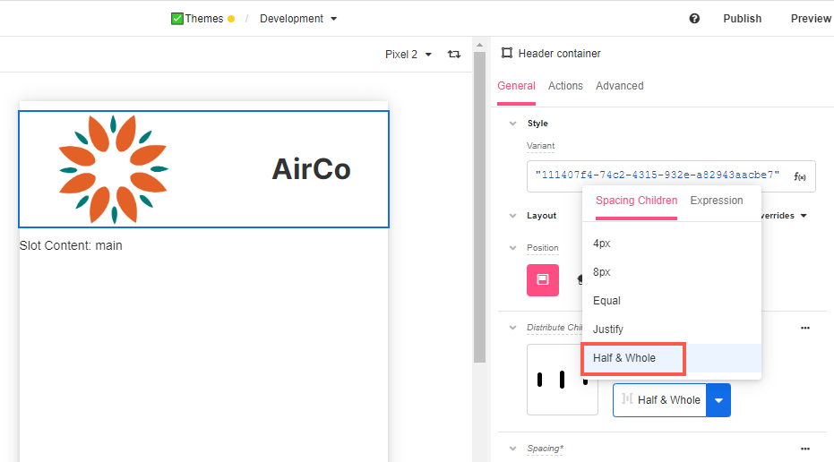
- You can also change the spacing to your linking by selecting one of the options from the dropdown or providing a customized one in Expression. In this case, we are using Half & Whole to distribute the Controls evenly.
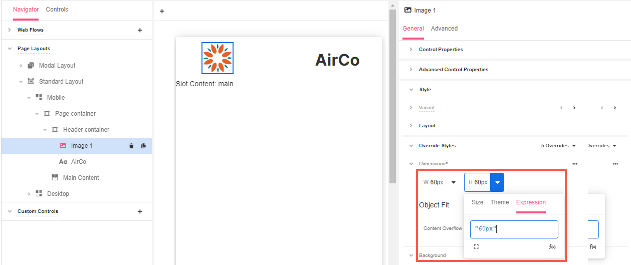
- Further adjustments can be made if we want, for example, the logo to be smaller:
a. With the Image Control selected, go to Override Styles > Dimensions.
b. In the General tab of the Inspector and change both the width and height as needed using the Expression editor:
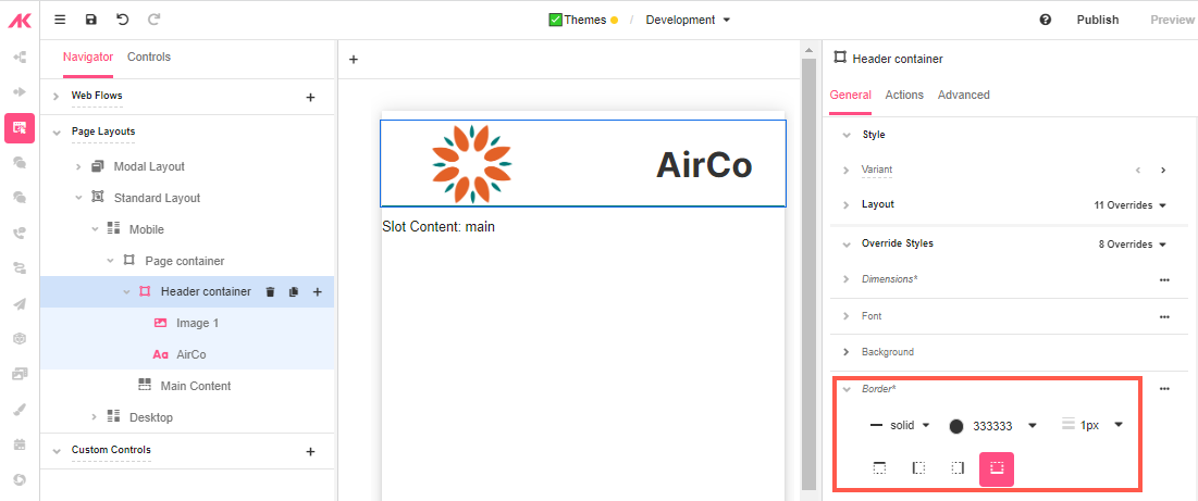
- A separator from the header to the rest of the app can also be created by adding a border to the Header container:
a. Select the Header container and go to the General tab of the Inspector.
b. Go to Override Style > Border and select a solid bottom line border.
c. Choose the textPrimary color and 1px for the border size.
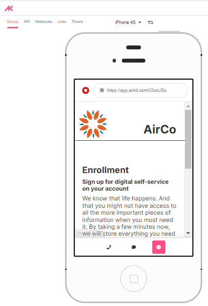
- Go to App Preview to see the changes reflected in the app:

Updated 4 months ago