Changing the Theme
To keep on adjusting the style of the app, we’ll change the styling of some Variants so that they better match our new logo.
What is a Variant?
Variants
A Variant is a set of styling properties for a specific Web Control, similar to a class in CSS. If you're not familiar with CSS classes, you might compare Web Controls and Variants to dinnerware. Plates, cups, and forks are all like different web controls: they each have a particular function, and this is reflected in aspects of their appearance. However, not all plates look the same. A square red plate and a round blue plate are both capable of serving as plates and are simply styled differently. If you are deciding whether to set your table with your blue plates or your red plates, this is like choosing between different Variants of plates.
Every Web Control has associated Variants: cosmetic variations that appear differently but function identically. Variants can be edited in Theme Builder and then used as defaults when adding new Web Controls. For instance, within a single application, you might create two Variants of button: a rectangular one in red, and a round one in blue. Any changes made to existing Variants also apply retroactively: existing Web Controls previously styled according to the old default will immediately take the form specified by the new default. This allows for consistent branding throughout the entirety of each user's Journey, and it also makes it easy to see how different combinations of colors, fonts, and graphics look together.
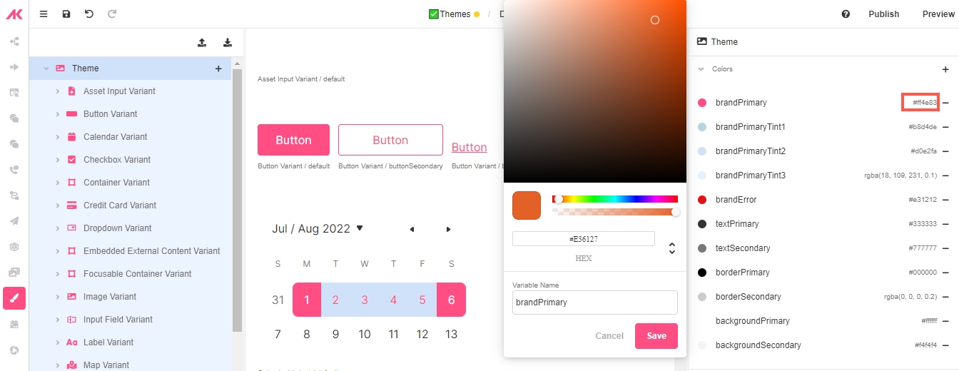
Changing the Default Color Palette
These are the Hex codes for the colors we are going to use:
- Orange: E36127
- Blue: 007A78
- Go to Theme Builder.
- Click on brandPrimary and change the default Hex color to E36127.
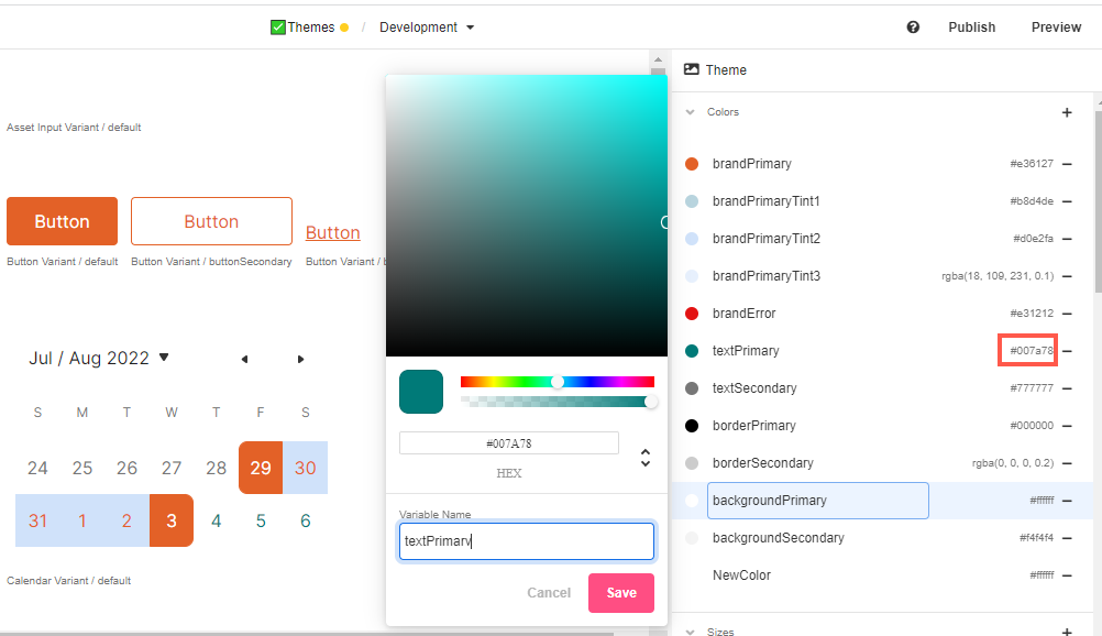
- Click on textPrimary and change the default Hex color to 007A78.
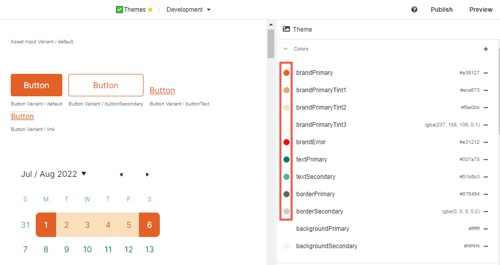
Additionally, you can change some of tints and secondary colors so that they all look good in combination:
Changing an Individual Variant
- Click on Button Variant > Default to make some changes to this Variant of this Control.
- Change the bottom and top padding to 15px for a larger margin.
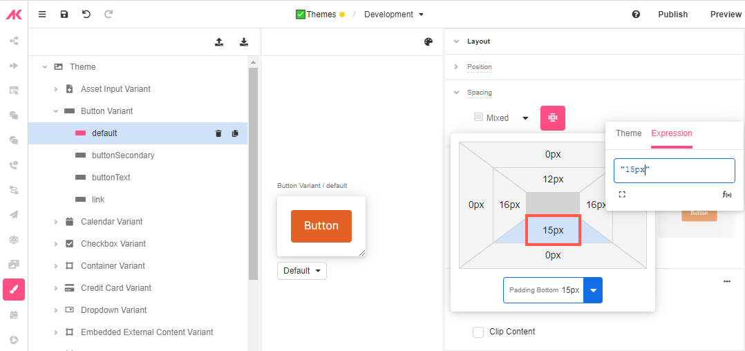
- Change the border for a double one, pick a different color and choose 4px to make it little thicker:
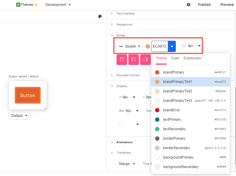
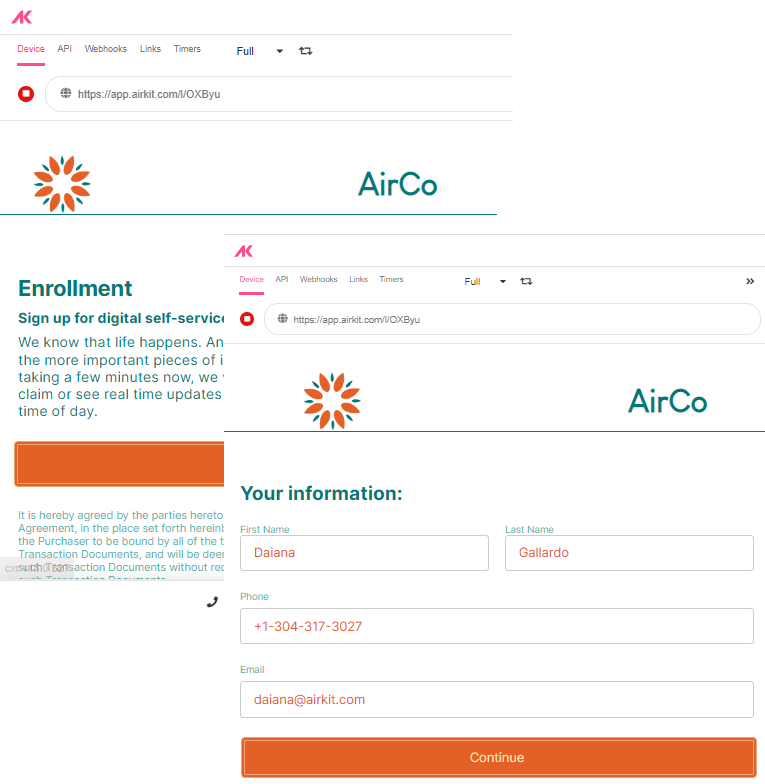
- Save the app and go to App Preview to see the changes reflected:
What other styling changes can be made to individual Variants?
Styling Variants
The same styling properties that apply to individual Web Controls apply to their Variants. Their height, shape, and color are all among the common customizable properties, although the details depend the specifics of the Web Control. For a deeper dive into the available customizations, see Common Styling Properties of Web Controls.

Updated 4 months ago