Changing the Theme
To keep on adjusting the style of the app, we’ll change the styling of some Variables and Variants so that they better match our new logo.
What is a Variable?
Variables
A Variable is a set of general styling properties for Colors, Sizes, Fonts and Times, similar to custom properties in CSS. These properties provide specific settings to specific elements. We can define different "contexts" (values for a Variable) for each Variable, that way, we can use the same color, size, font or timeframe several times, without needing to configure said elements each time.
Every Web Control and Variant has associated Variables for their colors and sizes, or fonts and times when applicable. For instance, within a single application, you might want to use the same colors across buttons, fonts or borders to maintain branding uniformity. Changes done in a Variable Color, will change subsequent elements that are using that color context. This will also apply for other Variables like sizes. If you want to keep a Web Control, such as a button, the same size throughout your application, you can use Variables to keep that button size consistent.
What is a Variant?
Variants
A Variant is a set of styling properties for a specific Web Control, similar to a class in CSS. If you're not familiar with CSS classes, you might compare Web Controls and Variants to dinnerware. Plates, cups, and forks are all like different web controls: they each have a particular function, and this is reflected in aspects of their appearance. However, not all plates look the same. A square red plate and a round blue plate are both capable of serving as plates and are simply styled differently. If you are deciding whether to set your table with your blue plates or your red plates, this is like choosing between different Variants of plates.
Every Web Control has associated Variants: cosmetic variations that appear differently but function identically. Variants can be edited in Theme Builder and then used as defaults when adding new Web Controls. For instance, within a single application, you might create two Variants of button: a rectangular one in red, and a round one in blue. Any changes made to existing Variants also apply retroactively: existing Web Controls previously styled according to the old default will immediately take the form specified by the new default. This allows for consistent branding throughout the entirety of each user's Journey, and it also makes it easy to see how different combinations of colors, fonts, and graphics look together.
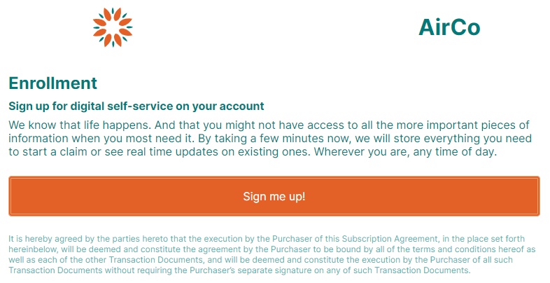
Changing the Default Color Palette
We will change the colors of our Web Page to better match the color of our example logo. These are the Hex codes for the colors we are going to use:
- Orange: E36127
- Blue: 007A78
-
Go to Theme Builder.
-
Under the Variables section, click on Colors
-
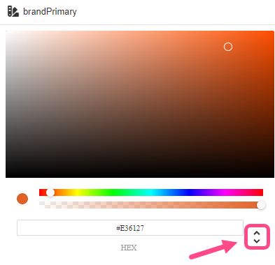
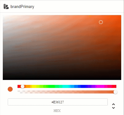
Click on brandPrimary
-
Change the default HEX color to E36127. You can edit the value for the HEX color code by using the field below the color panel to the right.
[block:image]
{
"images": [
{
"image": [
"https://files.readme.io/6452e88-image.png",
null,
null
][ "https://files.readme.io/6452e88-image.png", null, null ],
"align": "center",
"sizing": "600px"
}
]
}
[/block] -
Click on textPrimary and change the default HEX color to 007A78.
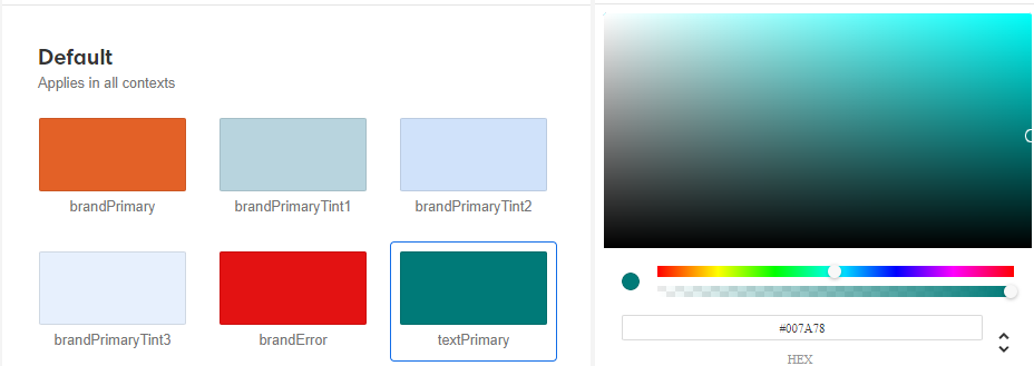
Additionally, change some of tints and secondary colors so that they all look good in combination:
brandPrimary #E36127
brandPrimaryTint1 #ECA673
brandPrimaryTint2 #F8E0BB
brandPrimaryTint3 RGBA (237, 188, 136, 0.1)
brandError #E31212
textPrimary #007A78
textSecondary #51B5B3
borderPrimary #676464
borderSecondary RGBA (0, 0, 0, 0.2)
backgroundPrimary #FFFFFF
backgroundSecondary #F4F4F4
Some colors only support RGBA color codes. You can alternate between the different color codes available for each color Variable by clicking on the up and down arrows next to the color code name.
Alternatively, you can also use the slide bars to select a color. The slide bars allow you to choose the primary color and its transparency, and the color panel allow you to change between different alternatives of that selected color. The circle to the left of the bars is a preview of the current selected color.
Modifying a Variant
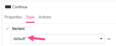
When using a Web Control, the Variant used in that control will be a default one. To see what Variant is being used in a selected Control, go to the Inspector to the right, and select the Style tab, under the Variant, you will see what Variant is selected. When a Web Control is created, it will have the default Variant.
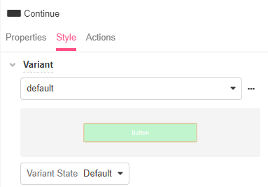
If you make any styling modifications to a Control, the Variant name will have an asterisk symbol (*) to let you know that the selected Variant was modified. This will also happen for the name of the sections you modify in the Style tab.
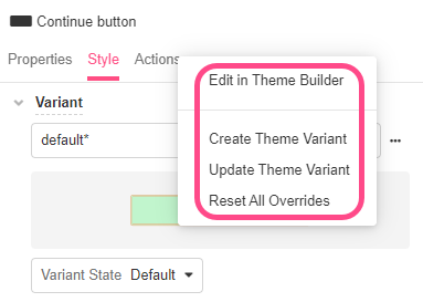
Creating and modifying a Variant
You can make different changes to a Variant on the Inspector. To do this, go to the Inspector to the right and click on the Style tab. Here, you can modify a selected Variant directly in the Theme Builder using the Edit in Theme Builder option. Alternatively, you can also make styling modifications to a Control and use those changes to create a new variant using the Create Theme Variant option or update an existing one using the Update Theme Variant option. You can also revert all your styling changes using the Reset All Overrides option.
Let's modify the current default Variant:
- On Web Flows, go to Terms and conditions accept > Info form page > Section container > Action container > Continue button
- On the Inspector, click on the Style tab. On Variant, make sure default is selected.
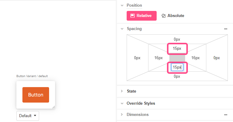
- Click Layout > Spacing and change the bottom and top padding to
15pxfor a larger margin.
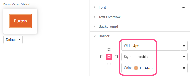
- On Border, change the border Style to double, select the brandPrimaryTint1 and choose
4pxto make it look wider:
We will modify the state of our current Variant for when the button is pressed, by changing the color of the default Variant, when pressed, to a lighter color.
- On Variant, select Variant State
Pressed - On Background, select the brandPrimaryTint2.
- We will save our changes. On Variant, click the three dot option button and select Update Theme Variant. This will overwrite the default settings for that Variant and replace them with the current ones.
We will now create a new Variant, to have two style options for our buttons. We will use the other branding color of our example logo.
- Make sure both default for Variant and default for Variant State options are selected, then click on Create Theme Variant
- Give a name to this new Variant, for this exercise, we will name it defaultAlternative. Click on Create
- On Background, select the textPrimary color and on Border, select textSecondary as color. By doing this, you will have two styles to choose from when editing buttons and their colors.
- Save your changes using the Update Theme Variant option, again.
- Save the app and go to App Preview to see the changes reflected:
What other styling changes can be made to individual Variants?
Styling Variants
The same styling properties that apply to individual Web Controls, apply to their Variants. Their height, shape, and color are some common customizable properties, although specific details depend on the particular elements of the Web Control. For a deeper dive into the available customizations, see Common Styling Properties of Web Controls.

Updated 3 months ago