Web Control Styling Properties
Web Controls can be customized using the style properties in the Style tab of the Inspector, which is available when inspecting Web Controls in either the Web Flows Builder or Theme Builder.
While the exact properties that can be styled vary from Web Control to Web Control, there are nevertheless some common patterns in how styling changes are implemented across elements. In this document, we'll walk through the most common style properties and discuss how they are used.
Variant
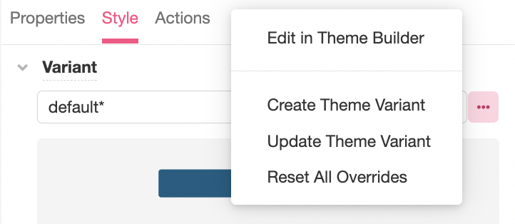
The Variant section configures the Variant that defines how the Web Control is styled. For more on what Variants are and how to create and edit them, see Theme Builder. To edit a Variant or define a new Variant based on styling changes made to a Web Control, click on the '...' icon to the right of the Variant selection dropdown menu:
Some Web Controls have multiple states, each of which can be associated with a different Variant. For instance, the Button Control has the following states:
- Default - when the Button first rendered without state
- Hover - when the mouse hovers over the Button
- Pressed - when the Button is selected
- Disabled - When the Button is disabled
- Focused - when the Button is in focus
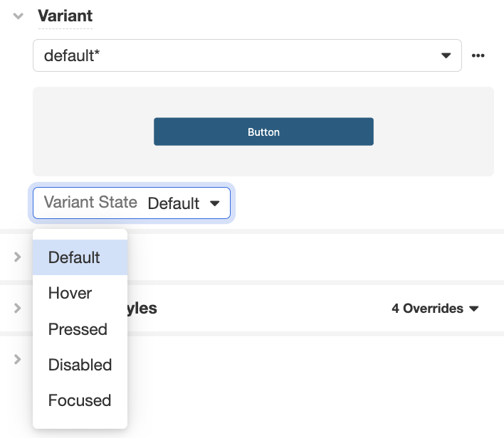
Changes made to the styling of a Web Control will apply only to the Variant State selected.
Layout
The Layout section configures the placement of the Web Control as well as any Web Controls nested within it (if applicable).
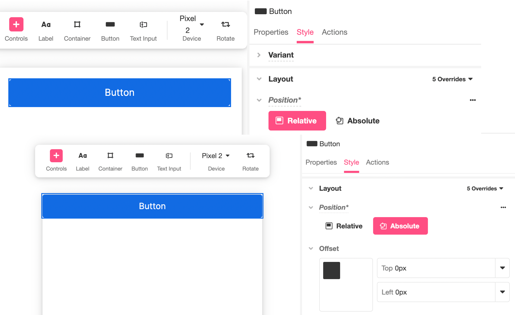
Position
Relative - Places an element relative to the surrounding Web Controls.
Absolute - Places an element in an absolute position within its parent element or Container. When this position is used, the Offset options are displayed. These allow you to define where the element appears within its Container.
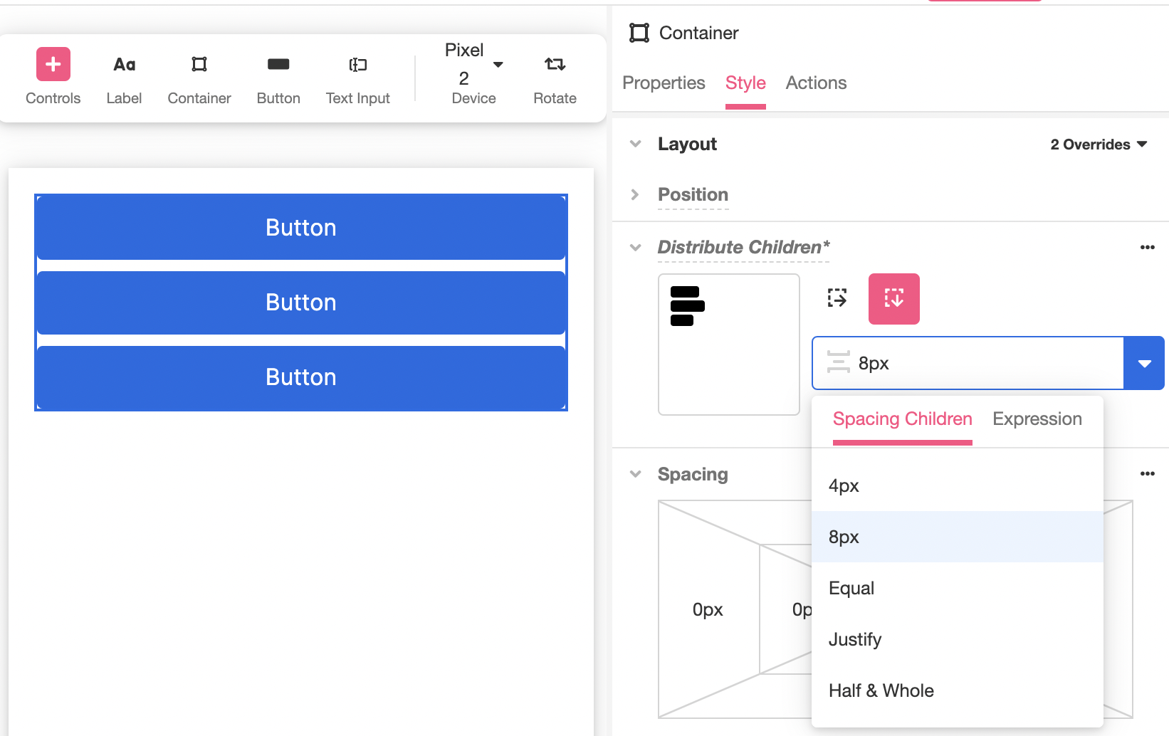
Distribute Children
Available for Container-type Web Controls such as Simple Cell and File Upload.
Distribution Box - Shows how nested Controls are distributed by default and allows you to quickly change their position relative to each other and the Container.
Stack Horizontal - Places all nested Web Controls horizontally.
Stack Vertical - Places all nested Web Controls vertically.
Spacing Children - Configures how much space separates each nested Web Control. This can be provided as Theme Variable or an Airscript Expression. If providing an Airscript Expression, it must result in a string representing valid size, such as "8px":
Wrap - Specifies if all nested Web Controls will be wrapped inside the Container.
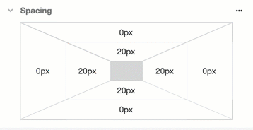
Spacing
Margin - Configures the spacing around the outside of the Web Control.
Padding - Configures the spacing around the inside of the Web Control.
In both cases, spacing on the top, bottom, left, and right can be configured separately. Values can all be defined in terms of either Theme Variables or Airscript Expressions. If providing an Airscript Expression, it must result in a string with a valid size.
Spacing can be viewed and edited in two formats: visually or as a List. To toggle between the two, click on the '...' icon to the right of Spacing:
Override Styles
The Override Styles section allows you to manually override any styling components defined by the Variant.
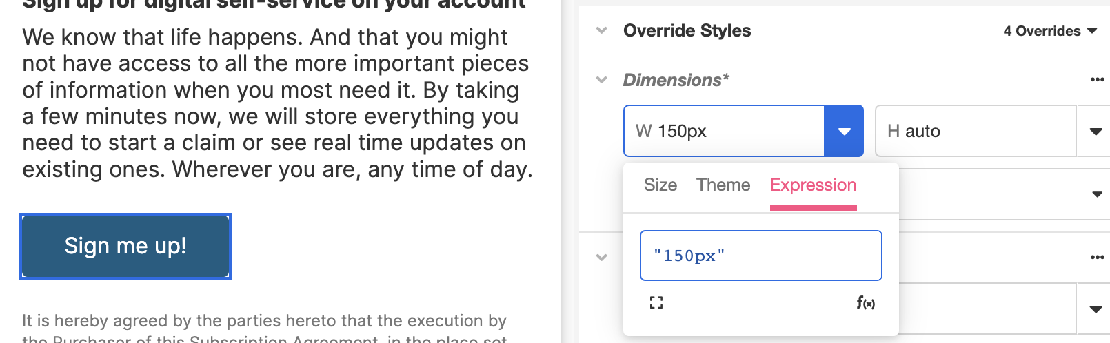
Dimensions
Height - Configures the vertical size of the Web Control.
Width - Configures the horizontal size of the Web Control.
In both cases, the value auto will cause the Control to take up enough space to accommodate the displayed content. Values can all be defined in terms of either Theme Variables or Airscript Expressions.
If providing an Airscript Expression, it must result in a string that is a valid size. For example, to set the Height to half the size of the Container, you would define the Height as the Airscript Expression "50%". To set the Width to 150px, you would set the Width to the Airscript Expression "150px":
Content Overflow - Configures how the content is displayed when it would take more space than is available within the Control's bounding box. It has the following states:
- Visible - This is the default state. The overflow is not clipped so the content renders outside the Control's bounding box.
- Hidden - The overflow is clipped, and the rest of the content is invisible.
- Auto - The overflow is clipped, and a scrollbar is added to see the rest of the content only when necessary.
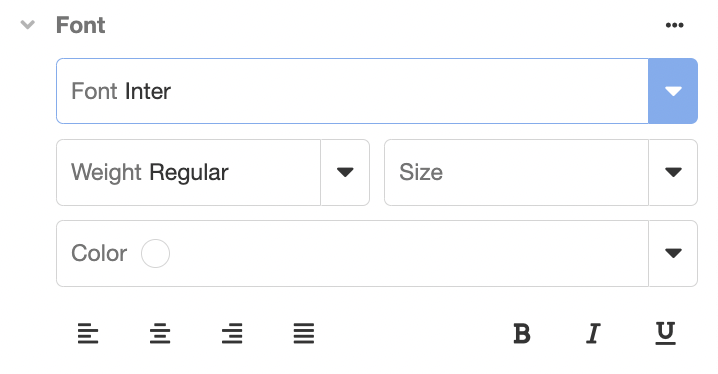
Font
Configures the font of the text on the Web Control. Possible choices are to:
- use a Theme Variable
- select a font from the fonts Airkit pulls from Google Fonts
- use a custom font by uploading a font file, or
- provide an Airscript Expression. If providing an Airscript Expression, it must result in a string that identifies a font, and cannot reference any Variable.
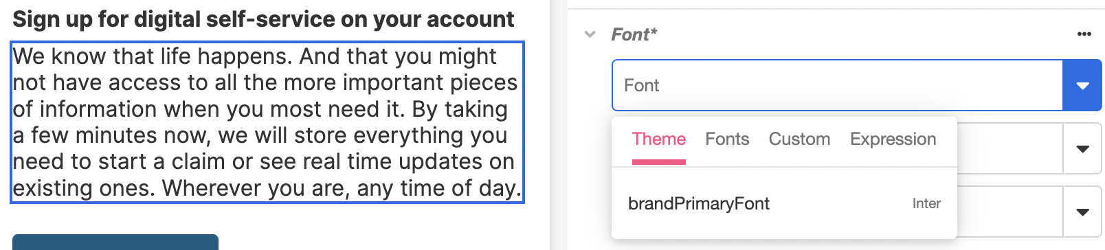
Once the font is selected, you can configure the rest of the formatting, including the color, alignment, and size:
Fonts used out of the box are pulled from Google Fonts and may be removed at any time without our knowledge.
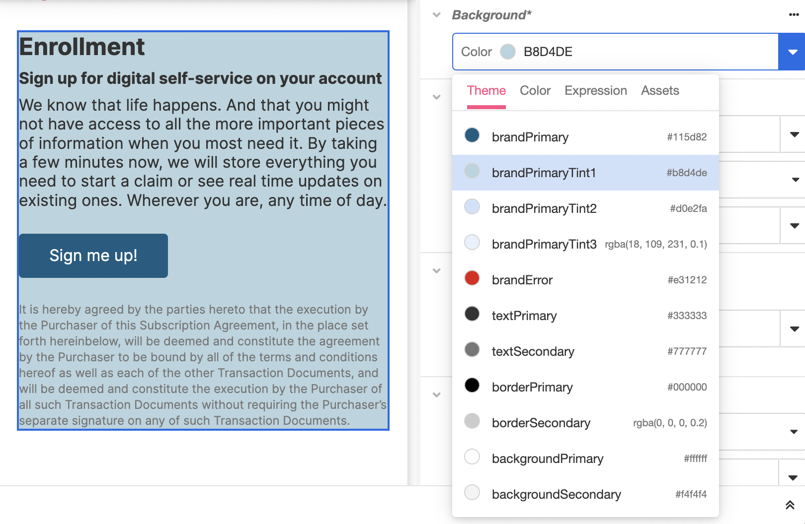
Background
Configures the color of the background of the Control's bounding box. Possible choices are:
- use a Theme Variable
- use the Color Picker
- provide an Airscript Expression
- this must result in a string that identifies a Color and cannot reference any Variable.
You can also add an Asset from the Media Library and configure its position, size, and repeatability. This Asset will layer over the background color, and so if there is any transparency in the image, the color underneath will be visible.
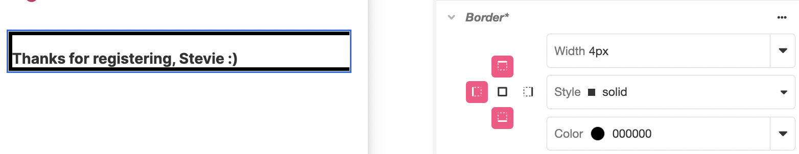
Border
Border Sides - Configures which sides of the border should be displayed. The visibility of the top, left, right, and bottom sides can be configured separately.
Width - Configures the width of the border stroke around the Control's bounding box. Possible choices are to provide a Theme Variable or an Airscript Expression.
Style - Configures how the border around the Control is displayed. Possible options are "none", "dotted", "dashed", "solid", "double", "groove", "ridge", "inset", or "outset".
Color - Configures the color of the border around the Control bounding box. Possible choices are to provide a Theme Variable, or an Airscript Expression. If providing an Airscript Expression, it must result in a string with a valid size and may not reference any Variables.
Rounded Corners
Rounded Corners - Configures which of the Control's border corners are rounded and which ones are not.
Radius - Configures the curve of the rounded corners. Values can all be defined in terms of either Theme Variables or Airscript Expressions. If providing an Airscript Expression, it must result in a string defining a valid size.
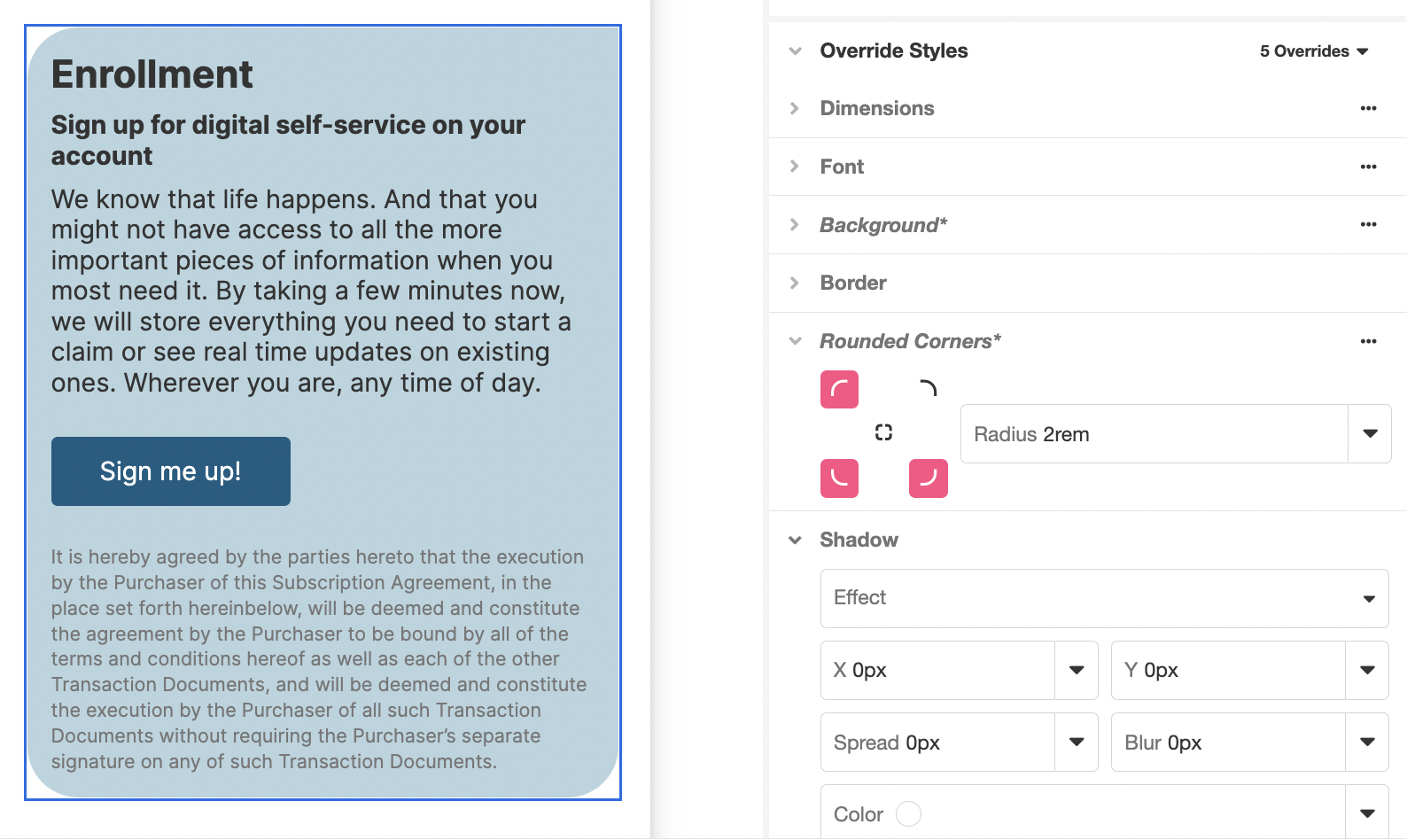
Shadow
Effect - Defines where the shadow will fall. A Drop Shadow falls outside the borders of the Web Control, an Inner Shadow falls within the borders of the Web Control.
X (length) - Defines the distance that the shadow is offset from the Control's bounds in the horizontal direction. This value can be positive or be negative.
Y (length) - Defines the distance that the shadow is offset from the Control's bounds in the vertical direction. This value can be positive or be negative.
Spread (length) - Defines the size of the shadow of the Control's bounding box. A value of zero causes the size of the shadow to be the same as that of the Control's bounding box, while a positive value will increase the size, and a negative value will decrease the size.
Blur (length) - Defines the width of the blur radius around the shadow.
Color (color) - Defines the color of the shadow.
X, Y, Spread, Blur, and Color values can all be defined in terms of either Theme Variables or Airscript Expressions. If providing an Airscript Expression, it must result in a string in the correct format (length or color).
Animations
When styling properties of Web Controls are defined by a variable, the change in appearance that results when the value of the variable changes can be animated. Configuring animations is done in the Animations section.
To animate changes to a styling property, select the Property changes you want to animate from the dropdown list:
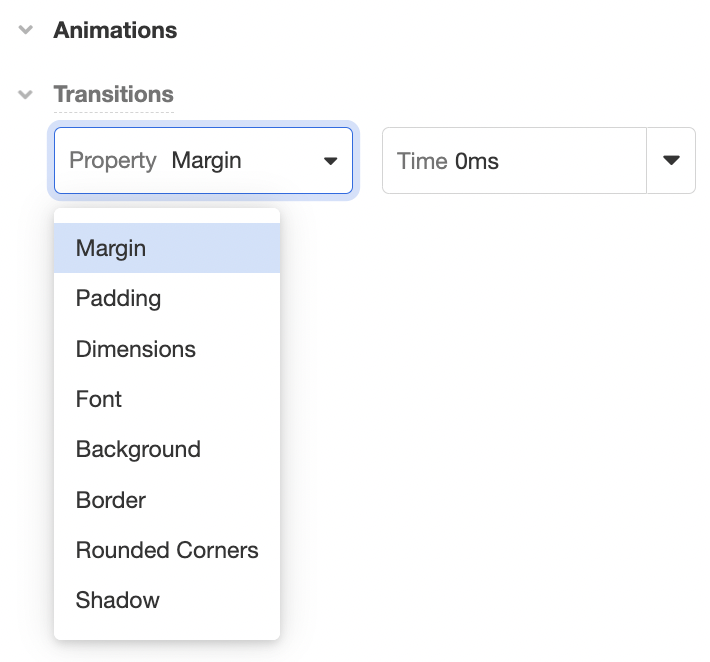
Each property can be associated with a Time that defines the duration of the animation.
For more on animations, see Animations.
Updated 3 months ago