Theme Builder
The Theme Builder provides a way to make stylistic changes that apply across your entire application, ensuring consistent styling throughout each user's web Journey.
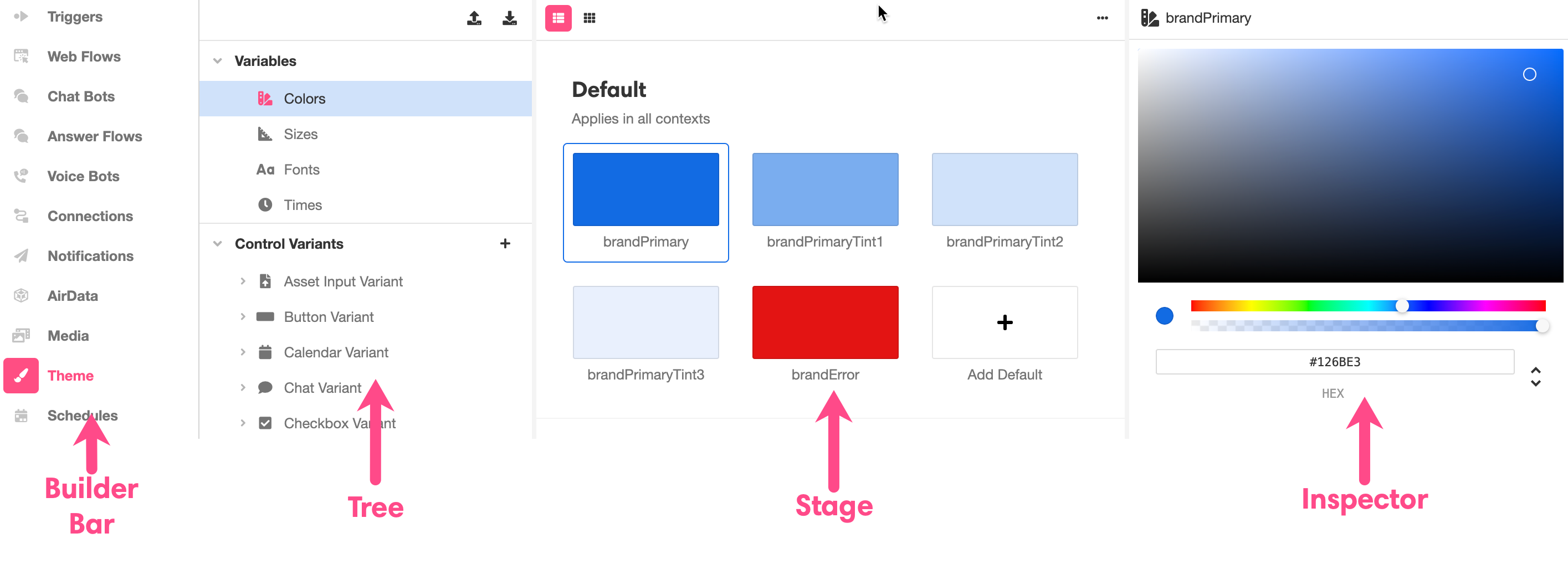
Like most Builders, the layout of the Theme Builder maps comfortably onto the general structure of the Studio: to the immediate right of the Builder Bar is the Tree, to the right of which is the Stage, to the right of which is the Inspector:
What is a Theme?
A theme consists of all the styling defaults that your application can call upon. This includes Variables, which define default color, size, font, and time values, as well as Control Variants, which define a set of styling properties for specific Web Controls, like a class in CSS. For more information on themes, see Themes and Control Variants.
While it is possible to make stylistic changes to individual Web Controls in the Web Flows Builder, it is typically best practice to make any stylistic changes in the Theme Builder, so that styling components can be applied consistently and reused.
Tree
The Tree is where you'll find an expandable and collapsible breakdown of the many styling defaults that can be edited within Theme Builder. What you select in the Tree determines what is displayed in the Stage and Inspector.
The Tree is nested as follows:
- Variables
- Control Variants
- Variants
Variables
Variables define colors, sizes, fonts, and units of time that can be modified at once and reused. In addition to being available while creating UI in the Web Flows Builder, they are also often used to define Control Variants. For instance, the color defined by brandPrimary is used automatically to define the background color of the default Button Variant:
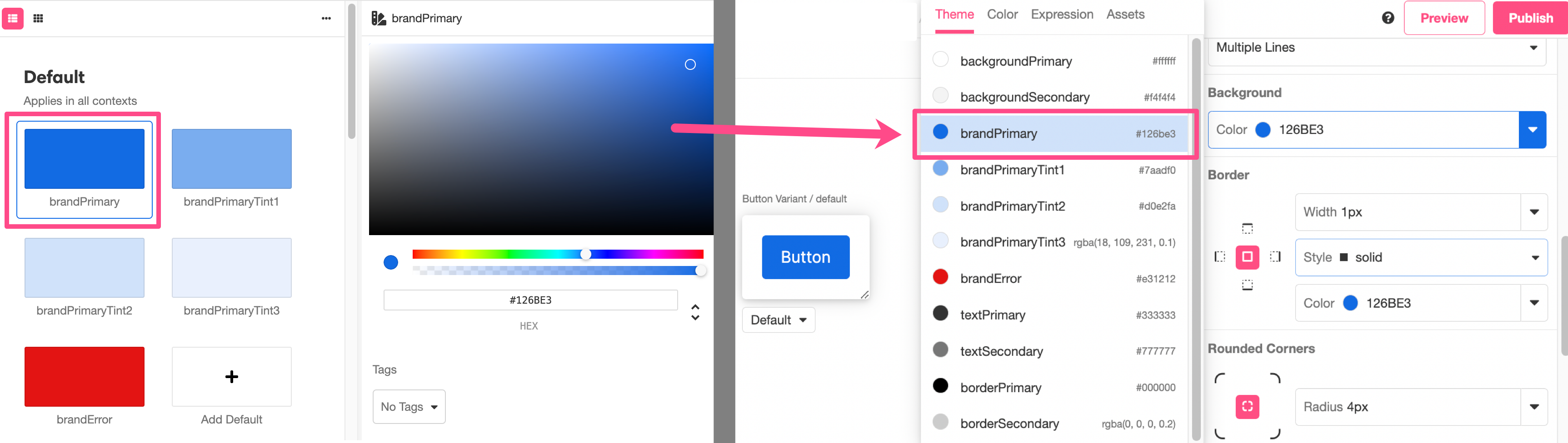
Any changes made to brandPrimary will be reflected in the default Button Variant.
To modify an existing variable, select it in the Stage and apply modifications in the Inspector. Changes made to a variable will be immediately reflected throughout the Studio.
It is also possible to make new Variables, which allows you to do things like keep track of a more detailed color palette, juggle multiple proprietary fonts, and store additional units of time that you might want to reuse in different kinds of Animations. Custom Variables can be assigned tags, which makes them appear at the top of relevant selection menus. For more on making new Variables and and managing their tags, see Themes and Control Variants.
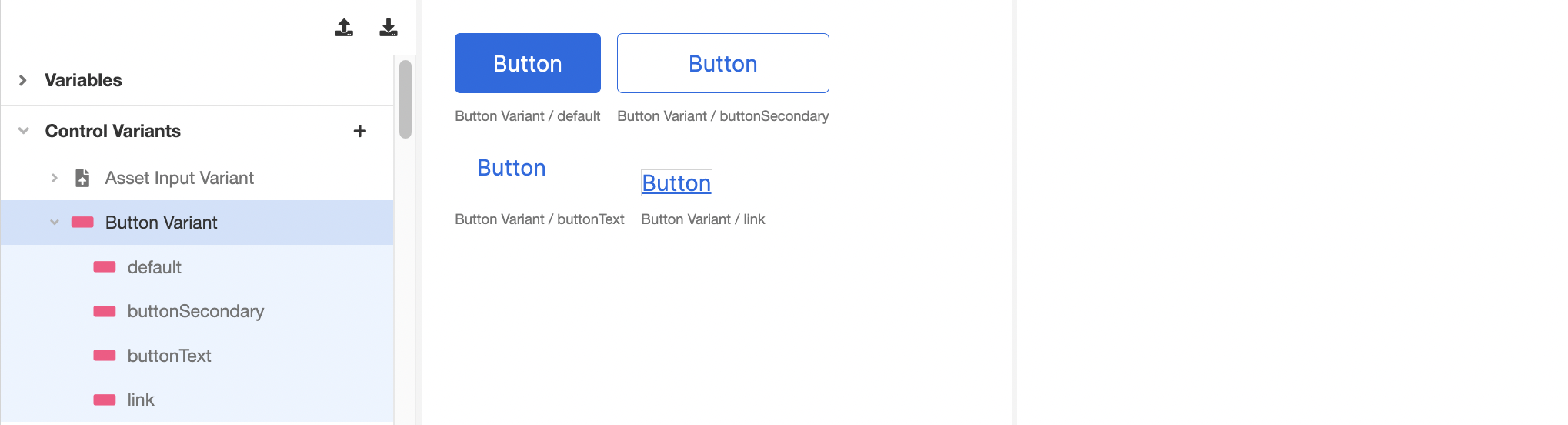
Control Variants
Nested under Control Variants is every Web Control that you can style. Working at the Web Control level allows you to see all Variants of that Web Control side-by-side in the Stage.
What is a Variant?
Variants
A Variant is a set of styling properties for a specific Web Control, similar to a class in CSS. If you're not familiar with CSS classes, you might compare Web Controls and Variants to dinnerware. Plates, cups, and forks are all like different web controls: they each have a particular function, and this is reflected in aspects of their appearance. However, not all plates look the same. A square red plate and a round blue plate are both capable of serving as plates and are simply styled differently. If you are deciding whether to set your table with your blue plates or your red plates, this is like choosing between different Variants of plates.
Every Web Control has associated Variants: cosmetic variations that appear differently but function identically. Variants can be edited in Theme Builder and then used as defaults when adding new Web Controls. For instance, within a single application, you might create two Variants of button: a rectangular one in red, and a round one in blue. Any changes made to existing Variants also apply retroactively: existing Web Controls previously styled according to the old default will immediately take the form specified by the new default. This allows for consistent branding throughout the entirety of each user's Session, and it also allows you to test how how different combinations of colors, fonts, and graphics look together before committing to an implementation.
The following example shows all of the different Variants of a Button Web Control. Note that all four Variants are displayed in the Stage, while the Inspector is left blank – there are no direct changes that can be made at the Web Control level:
Variants
Nested under the Web Controls are all the different Variants of each. Working at the Variant level allows you make stylistic changes to that Variant and see the changes as you make them.
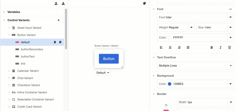
All changes made to a Variant will be applied everywhere that Variant is used.
For a deeper dive into the sort of stylistic changes that can be made in the Inspector, check out Common Style Properties of Web Controls.
If you want to add another Variant to a Web Control, you can click on the '+' icon at the Control Variant level and select which Web Control you want to add a Variant to:
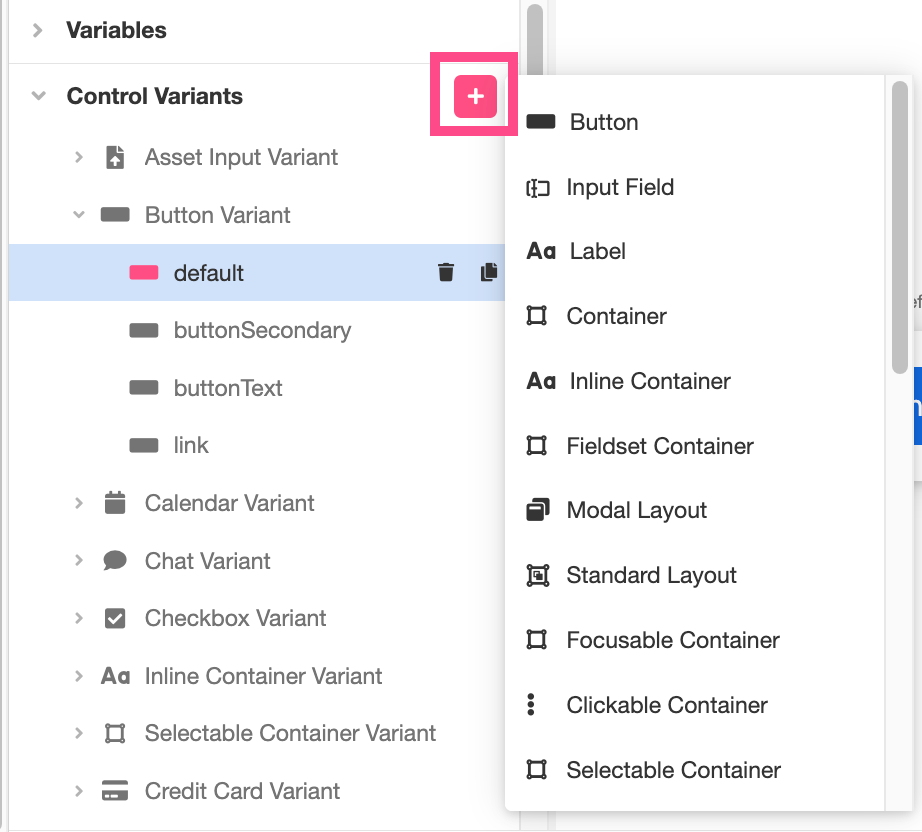
Once you've created a new Variant of a Web Control, you will be able to edit it just like any other Variant, and it will be available for selection at every instance of the Web Control.
Updated 4 months ago