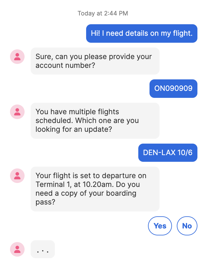
The Chat Web Control provides an interface for users to converse with the bots defined by Conversation Chat Bots. While the Chat Web Control can be incorporated into any web app, it is most commonly used in in apps embedded into existing websites via the AirkitWebSDK.
Enterprise FeatureThe Chat Web Control requires an ENTERPRISE license. If you would like to enable this feature for your Airkit Organization, please contact your Airkit representative or reach out to [email protected].
Properties
General
Resource ID
Expects type Text. This text must correspond to the Chat resource associated with the Conversation Hub configured in Settings. For more on how to configure Conversation Hubs, see Configuring Conversation Chat Bots.
This is the resource that allows the Chat Web Control to access Conversation Chat Bots.
Message Placeholder
Expects type Text.
This is the placeholder text that will appear in the message input box before the user begins composing their message.
Data Binding
Value
Expects type Text.
By default, a Variable of type Text is generated at the Web Page level to store the user input.
Quick Reply Options
Keep quick reply buttons after answer
Quick Replies allow users to select answers from pre-configured options, which appear as selectable buttons. When the Keep quick reply buttons after answer box is checked, these buttons remain even after one has already been selected.
Enable manual input when quick reply is available
Quick Replies allow users to select answers from pre-configured options, which appear as selectable buttons. When the Enable manual input when quick reply is available box is checked, users are also allowed to enter their answers manually.
Message Avatar
Image src
This image defines the appearance of the Message Avatar. By default, the Chat Web Control comes with a stock Message Avatar preconfigured, but it can be replaced by expanding the dropdown menu and selecting one of the three options:
- Asset: Select from images that are available at Media Library.
- Upload: Upload an image to use. Images uploaded her will become available in the Media Library. The following file types are allowed:
- .gif
- .jpeg
- .jpg
- .png
- .svg
- Expression: Expects type
Text. It specifies the link to the desired image or media file.
State
Is Visible
Expects type boolean.
If TRUE, the button will be visible. If FALSE, the button will not be displayed. If the field is empty, the button will be visible.
Is Disabled
Expects type boolean.
If TRUE, the button will be disabled and the user will not be able to interact with the control. If FALSE, the button will be enabled. If the field is empty, the button will be enabled.
Style
This Web Control is made up of other component Web Controls that can be styled individually.
Check Common Style Properties for details on how to style your Chat Web Control.
Actions
On Incoming Message
This Event is run whenever the user sends a message through the Chat Web Control.
On Close
This Event is run whenever the Conversation is ended, such as via the Close Conversation Action. Conversations can also be closed by users or human Agents.
On Routing Flow Update
This Event is run whenever the user is sent to a new Routing Flow, such as when the Move Conversation to Routing Flow Action is fired.
On Outgoing Message
This Event is run whenever a reply is sent to the user through the Chat Web Control.
Example
Fully configuring a Chat Web Control so that it can hold conversations requires building an Answer Flow and a Conversation Hub, as well as managing their interactions. For a detailed example of how to do this, see Setting Up Answer Flows and Configuring Conversation Chat Bots.