
The Currency Input Web Control collects numbers according to the format of the selected currency. Numbers are stored using a Variable of type Currency.
Properties
General
Placeholder Text
Expects type text.
Displays the text in the input’s box before the user starts typing. By default, this text only shows if the No Immediate Prefix in Advanced Property is checked.
Data Binding
Value
Expects type currency.
By default, this Data Binding property auto-generates a Variable of type Currency at the Web Page level to store the data from the input. Users can also edit the Data Binding property and create their own Variables.
Data Tag
Assigns a data tag on the value of the control. For more information, see Data Masking and Auditing.
Autocomplete
AutoComplete
Determines whether the user's device is allowed to autocomplete the field. Guidance can be provided to the app user's browsing environment by using one of the predetermined autocomplete options.
Input Format
Numeral Thousands Group Style
Expects type number.
Adjusts the style of how numbers are formatted with commas on the input. The default Value is 'thousand' where the value of 1000 will be displayed as 1,000. This setting has no effect on the raw Value stored.
Numeral Decimal Scale
Expects type number.
Adjusts the level of precision of numbers that can be entered by the number of digits. If the value of 3 is entered, the number of digits that can be entered after the decimal point will be 3. For example, the value of 5.333 could be entered, but not 5.3333.
Numeral Integer Scale
Expects type number.
Adjusts the scale of numbers that can be inputted by the number of digits. For example, if the value of 4 is set, the largest number possible will be 9999.
Prefix
Sets the Value that is displayed in the input box and is affixed before the number.
Currency Code
Displays a list of currency codes to choose from.This property gets bound to the Data Binding Value when the state of the control changes.
No Immediate Prefix
Defers displaying the Prefix until there is a value in the field or the field is being edited.
Raw Value Trim Prefix
Trims the Value that was set in Prefix before the number. It only affects the raw Value stored, which is not displayed to the app user.
Icon
Right Icon
Allows the display of icons on the right of the input box. The default option “country”, shows the “US” Value.
Accessibility
Aria Label
Expects type text.
The aria-label attribute is used to define a string that labels the current element. It is used to provide an accessible name for the control. For more information see here.
Aria Invalid
Expects type text.
A value of true or false to indicate that the value entered into an input field is not in a format or a value the application will accept. For more information, see here
Input ID
Expects type text.
The Input ID assigned to the Currency Input Web Control. This Input ID can tied to a Label so that clicking on the associated Label will allow users to enter Currency input.
For more on how to use the Input ID, see Connecting Labels to Input Controls.
State
Is Visible
Expects type boolean.
If TRUE the currency will be visible. If FALSE the currency will not be displayed. If the field is empty, the currency will be visible.
Is Disabled
Expects type boolean.
If TRUE the currency will be disabled and the user will not be able to interact with the control. If FALSE the currency will be enabled. If the field is empty, the currency will be enabled.
Style
The Currency Input has styles for the following states:
- Default - When first rendered without a state.
- Focused - When the Currency Input is focused.
- Disabled - When the Currency Input is disabled.
Check Common style properties of web controls for further details on how to style your Currency Web Control.
Actions
On Blur
Triggers when the user leaves the input field. That is, when changing the focus from the field to some other part of the application.
Value Changed
Triggers with each entered number. That is, Value changes every time a key is pressed, unlike a Checkbox, where its Value changes when the box is selected.
On Enter
Triggers upon pressing Enter.
For more information, check out Action Inspector Tab to find all the available actions.
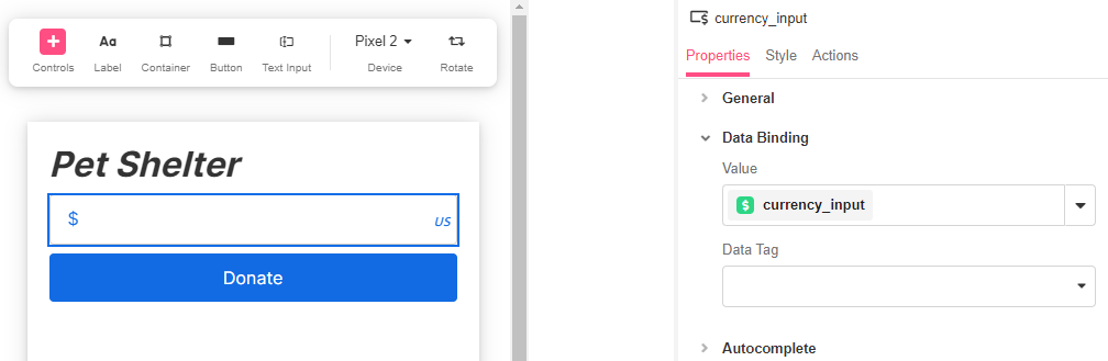
Example
In this example, a Currency Input is set for app users to enter how much they want to donate to a pet shelter.