The Form Web Control is a special type of Container that's used to generate forms from Data Models. The forms created in this way use Data Models to handle the complexities of data structuring and validation handling, expediting the process of form creation.
Properties
Data
Define the data that will be gathered by the Form by selecting a Data Model from the dropdown menu and then adding associated properties to the Form.
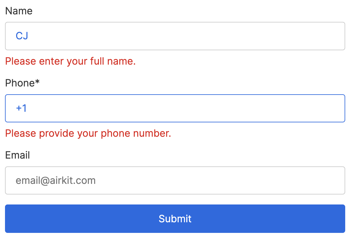
Adding a property to a Form nests an associated Container under the Form Web Control. Each Container consists of:
- a Label for the property name
- an appropriate Input Box, and
- a Label to display any Validation Messages. The content of this Label will be defined by a FIRST_VALIDATION function, which uses the variable set by Trigger Form Validation Actions (the same variable associated with Validation Results, see below) to generate appropriate error messages when users enter invalid information for the given property.
General
Aria Label
Expects type text.
The aria-label attribute is used to define a string that labels the focused element. It is used to provide an accessible name for the Control. For more information, see here.
Validation Rules
Define Validation Rules that can be used in the Trigger Form Validation Action to compare user input to the analogous Model properties and generate appropriate error messages as relevant. These error messages will then be tied to the variable bound to the Validation Results (see below), which, in turn, automatically displays them in the Labels configured to display Validation Messages.
Each Form Control comes pre-configured with a Validation Rule associated with each property that has been added to the Form. Model-level Validation Rules can be configured manually; see the Making Forms from Data Models for more details.
Data Binding
Validation Results
Expects type Object, where each property contains a List of strings.
By default, a Variable of type Object is generated at the Web Page-level to store the results of the Trigger Form Validation Actions. Each property of this Object corresponds to one of the Validation Rules defined above, and each of those properties contains a List of strings, where each string corresponds to a property-associated Failure Text that was applicable when the Trigger Form Validation Action last fired.
This variable is used in tandem with the FIRST_VALIDATION function to configure the Labels meant to dynamically display Validation Messages.
State
Is Visible
Expects type boolean.
If TRUE the Container will be visible. If FALSE the container will not be displayed. If the field is empty, the container will be visible.
Is Disabled
Expects type boolean.
If TRUE, the Container will be disabled and the user will not be able to interact with the Control. If FALSE, it will be enabled. If the field is empty, it will be enabled.
Style
Distribute Children
This provides the ability to distribute the elements evenly in the Form Container, based off of the selected setting.
-
Distribution Box - Shows how children Controls are distributed by default and allows you to quickly change their position as a block within the Container.
-
Stack Horizontal - Aligns all children Web Controls horizontally.
-
Stack Vertical - Aligns all children Web Controls vertically.
-
Wrap - Specifies whether all children Web Controls should be wrapped inside the Parent or not.
-
Spacing Children - Configures how much space is taken around each child Web Control. Possible choices are to provide a Theme Variable, or an Airscript Expression. If providing an Airscript Expression, it must result in a string with a valid size.
For more information, see Common Style Properties of Web Controls.
Actions
Trigger Validation
Triggers each time Form Validation is run via the Trigger Form Validation Action.
Example
Check out the Guide Making Forms from Data Models for a more detailed walkthrough of how to use the Form Control.