The Date Input Web Control inserts boxes that allow app users to input date data.
Properties
General
Placeholder Text
Expects type text.
The text that is displayed on the box before the app users enters text. This field expects text to be encapsulated by string quotes.
Data Binding
Value
Expects type text.
By default, a Variable of type Date is generated at the Web Page level to store the data from the input. Users can also edit the Data Binding property and create their own Variables.
Data Tag
Assigns a data tag on the value of the control. For more information, see Data Masking and Auditing.
Autocomplete
Autocomplete
Determines whether the user's device is allowed to autocomplete the field. Guidance can be provided to the app user's browsing environment by using one of the pre-determined autocomplete options. For more information, see the autocomplete attribute.
Input Format
Date Pattern
Sets the date format. This field may accept an expression and expects text.
Value Format
Raw - sets the inputted data as aDATEobject to the autocreated variable
Normalized - takes the inputted data and saves the DATE object as a string value with the format set on Date Pattern
Delimiter
Displays the symbol that delimits sections of a date as it is entered.
Delimiter Lazy Show
If checked, delimiter will be written by default when inputting date.
Accessibility
Aria Label
Expects type text.
The aria-label attribute is used to define a string that labels the current element. It is used to provide an accessible name for the control. For more information see here.
Aria Invalid
Expects type text.
A value of true or false to indicate that the value entered into an input field is not in a format or a value the application will accept. For more information, see here
Input ID
Expects type text.
The Input ID assigned to the Date Input Web Control. This Input ID can tied to a Label so that clicking on the associated Label will allow users to enter Date input.
For more on how to use the Input ID, see Connecting Labels to Input Controls.
State
Is Visible
Expects type boolean.
If TRUE the input will be visible. If FALSE the input will not be displayed. If the field is empty, the input will be visible.
Is Disabled
Expects type boolean.
If TRUE the input will be disabled and the user will not be able to interact with the control. If FALSE the input will be enabled. If the field is empty, the control will be enabled.
Style
The Date Variant has styles for the following states:
Default - When first rendered without state
Disabled - When the Time Input is disabled
Focused - when the Time Input is focused
Check Common style properties of web controls for further details on how to style this Control.
Actions
On Blur
Triggers when the user leaves the input field. That is, when changing the focus from the field to some other part of the application.
Value Changed
Triggers with each typed letter. That is, Value changes every time a key is pressed, unlike a Checkbox, where its Value changes when the box is selected.
On Enter
Triggers upon pressing Enter.
For more information, check out Action Inspector Tab to find all the available action.
Date Picker
By default, the Date Input Web Control includes a date picker to collect a specific date from the user. For more information, see Date Picker Web Control.
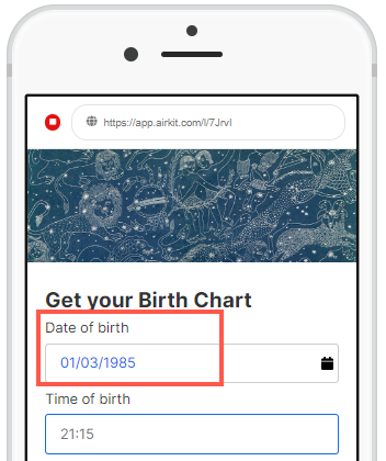
Example
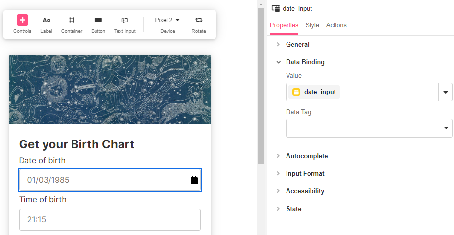
Data entered into date inputs are tied by default to an Airkit automatically generated Date Variable for the inputted data to be stored, which can be seen within Inspector > Data Binding.
In this example, a date_input variable has been created which can be used to pass data across web pages, events, data flows and more.