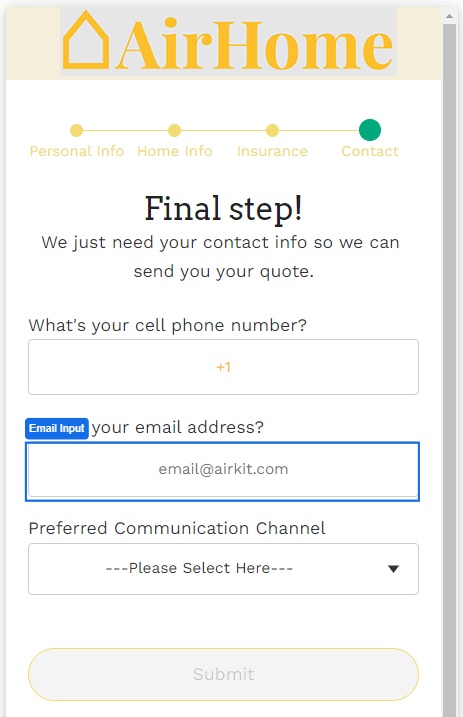
The Email Input Web Control captures email addresses. The email input value also evaluates to null if an invalid email is entered. This can help with building out a validation experience.
Properties
General
Placeholder Text
Expects type text.
The text that is displayed in the input’s box before the user starts typing.
Data Binding
Value
Expects type email.
By default, this Data Binding property auto-generates a Variable of type Email at the Web Page level to store the data from the input. Users can also edit the Data Binding property and create their own Variables.
Data Tag
Assigns a data tag on the value of the control. For more information, see Data Masking and Auditing.
Autocomplete
Autocomplete
Determines whether the user's device is allowed to autocomplete the field. Guidance can be provided to the App user's browsing environment by using one of the predetermined autocomplete options.
Icon
Right Icon
Allows the display of icons to the right-hand-side of the input box.
Accessibility
Aria Label
Expects type text.
The aria-label attribute is used to define a string that labels the current element. It is used to provide an accessible name for the control. For more information see here.
Aria Invalid
Expects type text.
A value of true or false to indicate that the value entered into an input field is not in a format or a value the application will accept. For more information, see here
Input ID
Expects type text.
The Input ID assigned to the Email Input Web Control. This Input ID can tied to a Label so that clicking on the associated Label will allow users to enter Email input.
For more on how to use the Input ID, see Connecting Labels to Input Controls.
State
Is Visible
Expects type boolean.
If TRUE the email input will be visible. If FALSE the email input will not be displayed. If the field is empty, the email input will be visible.
Is Disabled
Expects type boolean.
If TRUE the email input will be disabled and the user will not be able to interact with the control. If FALSE the email input will be enabled. If the field is empty, the email input will be enabled.
Style
The control Variants have styles for the following states:
Default - When first rendered without state
Focused - when the Email Input is focused
Disabled - When the Email Input is disabled
Check Common style properties of web controls for further details on how to style this control.
Actions
On Blur
Triggers when the user leaves the input field. That is, when changing the focus from the field to some other part of the application.
Value Changed
Triggers with each typed character. That is, with an email input, the Value changes every time a key is pressed, unlike a Checkbox, where its Value changes when the box is selected.
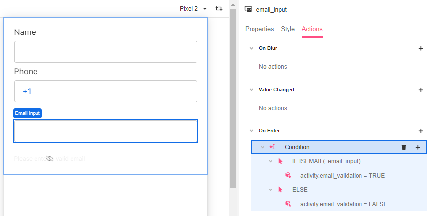
On Enter
Triggers upon pressing Enter.
Please check out Action Inspector Tab to find all the available actions.
Example
In this example, the Email Input includes a condition based on the input validity. If the app user enters a value other than an email address, when pressing enter, a label asking the user to enter a correct input is displayed.