The Checkbox Web Control is an Input control that allows the selection of a single value.
Properties
General
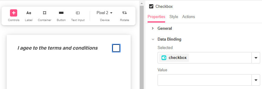
Data Binding
Value
Expects type any.
The value that the bound variable will have when the checkbox is selected. When the checkbox is not selected, the value of this bound variable will be NULL.
Selected
Expects type boolean.
By default, a Variable of type Boolean is generated at the Web Page level to store the data from the input. Users can also edit the Data Binding property and create their own Variables.
Accessibility
Aria Label
Expects type text.
The aria-label attribute is used to define a string that labels the current element. It is used to provide an accessible name for the control. For more information see here.
Aria Invalid
Expects type text.
A value of true or false to indicate that the value entered into an input field is not in a format or a value the application will accept. For more information, see here
Input ID
Expects type text.
The Input ID assigned to the Checkbox. This Input ID can tied to a Label so that clicking on the associated Label will allow users to select the Checkbox.
For more on how to use the Input ID, see Connecting Labels to Input Controls.
State
Is Visible
Expects type boolean.
If TRUE the checkbox will be visible. If FALSE the checkbox will not be displayed. If the field is empty, the checkbox will be visible.
Is Disabled
Expects type boolean.
If TRUE the checkbox will be disabled and the user will not be able to interact with the control. If FALSE the checkbox will be enabled. If the field is empty, the checkbox will be enabled.
Style
Checkboxes have styles for the following states:
Default - When first rendered without state
Hover - When the user is hovering over the Checkbox
Focused - when the Checkbox is focused
Pressed - when the Checkbox is being pressed
Selected - when the Data Binding evaluates to true
Disabled - When the Checkbox is disabled
Check Common style properties of web controls for further details on how to style your Checkbox Web Control.
Actions
Value Changed
This event is run each time the checkbox is selected or unselected.
Metadata about this event can be accessed through the event namespace.
Example #1
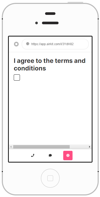
Checkboxes are commonly used for a single selection. Here, the Checkbox operates by itself, so add the Checkbox, and an automatically generated variable will hold its value.
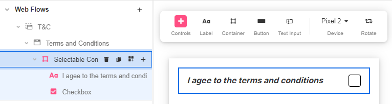
Example #2
To be able to align the Checkbox with a line of text, a Selectable Container Web Control must be added first. Then add the Checkbox and Label describing the item it corresponds to.