The Image Web Control is used to insert images into a Web Page.
Properties
General
Image src
By default, a stock image URL is inserted that should be replaced.
- Asset: Displays the images that are available at Media Library.
- Upload: Upload an image to use. Images uploaded her will become available in the Media Library. The following file types are allowed:
- .gif
- .jpeg
- .jpg
- .png
- .svg
- Expression: Expects type
text. It specifies the link to the desired image or media file.
Accessibility
Aria Label
Expects type text.
Defines a value to the aria-label of the control for accessibility. For more information see here.
Title
Assigns a Title attribute to the control to provide additional information about the control. It is used to display a tooltip when the user hovers over the element.
Alt Text
Expects type text.
Allows the app builder to insert alternative text to the image. This text will be displayed to the app user if the image cannot be displayed. For more information, see MDN.
State
Is Visible
Expects type boolean.
If TRUE the control will be visible. If FALSE the control will not be displayed. If the field is empty, the control will be visible.
Is Disabled
Expects type boolean.
If TRUE the control will be disabled and the user will not be able to interact with it. If FALSE the control will be enabled. If the field is empty, the control will be enabled.
Style
Check Common style properties of web controls for further details on how to style your Image Web Control.
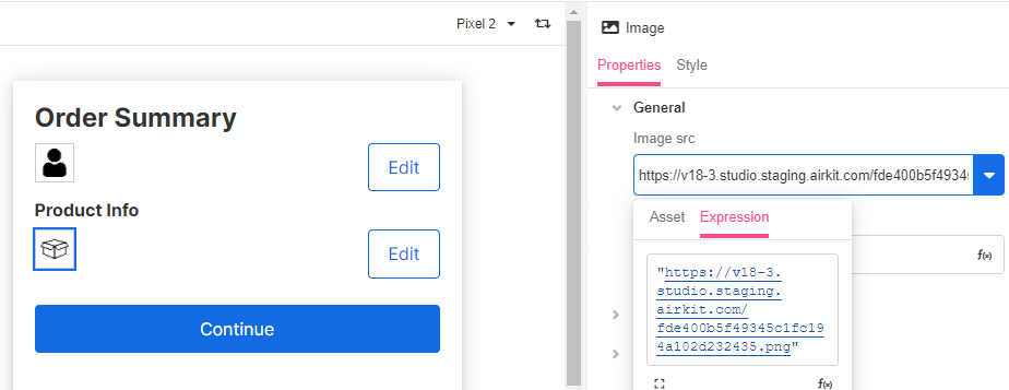
Example #1
After uploading the image from Media Library, select it from Asset or paste the URI of the image.
Example #2
Use this control to add a header to your app. See Creating an App Header for more information.