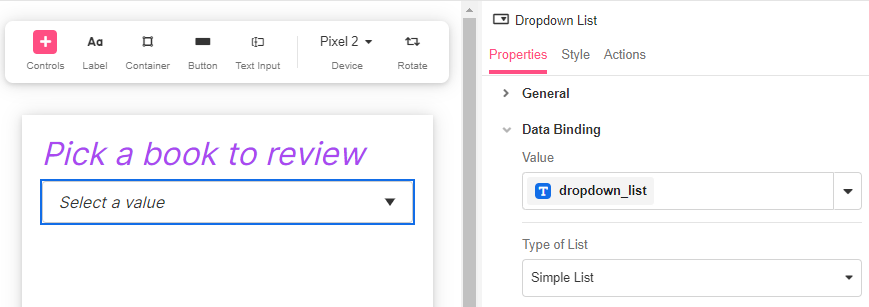
The Dropdown List Web Control creates a dropdown list from where the app user can select a value.
Properties
General
Placeholder Text
Expects type text.
Displays the text in the Dropdown List before the user selects a value.
Data Binding
Value
Expects type text.
By default, a Variable of type Text is generated at the Web Page level to store the data from the dropdown. Users can also edit the Data Binding property and create their own Variables.
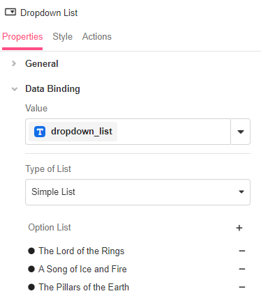
Type of List
Simple List
Allows the creation of options for the Dropdown List. Under the hood, selecting Simple List creates a List of Strings as the options of the Dropdown List.
Option List: Expects the options of the dropdown. By clicking on the '+' sign, you can add as many options as needed.
- The options defined here represent both how the option will be displayed as well as what will be saved to the bound variable upon selection. To save a value that differs from the selection display, a Custom Expression is required.
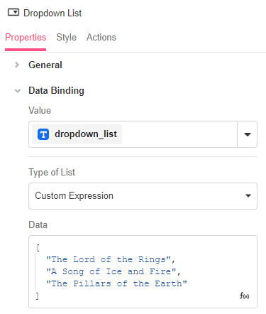
Custom Expression
Provides full control over all the properties of the Dropdown List.
- Data: Expects type
list. It is the data which the Dropdown List refers to for the user-selectable options. - Display Text: The data which the Dropdown List refers to for the user-selectable options. This field supports the Expression Editor so that Objects may be provided within Lists.
- Value Text: The value that will be stored when the app user selects an item in the Dropdown List. If left blank, the Value Text will be the
item. - Selected: Accepts an Expression that evaluates whether or not the selected item is indicated to the App user. An Expression that evaluates to
TRUEwill make the Dropdown List display the selected Display Text, whereas an Expression that evaluates toFALSEwill not display what has been selected to the App user.
Accessibility
Aria Label
Expects type text.
The aria-label attribute is used to define a string that labels the current element. It is used to provide an accessible name for the control.For more information see here.
Input ID
Expects type text.
The Input ID assigned to the Dropdown List. This Input ID can tied to a Label so that clicking on the associated Label will allow users to select an item from the Dropdown List.
For more on how to use the Input ID, see Connecting Labels to Input Controls.
State
Is Visible
Expects type boolean.
If TRUE the dropdown list will be visible. If FALSE the dropdown list will not be displayed. If the field is empty, the dropdown list will be visible.
Is Disabled
Expects type boolean.
If TRUE the Control will be disabled and the user will not be able to interact with it. If FALSE the Control will be enabled. If the field is empty, the Control will be enabled.
Style
Dropdown Lists have styles for the following states:
Default - When first rendered without state
Disabled - When the Dropdown List is disabled
Also, the arrow on the box can be independently styled from Style > Override Styles to personalize its size, color, direction, and border.
Check Common style properties of web controls for further details on how to style your Checkbox Web Control.
Actions
Value Changed
This event is run each time an item from the dropdown list is selected.
Metadata about this event can be accessed through the event namespace.
Example #1
A simple List of options:
Example #2
Working with Custom Expressions to use and display data:
Example #3
Working with Custom Expressions to use and display objects:
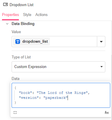
In this example, if the app user selects "The Lord of teh Rings", the value that will be stored will be the entire object as there is no Value Text entered.
{ "book": "The Lord of the Rings", "version": "paperback" }Example #4
Check out this Building Byte video on how to create Dependent Dropdowns using Custom Expression: