The Simple Checkbox List Web Control is an Input Control with a repeating component that allows the user to select one or many items from a List. This differs from a Simple Radio List and a Dropdown List in that it is possible to select more than one item.
Properties
General
Legend Text
Expects type text.
Defines a heading for the Control.
Data Binding
Data
Expects type list.
Each item in this list will correspond to its own item in the Checkbox List.
Value
Expects type any.
By default, a Variable of type Any is generated at the Web Page level to store the data from the input. Users can also edit the Data Binding property and create their own Variables.
In practice, the data bound to this variable will be of the same data type as the items in the List given in the Data field, see below. If the Simple Checkbox List is given is a List of Objects, then the value stored in this variable will correspond to the entire selected Object.
A value name as a text can be used by assistive technologies to identify this element on the Web Page.
Display Text
Expects type text.
The text that will display beside each Checkbox . By default, this value is set to item, and so it will display the full value of the corresponding item from the List given as Data. As the item namespace refers to each item in the List, it can be used to reference each item in Airscript expressions. For instance, if you have a List of DateTimes, you might define the Display Text with the expression which uses the FORMAT_DATETIME function to display each DateTime in a format users can more easily parse. If you have a List of Objects, you can use Dot Notation to display the value of only one of the Object's properties.
FORMAT_DATETIME(
  item,
  "MMMM Do, YYYY h:mm A z"
)
Accessibility
Aria Label
Expects type text.
The aria-label attribute is used to define a string that labels the current element. It is used to provide an accessible name for the control. For more information see here.
State
Is Visible
Expects type boolean.
If TRUE, the Simple Checkbox List will be visible. If FALSE, it will not be displayed. If the field is empty, it will be visible.
Is Disabled
Expects type boolean.
If TRUE, the Simple Checkbox List will be disabled and the user will not be able to interact with the Control. If FALSE, it will be enabled. If the field is empty, it will be enabled.
Style
This Web Control is made up of other component Web Controls that can be styled individually.
Check Common style properties of web controls for further details on how to style your Checkbox Web Control.
Actions
Value Changed
This Event is run each time a checkbox within the Simple Checkbox List is selected or unselected.
Metadata about this Event can be accessed through the event namespace.
Example 1
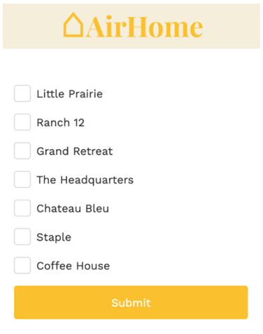
This list can be created by adding a Simple Checkbox List and setting the Data Property to a List of text (in this case, houses).
In the General tab of the Inspector, go to Data Binding > Data and add the following expression:
["Little Prarie", "Ranch 12", "Grand Retreat", "The Headquarters", "Chateau Bleu", "Staple", "Coffee House"]
The Simple Checkbox List will populate with the text values. In Preview, the Variable that is bound to the Value property will then populate with the list of items that are selected by the user.
Example 2
Continuing with the example above, change the data in Data Binding > Data for the following expression containing a list of objects, this time, a house type plus its location:
[
{
"house": "Little Praire",
"location": "LA"
},
{
"house": "Ranch 12",
"location": "LA"
},
{
"house": "Grand Retreat",
"location": "CO"
},
{ "house": "The Headquarters",
"location": "CO"
},
{ "house": "Chateau Bleu",
"location": "CO"
},
{ "house": "Staple",
"location": "OK"
},
{{ "house": "Coffee House",
"location": "OK"
}
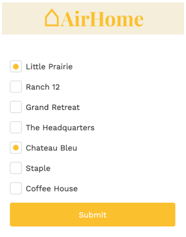
]Now when a user selects items from the checkbox list, the variable that is bound to the Value property will then populate as a List filled with the Objects selected by the user:
[
  {
    "house": "Little Praire",
    "location": "LA"
  },
  {
    "house": "Chateau Bleu",
    "location": "CO"
  }
]
Example 2
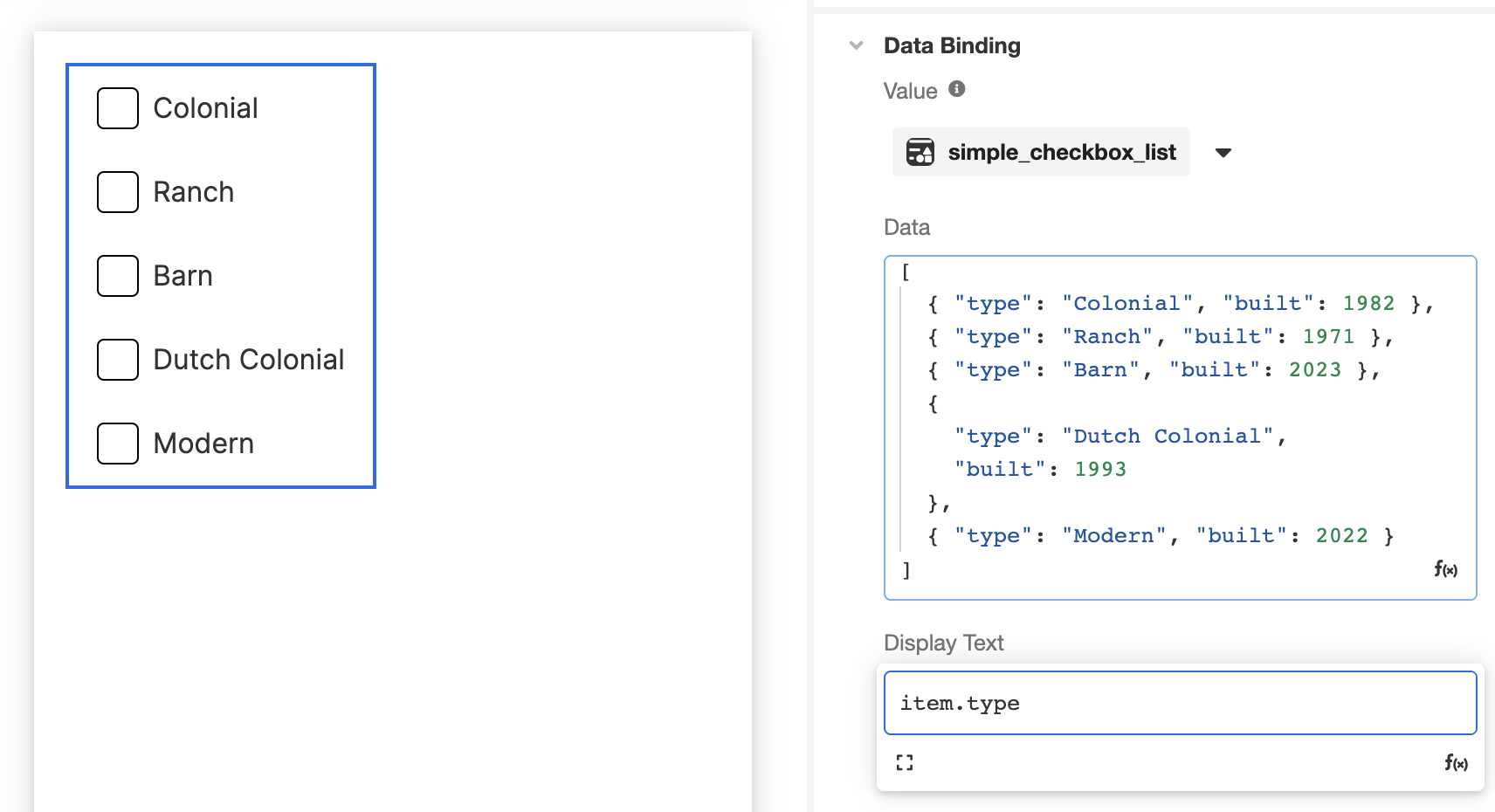
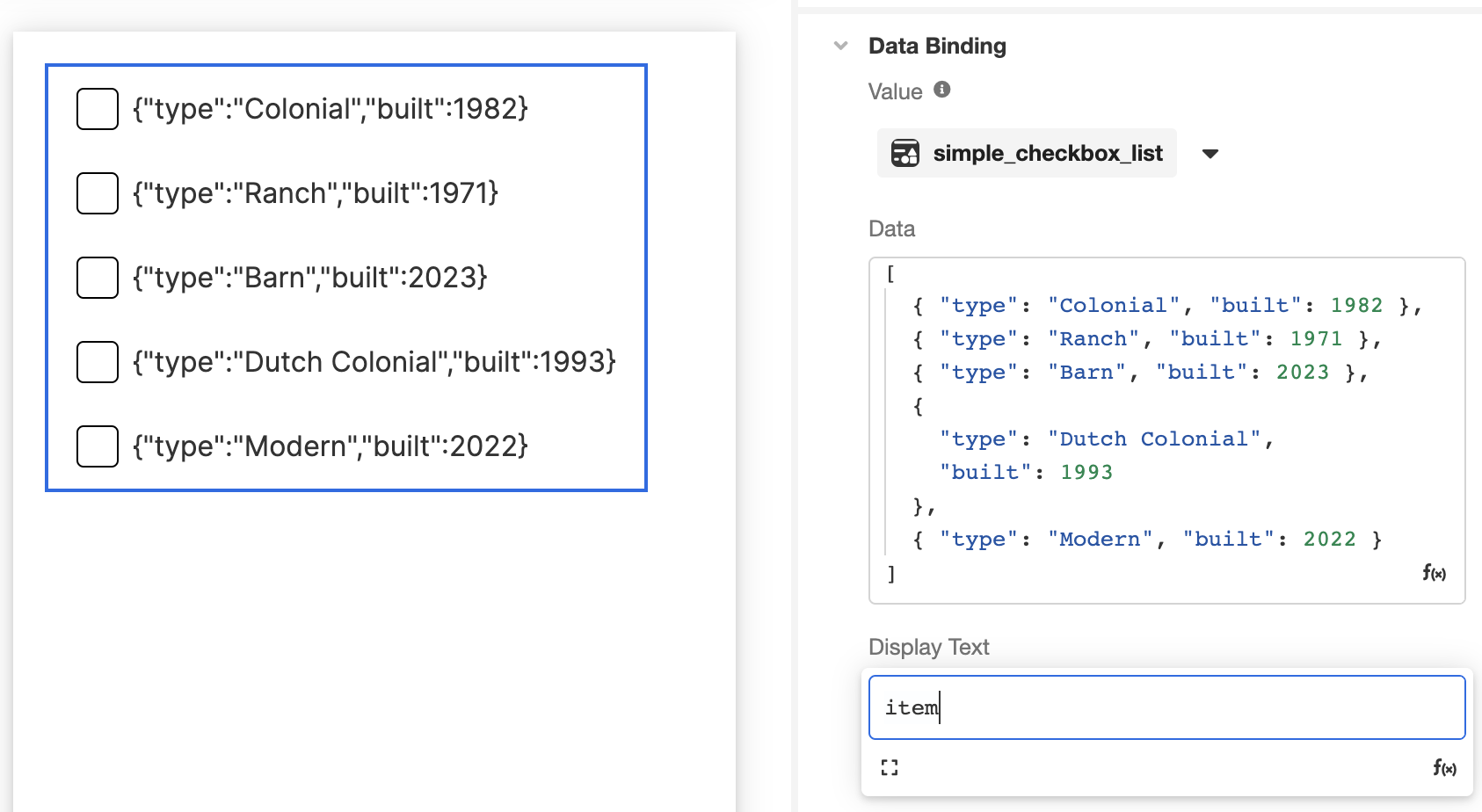
Continuing with the example above, change the data in Data Binding > Data for the following expression containing a List of Objects: this time, a house type as well as the year the house was built:
[
  { "type": "Colonial", "built": 1982 },
  { "type": "Ranch", "built": 1971 },
  { "type": "Barn", "built": 2023 },
  {"type": "Dutch Colonial","built": 1993},
  { "type": "Modern", "built": 2022 }
]
In this case, each item references an Object, the individual properties of which can be referenced in the Simple Checkbox List via the item namespace. For instance, the following example shows how the Checkbox List appears when the Display Text value is item. Note how the full object appears for selection in the Stage.
In contrast, the following example shows how the Checkbox List appears when the Display Text value is item.type. Note how only the type property of each listed object appears in the Stage, even though the full object will be saved upon selection: