Animations
Overview
Animations serve to animate a changes to dynamically-defined styling properties.
While styling properties are static by default, they can also be defined in terms of variables that change according to user input or information from external systems. Changes to the values of such variables are reflected as changes in the appearance of the Web Control, and applying animations smoothens these transitions.
Web Controls that allow animated style changes in this way will have an Animations section in Style tab of their associated Inspector. This is where you can define Transition Types and Transition Times.
Transition Types
There are eight types of stylistic changes that can be animated:
- Margin
- Padding
- Dimensions
- Font
- Background
- Border
- Rounded Corners
- Shadow
Animations will be applied only to changes that impact in the designated styling component. For example, a Web Control that has only been assigned a Dimension Transition Type will only animate changes to the Web Control's size, and not, say, the Web Control's color.
A single Web Control might be associated with multiple animations of different Transition Types.
Transition Times
Transition Times dictate how fast an animation will appear by defining how long it takes for the transition to fully take place. Three Transition Times come pre-configured for selection:
- timingQuick - 100 milliseconds
- timingMedium - 500 milliseconds
- timingSlow - 1 second
Default Transition Time values can be created and edited in the Theme Builder. You can also define the Transition Time with a custom expression. The expected format is:
"{{number}}{{time_units}}"For instance, an animation that takes place over the span of five seconds would be defined by the Transition Time:
"5s"An animation that takes place over the span of 70 milliseconds would be defined by the Transition Time:
"70ms"Example: Animate a Pseudo Progress Bar
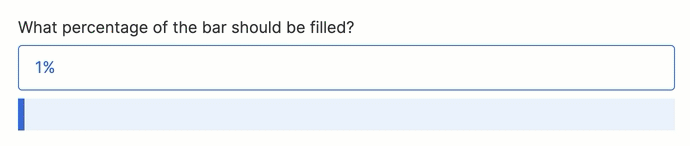
To demonstrate how Animations are configured in practice, let's walk through the process of building a pseudo progress bar that changes width based on user input. When it is finished, it will look like this:

- Toggle over to the Web Flows Builder. Start with a blank Web Page and add the following two Web Controls:
- A Label that reads, "What percentage of the bar should be filled?"
- A Text Input with the placeholder text "90%"
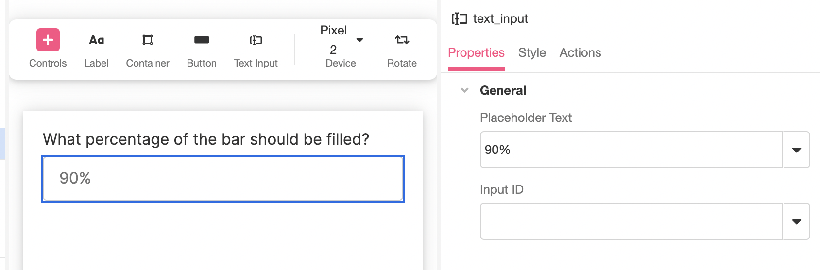
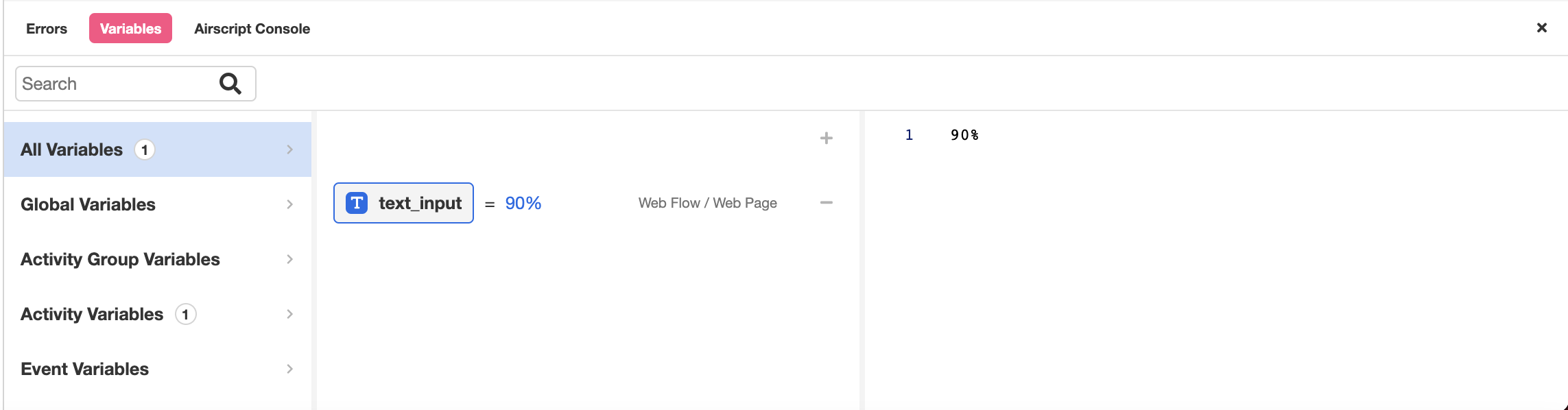
- The Text Input Web Control will automatically bind input to the variable
text_input. To assign this variable a sample value, open the Variable Tree at the bottom left of the Studio and enter "90%" into the right-side column.
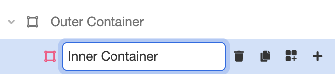
- Add a Container Web Control to the Web Page. Designate this Container "Outer Container."

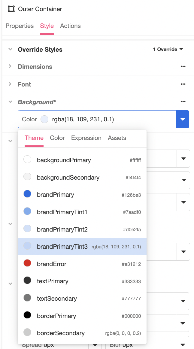
- Inspect the Outer Container. Under Style > Override Styles > Background, change the color to brandPrimaryTint3.
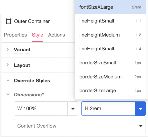
- Under Override Styles > Dimensions , change the height to fontSizeXLarge.
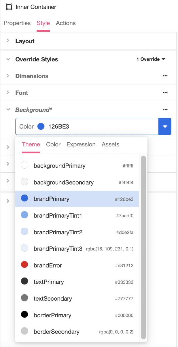
- Nest another Container under Outer Container. Designate this Container "Inner Container."
- Inspect the Inner Container. Under Style > Override Styles > Background, change the color to brandPrimary.
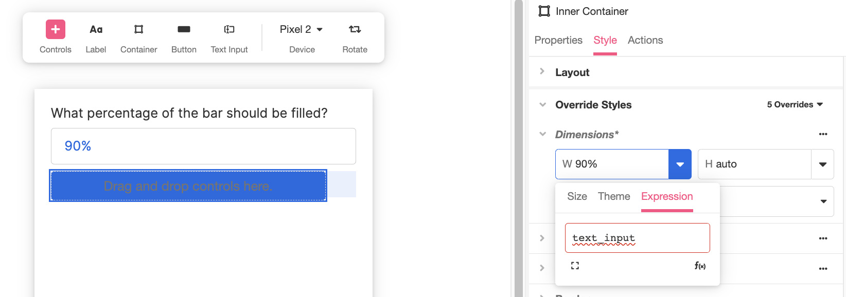
- Under Override Styles > Dimensions, change the width to the custom expression
text_input. Note how this will change the appearance of the Inner Container in the Stage so that a portion of the Outer Container is visible:
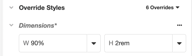
- Change the height to fontSizeXLarge.
- Under Animations > Transitions, select Dimensions as the Transition Type and timingSlow as the Transition Time.

- Save and Preview your application. Changing the percentage described in the Text Input box will change the percentage of the bar that's filled; note how the transition is animated:
Discussion
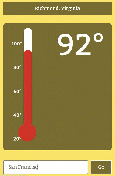
The pseudo progress bar is a toy example to demonstrate the basic principles of animation, which can be applied to far more complicated use cases. For example, the Background and Dimensions Transition Types can be applied in tandem with data pulled from a weather API to create an animated thermometer:
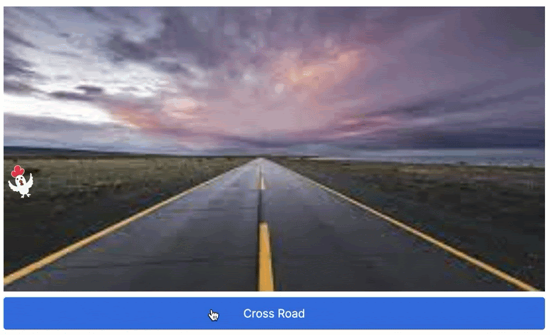
Animations can also be used in combination with gifs, creating even more dynamic UI elements.
Updated 4 months ago