Configuration
This document provides a reference for the formatting properties available to customize the framing of your Airkit application when it is embedded in another web page via the SDK. See Example Configurations for applied examples that can be copy/pasted directly into your existing web pages after the SDK_API_URL has been defined.
Inline vs. Popup vs. Modal
When inserting an Airkit application into an existing web page, there are three core ways for the app to be viewed: Inline mode, Popup mode, or Modal mode.
The Inline view makes the application appear as though it is directly part of the web page. Visitors to the web page will see the embedded application when navigating to the page, and so an application Journey will be initiated as soon as the web page is accessed.
The Popup view allows the application to be opened as a popup window within the web page. Visitors to the web page will only see the application when they click on the floating button to open it, and so the application Journey will be initiated when that button is clicked.
The Modal view allows the application to be opened as a center-positioned modal within the web page. Visitors to the web page will only see the application when they click on the button to open it, and so the application Journey will be initiated when that button is clicked.
Initializer Configuration
config.instanceId
We recommend passing a unique ID for each embed. config.instanceId is used to read/write sessionId and appURL to/from cookie.
| Type | Required | Default |
|---|---|---|
string | Sometimes | Randomly-generated ID |
Unique instanceId is required when using multiple embeds in same website.
config.iframeConfig
config.iframeConfig is used to add properties directly to the iframe element. config.iframeConfig.referrerPolicy is set on iFrame itself and should not be confused with referrerPolicy available on config.options which will be used for fetch call to SDK API.
type CSS = Partial<CSSStyleDeclaration>
type Aria = Record<string, string>
The keys in config.iframeConfig.style must be CamelCase. For example:
- Do:
{webkitBoxShadow: '0px 0px 20px 5px rgba(0,0,0,0.43)'} - Do Not:
{'-webkit-box-shadow': '0px 0px 20px 5px rgba(0,0,0,0.43)'}
config.iframeConfig.onLoad is called when iFrame is loaded.
It is possible to override default values fully or partially by passing your own CSS Object.
This attribute is not required.
Type
{
    class?: string
    id?: string
    name?: string
    style?: CSS
    aria?: Aria
    referrerPolicy?: ReferrerPolicy
    onLoad?: () => void
}
Inline Mode Default
{
  style: {
    width: '100%',
    height: '100%',
    border: '0px',
  },
}
Modal Mode Default
{
  style: {
    width: '100%',
    height: '100%',
    border: '0px',
    borderBottomRightRadius: '10px',
    borderBottomLeftRadius: '10px',
    webkitBorderBottomRightRadius: '10px',
    webkitBorderBottomLeftRadius: '10px',
  },
}
config.renderMode
This property determines how SDK renders the iframe. In inline mode, the generated UI will be append to existing element. In popup mode, a floating button will be added to Document and clicking on it will toggle the popup panel that renders the iframe. In modal mode, a button will be appended to an existing element and clicking on it will open the center positioned modal panel that renders the iframe.
| Type | Required | Default |
|---|---|---|
'inline' or 'popup' or modal | No | popup |
For more on how each mode impacts the structure of the UI, see the UI Layouts section for each rendering mode.
config.testIdPrefix
This property provides support for E2E testing. The SDK adds the data-test-id property to wrappers and interactive elements.
| Type | Required | Default |
|---|---|---|
string | No | airkit |
For more details, see the UI Layouts section for each rendering mode.
config.classNamePrefix
This property provides support to style the embed through CSS classes. The SDK adds the class property to wrappers and interactive elements.
| Type | Required | Default |
|---|---|---|
string | No | airkit |
For more details, see the UI Layouts section for each rendering mode.
config.renderConfig
config.renderConfig is an object that defines the appearance of how the embed is framed.
This attribute is not required.
Type
{
    containerStyle?: CSS
    button?: {
        openIconSrc?: string
        closeIconSrc?: string
        hoverColor?: string
        buttonStyle?: CSS
        iconStyle?: CSS
        buttonAria?: Aria
        iconAria?: Aria
        typography?: {
            openText: string
            closeText: string
            style: CSS
            hoverColor?: string
        }
    }
    panel?: {
        width?: string
        height?: string
        style?: CSS
    }
}
Inline Mode
Default
{
  containerStyle: {
    width: "100%",
    height: "100%",
    overflow: "hidden",
  },
}
Description
config.renderConfig.containerStyle is an optional style object which applies as a wrapper HTML Div element. Default values can be either fully or partially overridden by passing a CSS Object.
config.renderConfig.button and config.renderConfig.panel are only used in popup mode and modal mode.
type CSS = Partial<CSSStyleDeclaration>
type Aria = Record\<string, string>
Popup Mode
Default
{
  containerStyle: {
    position: "fixed",
    bottom: "20px",
    right: "20px",
    zIndex: "1000",
    margin: "0px",
    minHeight: "60px",
    minWidth: "60px",
  },
  button: {
    openIconSrc: '.../airkit_chat.png',
    closeIconSrc: '.../airkit_close.png',
    hoverColor: "#ff4e8357",
    buttonStyle: {
      width: "61px",
      height: "61px",
      borderRadius: "50%",
      position: "absolute",
      display: "flex",
      alignItems: "center",
      cursor: "pointer",
      justifyContent: "center",
      top: "0px",
      bottom: "0px",
    },
    iconStyle: {
      width: "58px",
      height: "58px",
    },
    buttonAria: {
      role: "button",
      "aria-label": "Click to toggle popup panel",
    },
    iconAria: {
      role: "presentation",
    },
  },
  panel: {
    width: "400px",
    height: "564px",
    style: {
      position: "absolute",
      bottom: "70px",
      right: "0px",
      webkitBorderRadius: "10px",
      borderRadius: "10px",
      webkitBoxShadow: "#938b8d85 0px 1px 10px 2px",
      boxShadow: "#938b8d85 0px 1px 10px 2px",
      transition: "all 300ms linear 0s",
      overflow: "hidden",
      zIndex: "1001",
    },
  },
}
Description
config.renderConfig.containerStyle is an style object which applies as a wrapper HTML Div element. It contains both the floating button and popup panel. The position of floating button on page is control by this property.
config.renderConfig.button holds the configuration of the floating button. Depending on panel being open or closed, the center image could be either openIconSrc orcloseIconSrc respectively. The values could be URL or base64. buttonStyle and buttonAria apply to wrapping the floating button as a HTML Div element. iconStyle and iconAria apply to the HTML Image element inside the floating button. The floating button also supports optional typography. Depending on the panel being open or closed, the text could be either openText or closeText respectively. The CSS for this text is controlled by the style property and hoverColor defines the floating button text color for the mouse-over effect.
config.renderConfig.panel holds the optional header and iframe. Clicking on floating button toggles this panel. width and height must be calculated considering the optional header and iframe final box sizes. These two properties are used to render the final popup panel as well as in animation. style applies to entire panel. Animation on height and opacity are controlled from here.
All default values can be either fully or partially by passing a CSS Object.
type CSS = Partial<CSSStyleDeclaration>
type Aria = Record\<string, string>
Modal Mode
Default
{
        containerStyle: {
            position: "fixed",
            inset: "0px",
            zIndex: "1000",
            height: "100%",
            width: "100%",
            backgroundColor: "#5e5c5c45",
            display: "flex",
            justifyContent: "space-around",
            alignItems: "center",
        },
        button: {
            hoverColor: "#ff4e8357",
            buttonStyle: {
                width: "160px",
                height: "61px",
                borderRadius: "16px",
                display: "flex",
                alignItems: "center",
                justifyContent: "center",
                cursor: "pointer",
                top: "0px",
                bottom: "0px",
                border: "1px solid #f94e83",
            },
            buttonAria: {
                role: "button",
                "aria-label": "Click to toggle popup panel",
            },
            typography: {
                openText: "Click to close",
                closeText: "Click to open",
                style: {
                    color: "#f94e83",
                    fontFamily: "Helvetica",
                    fontSize: "16px",
                    marginLeft: "4px",
                },
                hoverColor: "#ffffff",
            },
        },
        panel: {
            width: "800px",
            height: "600px",
            style: {
                webkitBorderRadius: "10px",
                borderRadius: "10px",
                webkitBoxShadow: "#938b8d85 0px 1px 10px 2px",
                boxShadow: "#938b8d85 0px 1px 10px 2px",
                transition: "all 300ms linear 0s",
                overflow: "hidden",
                zIndex: "1001",
                backgroundColor: "#fff",
            },
        },
    }
Description
config.renderConfig.containerStyle is a style object which applies as a modal backdrop HTML Div element. It contains the modal. Clicking on the backdrop will close the modal window.
config.renderConfig.button holds the configuration of the action button. Depending on the modal being open or closed, the center image could be either openIconSrc or closeIconSrc respectively. The values could be URL or base64. buttonStyle and buttonAria apply to wrapping the floating button as a HTML Div element. iconStyle and iconAria apply to the HTML Image element inside the floating button. Action button also supports optional typography, depending on the modal being open or closed, the text could be either openText or closeText respectively. The CSS for this text is controlled by the style property and hoverColor defines the action button text color for the mouse-over effect.
config.renderConfig.panel holds the optional header and iframe. Clicking on the action button opens the modal. width and height must be calculated considering the optional header and iframe final box sizes.
All default values can be defined either fully or partially by passing a CSS Object.
type CSS = Partial<CSSStyleDeclaration>
type Aria = Record\<string, string>
config.headerConfig
config.headerConfig is an object that defines an optional header that will render outside the iframe tag. It is most commonly used to display a combination of company logo and trademark text.
config.headerConfig.close and config.headerConfig.minimize are not supported in inline mode.
config.headerConfig.minimize is not supported in modal mode.
config.headerConfig.close and config.headerConfig.minimize are supported in popup mode.
This attribute is not required.
Type
{
 headerStyle?: CSS
 trademarkBoxStyle?: CSS
 actionsBoxStyle?: CSS
 logo?: {
  src: string
  style: CSS
  buttonAria?: Aria
  imageAria?: Aria
 }
 typography?: {
  text: string
  style: CSS
 }
 close?: {
  src: string
  imageStyle: CSS
  buttonStyle: CSS
  hoverColor?: string
  buttonAria?: Aria
  imageAria?: Aria
 }
 minimize?: {
  src: string
  imageStyle: CSS
  buttonStyle: CSS
  hoverColor?: string
  buttonAria?: Aria
  imageAria?: Aria
 }
}
Inline Mode
Default
This is optional, and there is no default header for inline mode.
Description
config.headerConfig.headerStyle applies to the HTML Div element that wraps the entire header. It defaults to an empty object: {}.
config.headerConfig.trademarkBoxStyle applies to the HTML Div element that wraps the logo and trademark text. it Defaults to an empty object: {}. trademarkBox renders on left hand side of header.
config.headerConfig.logo renders an HTML Image element and applies the provided style to it. buttonAria applies to the wrapper HTML Div element. imageAria applies to the Image element. src can be URL or Base64.
config.headerConfig.typography renders the HTML Span element at the right hand side of logo (if any), with text as the body and style applied directly to element.
type CSS = Partial<CSSStyleDeclaration>
type Aria = Record<string, string>
Popup Mode
Default
{
  headerStyle: {},
  actionsBoxStyle: {
    display: "flex",
    alignItems: "center",
    gap: "4px",
  },
  close: {
    src: '.../airkit_close.png',
    imageStyle: {
      width: "12px",
      height: "12px",
      margin: "0 auto",
    },
    buttonStyle: {
      width: "28px",
      height: "28px",
      borderRadius: "8px",
      webkitBorderRadius: "8px",
      transition: "background-color 150ms cubic-bezier(0.4, 0, 0.2, 1) 0ms",
      display: "flex",
      alignItems: "center",
      cursor: "pointer",
    },
    hoverColor: "#e52b63",
    buttonAria: {
      role: "button",
      "aria-label": "Close popup panel",
    },
    imageAria: {
      role: "presentation",
    },
  },
}
config.headerConfig.headerStyle applies to the HTML Div element that wraps the entire header. It defaults to an empty object:{}.
Description
The default header renders actionsBox with close icon. This default value can be fully or partially overwritten by passing a CSS Object.
config.headerConfig.headerStyle applies to the HTML Div element that wraps the entire header. It defaults to an empty object: {}.
config.headerConfig.trademarkBoxStyle applies to the HTML Div element that wraps the logo and trademark text. It defaults to an empty object :{}. trademarkBox renders on left hand side of header.
config.headerConfig.logo renders an HTML Image element and applies the provided style to it. buttonAria applies to the wrapper HTML Div element . imageAria applies to the Image element. src can be URL or Base64.
config.headerConfig.typography renders the HTML Span element on the right hand side of logo (if any) , with text as the body and style applied directly to element.
config.headerConfig.actionsBoxStyle applies to the HTML Div element that wraps the minimize and close icons. actionsBox renders on the right hand side of header.
config.headerConfig.close and config.headerConfig.minimize render an icon button. Clicking on either will close the popup panel. src can be URL or Base64. buttonStyle and buttonAria apply to the wrapping HTML Div element (the icon button). imageStyle and imageAria apply to the HTML Image element inside the icon button. hoverColor defines the icon button background color for the mouse-over effect.
type CSS = Partial<CSSStyleDeclaration>
type Aria = Record<string, string>
Modal Mode
Default
{
        headerStyle: {
            display: "flex",
            justifyContent: "flex-end",
            padding: "8px",
            backgroundColor: "#ff4e83",
            borderTopRightRadius: "10px",
            borderTopLeftRadius: "10px",
            webkitBorderTopRightRadius: "10px",
            webkitBorderTopLeftRadius: "10px",
        },
        actionsBoxStyle: {
            display: "flex",
            alignItems: "center",
            gap: "4px",
        },
        close: {
            src: CloseIcon,
            imageStyle: {
                width: "12px",
                height: "12px",
                margin: "0 auto",
            },
            buttonStyle: {
                width: "28px",
                height: "28px",
                borderRadius: "8px",
                webkitBorderRadius: "8px",
                transition: "background-color 150ms cubic-bezier(0.4, 0, 0.2, 1) 0ms",
                display: "flex",
                alignItems: "center",
                cursor: "pointer",
            },
            hoverColor: "#e52b63",
            buttonAria: {
                role: "button",
                "aria-label": "Close popup panel",
            },
            imageAria: {
                role: "presentation",
            },
        },
    }
Description
The default header renders actionsBox with a close icon. This default value can be fully or partially overwritten by passing a CSS Object.
config.headerConfig.headerStyle applies to the HTML Div element that wraps the entire header.
config.headerConfig.trademarkBoxStyle applies to the HTML Div element that wraps the logo and trademark text. It defaults to an empty object. trademarkBox renders on the left hand side of the header.
config.headerConfig.logo renders an HTML Image element and applies the provided style to it. buttonAria applies to the wrapper HTML Div element . imageAria applies to the Image element. src can be URL or Base64.
config.headerConfig.typography renders the HTML Span element on the right hand side of the logo (if any).
config.headerConfig.actionsBoxStyle applies to the HTML Div element that wraps the minimize and close icons. actionsBox renders on the right hand side of the header.
config.headerConfig.close renders an icon button. Clicking on it will close the popup panel. src can be URL or Base64. buttonStyle and buttonAria apply to the wrapping HTML Div element (the icon button). imageStyle and imageAria apply to the HTML Image element inside the icon button. hoverColor defines the icon button background color for the mouse-over effect.
type CSS = Partial<CSSStyleDeclaration>
type Aria = Record\<string, string>
Render Configuration
config.url
This is the SDK_API_URL. It is created as part of configuring an Airkit app to be displayed in an existing web page, though a default scaffold is provided. By default, the SDK will make a POST request to this URL to get the appURL and sessionId. To load an app successfully, either the url or appURL must be provided.
For more on how to create and locate the SDK_API_URL, see the SDK Quickstart.
| Type | Required | Default |
|---|---|---|
string | NO | - |
config.appURL
To load an app successfully, either the url or appURL must be provided
For more on how to create and locate the SDK_API_URL, see the SDK Quickstart.
| Type | Required | Default |
|---|---|---|
string | NO | - |
config.container
In inline mode, this is the container where the SDK will render the iFrame. If a String is passed, getElementById is used to locate the element in HTML page. If an HTMLElement is passed, that will be used directly.
In modal mode, this is the container where the SDK will render the action button. If a String is passed, getElementById is used to locate the element in the HTML page. If an HTMLElement is passed, that will be used directly.
| Type | Required | Default |
|---|---|---|
string or HTMLElement | No | airkit-sdk |
config.sessionId
This is used to set the url and sessionId. If these are set here, the SDK won't need to call the API in order to find them.
| Type | Required | Default |
|---|---|---|
string | No | - |
config.options
This allows initial values to passed into the Airkit app by passing the data into Fetch.
| Type | Required | Default |
|---|---|---|
Record<string, unknown> | No | - |
This property has a few possible attributes:
| Attribute | Description | Type | Example | Default |
|---|---|---|---|---|
config.options.headers | The HTTP Request Headers | object | { "Authorization": TOKEN_PARAMETER_VALUE } | { "x-airkit-session-id": sessionId, "Content-Type": "application/json" } |
config.options.body | The HTTP Request Body | JSONstring or object | '{"id":12345}' or{ id: 12345 } | JSON.stringify({ sessionId }) |
config.options.container | Information about the app container | object | {container: document.getElementById("app")} | "airkit-sdk" |
config.track
This allows for the tracking of SDK behavior by the following events:
{ type: "error", text: "URL is required"}{ type: "error", text: "Development on http is unsupported" }{ type: "error", text: "Container ${container} does not exist. Please check the container value passed to render method"}{ type: "error", text: "Fetch is not supported by your browser" }{ type: "error", text: "URL ${url} didn't return sessionId and/or Application URL" }{ type: "error", text: "Failed to load sessionId and application's url from ${url} with error: ${error}" }{ type: "error", text: 'Neither "appURL" nor "url" was provided. SDK failed to load.' }{type: "error", text: closePanel API is not available for rendering mode: ${this.config.renderMode}.}{type: "error", text: 'alterBtnText API is not available for rendering mode: inline'}{type: "error", text: 'Button text could not be altered, Initial renderConfig.button.typography is empty'}{type: "error", text: 'alterBtnIcon API is not available for rendering mode: inline'}{type: "error", text: 'Button text could not be altered, Initial renderConfig.button does not have icon config'}{ type: "warn", text: "No sessionId was found for instanceId: ${this.instanceId}" }{ type: "warn", text: appURL "${appURL}" was provided without sessionId. }{ type: "info", text: "Minimize button on popup panel clicked" }{ type: "info", text: "Close button on popup panel clicked" }{ type: "info", text: "Popup button clicked" }
| Type | Required | Default |
|---|---|---|
config.track | No | console.error or console.warn or console.info |
Mobile View in Popup and Modal Modes
In popup mode and modal mode, when window.innerWidth is less than or equal to 700px, the popup panel or modal window will render in full size.
Complete Configuration's Typescript
  type CSS = Partial<CSSStyleDeclaration>
type Aria = Record<string, string>
type RenderMode = "popup" | "inline" | "modal"
interface IFrameConfig {
    class?: string
    id?: string
    name?: string
    style?: CSS
    aria?: Aria
    referrerPolicy?: ReferrerPolicy
    onLoad?: () => void
}
interface RenderConfig {
    containerStyle?: CSS
    button?: {
        openIconSrc?: string
        closeIconSrc?: string
        hoverColor?: string
        buttonStyle?: CSS
        iconStyle?: CSS
        buttonAria?: Aria
        iconAria?: Aria
        typography?: {
            openText: string
            closeText: string
            style: CSS
            hoverColor?: string
        }
    }
    panel?: {
        width?: string
        height?: string
        style?: CSS
    }
}
interface Header {
    headerStyle?: CSS
    trademarkBoxStyle?: CSS
    actionsBoxStyle?: CSS
    logo?: {
        src: string
        style: CSS
        buttonAria?: Aria
        imageAria?: Aria
    }
    typography?: {
        text: string
        style: CSS
    }
    close?: {
        src: string
        imageStyle: CSS
        buttonStyle: CSS
        hoverColor?: string
        buttonAria?: Aria
        imageAria?: Aria
    }
    minimize?: {
        src: string
        imageStyle: CSS
        buttonStyle: CSS
        hoverColor?: string
        buttonAria?: Aria
        imageAria?: Aria
    }
}
type Props = {
    instanceId?: string
    iframeConfig?: IFrameConfig
    renderMode?: RenderMode
    renderConfig?: RenderConfig
    testIdPrefix?: string
    classNamePrefix?: string
    headerConfig?: Header
}
interface Log {
    text: string
    type: "error" | "warn" | "info"
}
interface Message {
    eventSourceKey: string
    data: Record<string, unknown>
}
interface Render {
    url?: string // sdkAPI
    appURL?: string // launch trigger
    container?: string | HTMLElement // Only for inline and modal mode
    sessionId?: string
    options?: Record<string, unknown>
    track?: (error: Log) => void
UI Layout for Inline Mode
An embedded Airkit application will be formatted according to Inline Mode when:
config.renderMode = 'inline'This creates a frame around the application that is formatted as follows:
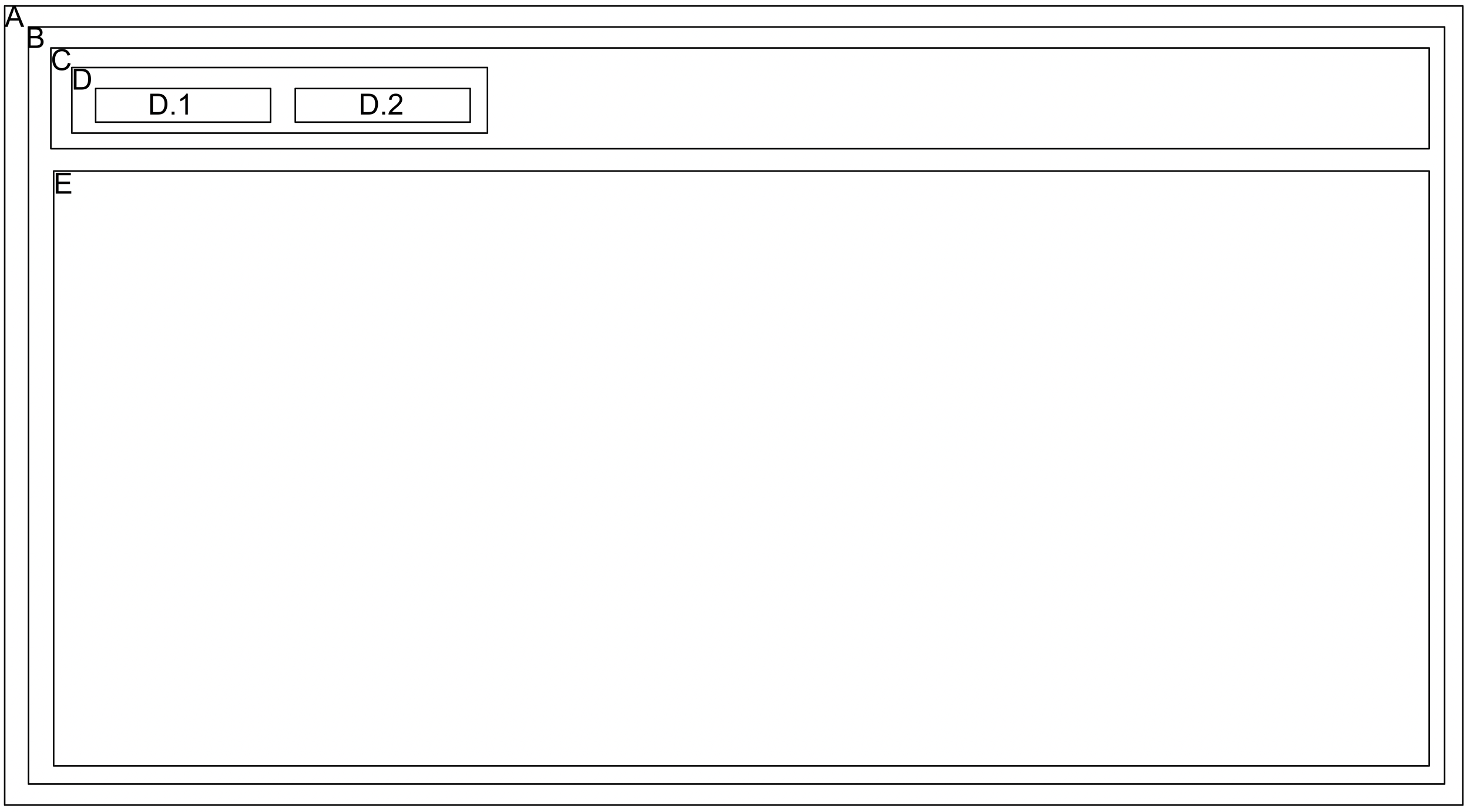
The box labeled E is where the body of the application will be displayed. All other boxes are customizable formatting elements that frame the application.
A (Outer Container)
The SDK expects element with id attribute set to config.container. The SDK appends generated UI to this element. If this element is not found, iframe will not be rendered.
B (Inner Container)
This is a HTML Div element. It contains the UI generated by SDK and gets appended to box A. config.renderConfig.containerStyle controls the style of this box.
class = `${config.classNamePrefix | 'airkit'}-container`
data-test-id = `${config.testIdPrefix | 'airkit'}-container`
C (Optional Header)
This is an optional header. config.headerConfig.headerStyle controls the style of this box.
class = `${config.classNamePrefix | 'airkit'}-header`
data-test-id = `${config.testIdPrefix | 'airkit'}-header`
D (Header Content)
This is a trademarkBox in header. It holds a logo and/or text. config.headerConfig.trademarkBoxStyle controls the style of this box.
class = `${config.classNamePrefix | 'airkit'}-trademark`
data-test-id = `${config.testIdPrefix | 'airkit'}-trademark`
D.1 (logo)
Optional logo will render here. config.headerConfig.logo controls the style of this box.
class = `${config.classNamePrefix | 'airkit'}-logo`
data-test-id = `${config.testIdPrefix | 'airkit'}-logo`
D.2 (text)
Optional text will render here. config.headerConfig.typography controls the style of this box.
class = `${config.classNamePrefix | 'airkit'}-header-text`
data-test-id = `${config.testIdPrefix | 'airkit'}-header-text`
E (Iframe)
This is HTML iframe element which loads the App. config.iframeConfig controls the style of this box.
UI Layout for Popup Mode
An embedded Airkit application will be formatted according to Popup Mode when:
config.renderMode = 'popup'This creates a frame around the application that is formatted as follows:
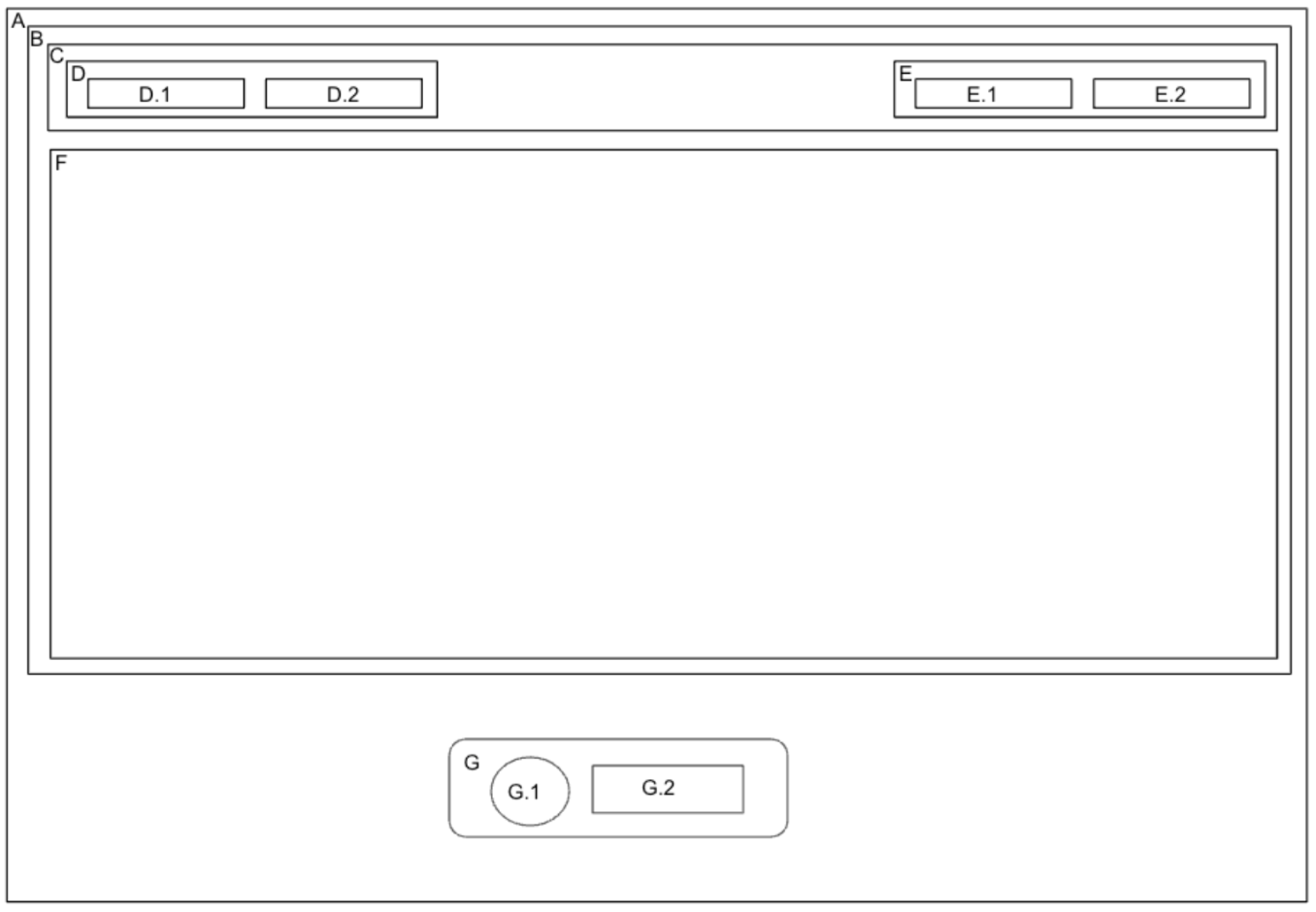
The box labeled F is where the body of the application will be displayed. All other boxes are customizable formatting elements that frame the application.
A (Outer Container)
This HTML Div element is injected to DOM. The position must be set to fixed with appropriate z-index. The floating button and popup panel render inside this element. The position of the floating button is controlled by this box’s style. config.renderConfig.containerStyle controls the style of this box.
class = `${config.classNamePrefix | 'airkit'}-container`
data-test-id = `${config.testIdPrefix | 'airkit'}-container`
B (Inner Container)
This is an HTML Div element. It contains the UI generated by the SDK for popup panel. config.renderConfig.panel controls the style of this box. The SDK will change height and opacity of this element when floating button or action icon buttons are clicked. Animation can be passed to these two properties as part of config.renderConfig.panel.style.
class = `${config.classNamePrefix | 'airkit'}-panel`
data-test-id = `${config.testIdPrefix | 'airkit'}-panel`
C (Optional Header)
This is an optional header. config.headerConfig.headerStyle controls the style of this box.
class = `${config.classNamePrefix | 'airkit'}-header`
data-test-id = `${config.testIdPrefix | 'airkit'}-header`
D (Header Content)
This is a trademarkBox in the header. It holds a logo and/or text. config.headerConfig.trademarkBoxStyle controls the style of this box.
class = `${config.classNamePrefix | 'airkit'}-trademark`
data-test-id = `${config.testIdPrefix | 'airkit'}-trademark`
D.1 (logo)
Optional logo will render here. config.headerConfig.logo controls the style of this box.
class = `${config.classNamePrefix | 'airkit'}-logo`
data-test-id = `${config.testIdPrefix | 'airkit'}-logo`
D.2 (text)
Optional text will render here. config.headerConfig.typography controls the style of this box.
class = `${config.classNamePrefix | 'airkit'}-header-text`
data-test-id = `${config.testIdPrefix | 'airkit'}-header-text`
E (Actions)
This is a actionsBox in the header. It holds minimize and/or close icon buttons. config.headerConfig.trademarkStyle controls the style of this box.
class = `${config.classNamePrefix | 'airkit'}-actions`
data-test-id = `${config.testIdPrefix | 'airkit'}-actions`
E.1 (minimize)
Optional minimize icon button will render here. config.headerConfig.minimize controls the style of this box.
class = `${config.classNamePrefix | 'airkit'}-minimize-button`
data-test-id = `${config.testIdPrefix | 'airkit'}-minimize-button`
E.2 (close)
Optional close icon button will render here. config.headerConfig.close controls the style of this box.
class = `${config.classNamePrefix | 'airkit'}-close-button`
data-test-id = `${config.testIdPrefix | 'airkit'}-close-button`
F (Iframe)
This is HTML iframe element which loads the App. config.iframeConfig controls the style of this box.
G (Floating Button)
This is an HTML Div element. It renders the floating button. config.renderConfig.button controls the style of this box.
class = `${config.classNamePrefix | 'airkit'}-popup-button`
data-test-id = `${config.testIdPrefix | 'airkit'}-popup-button`
G.1
The image displayed in this box changes depending on if the popup panel is open or closed. config.renderConfig.button controls the style of this box.
G.2
The text displayed in this box changes depending on if the popup panel is open or closed. config.renderConfig.button.typography controls the style of this box.
UI Layout for Modal Mode
An embedded Airkit application will be formatted according to Modal Mode when:
config.renderMode = 'modal'This creates a frame around the application that is formatted as follows:
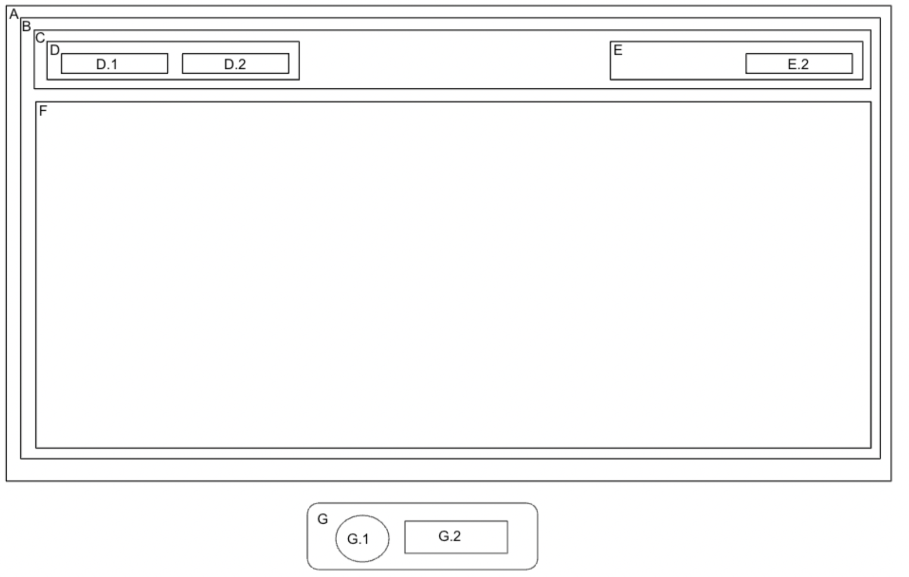
The box labeled F is where the body of the application will be displayed. All other boxes are customizable formatting elements that frame the application.
A (Modal Backdrop)
This HTML Div element is injected to DOM. The position must be set to fixed with appropriate z-index. The Modal renders inside this element. config.renderConfig.containerStyle controls the style of this box.
class = `${config.classNamePrefix | 'airkit'}-container`
data-test-id = `${config.testIdPrefix | 'airkit'}-container`
B (Modal)
This is an HTML Div element. It contains the UI generated by the SDK for the modal. config.renderConfig.panel controls the style of this box.
class = `${config.classNamePrefix | 'airkit'}-modal`
data-test-id = `${config.testIdPrefix | 'airkit'}-modal`
C (Optional Header)
This is an optional header. config.headerConfig.headerStyle controls the style of this box.
class = `${config.classNamePrefix | 'airkit'}-header`
data-test-id = `${config.testIdPrefix | 'airkit'}-header`
D (Header Content)
This is a trademarkBox in the header. It holds a logo and/or text. config.headerConfig.trademarkBoxStyle controls the style of this box.
class = `${config.classNamePrefix | 'airkit'}-trademark`
data-test-id = `${config.testIdPrefix | 'airkit'}-trademark`
D.1 (logo)
Optional logo will render here. config.headerConfig.logo controls the style of this box.
class = `${config.classNamePrefix | 'airkit'}-logo`
data-test-id = `${config.testIdPrefix | 'airkit'}-logo`
D.2 (text)
Optional text will render here. config.headerConfig.typography controls the style of this box.
class = `${config.classNamePrefix | 'airkit'}-header-text`
data-test-id = `${config.testIdPrefix | 'airkit'}-header-text`
E (Actions)
This is a actionsBox in the header. It holds minimize and/or close icon buttons. config.headerConfig.trademarkStyle controls the style of this box.
class = `${config.classNamePrefix | 'airkit'}-actions`
data-test-id = `${config.testIdPrefix | 'airkit'}-actions`
E.2 (close)
Optional close icon button will render here. config.headerConfig.close controls the style of this box.
class = `${config.classNamePrefix | 'airkit'}-close-button`
data-test-id = `${config.testIdPrefix | 'airkit'}-close-button`
F (Iframe)
This is HTML iframe element which loads the App. config.iframeConfig controls the style of this box.
G (Floating Button)
This is an HTML Div element. It renders the floating button. config.renderConfig.button controls the style of this box.
class = `${config.classNamePrefix | 'airkit'}-popup-button`
data-test-id = `${config.testIdPrefix | 'airkit'}-popup-button`
G.1
The image displayed in this box changes depending on if the popup panel is open or closed. config.renderConfig.button controls the style of this box.
G.2
The text displayed in this box changes depending on if the popup panel is open or closed. config.renderConfig.button.typography controls the style of this box.
SDK APIs
openPanel - In popup and modal mode, calling this API on SDK instance will open popup panel/modal respectively.
closePanel - In popup and modal mode, calling this API on SDK instance will close popup panel/modal respectively.
alterBtnText - In popup and modal mode, calling this API on SDK instance will alter floating button/action button text respectively.
alterBtnIcon - In popup and modal mode, calling this API on SDK instance will alter floating button/action button icon respectively.
Updated 3 months ago