Using Animations
Animated style changes can also be applied to some parts of your app’s UI to provide smoother ways to transition from one section to the other or to generate a more engaging app interaction by making and animating your own custom UI elements.
Web Controls and Web Pages that allow animation will have an Animations section in their associated Inspector.
Animating Page Transitions
Away to include this feature to your app is by animating the transitions from Web Page to Web Page.
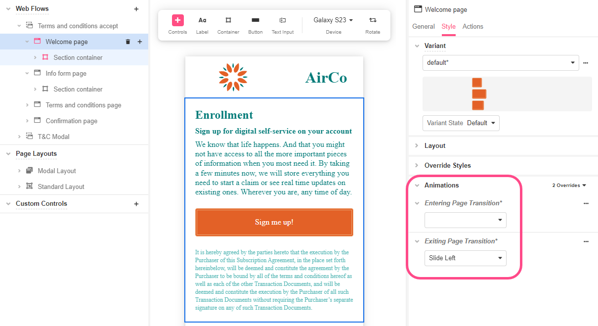
- In Web Flows Builder, select Welcome page and go to the Style tab of the Inspector.
- In Animations > Exiting Page Transitions, choose Slide left to give a smooth transition between web pages.
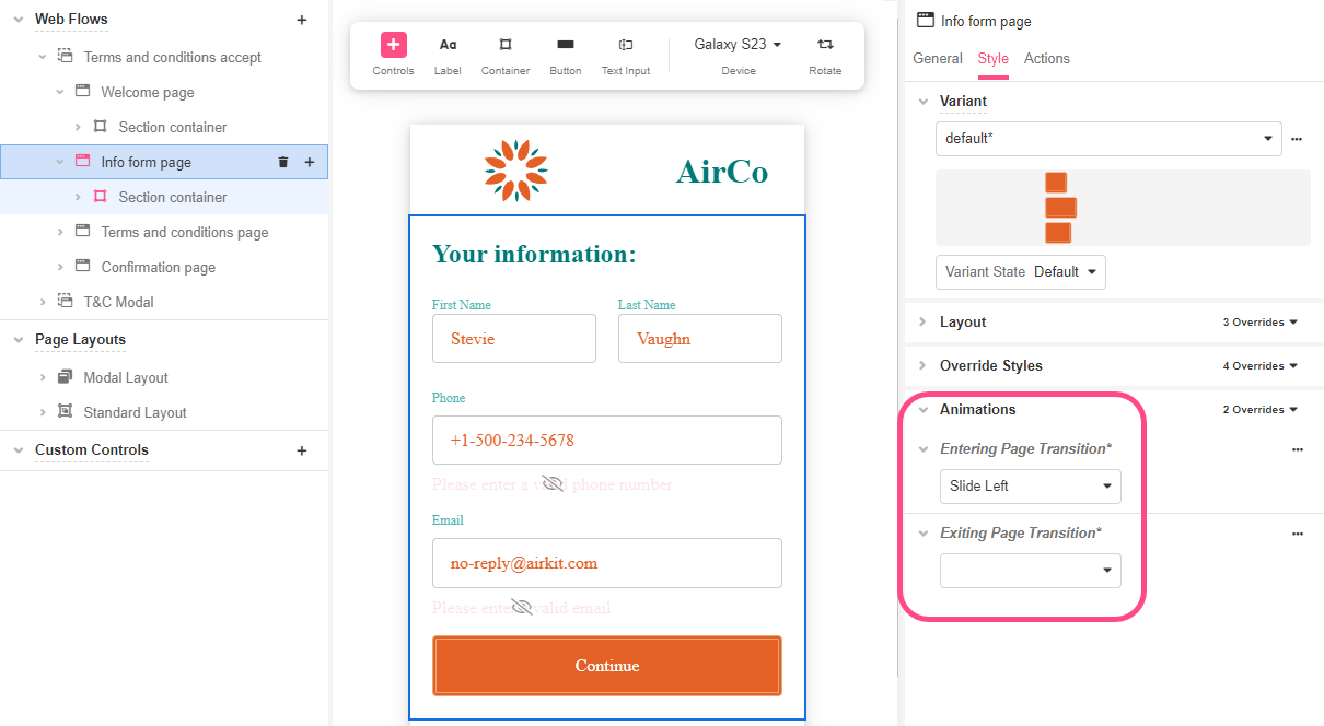
- Now select the Info form page, and go to Style > Animations > Entering Page Transitions and select Slide left, as well.
- Go to App Preview to see how the first Web Page slides left after clicking on the button that takes the user to the next Web Page.
Animated Progress Bar (Advanced)
We can also use Animations to create custom UI components. To do this, some familiarity with Airscript is required, as we’ll be working with User Defined Functions.
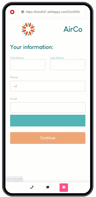
Let's add to our Info form Web Page an animated Progress Bar to indicate the user how far into completing the form they are.
Bear in mind that in this case, we'll be creating a custom animated progress bar from scratch based on user input. Unlike adding the Progress Bar that Airkit provides as a Web Control, we'll be customizing all aspects of its appearance.
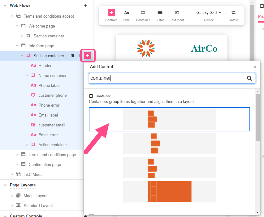
- In Web Flows Builder, select the Info form page.
- Select the Section container and add a Container.
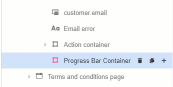
- Rename it “Progress Bar Container”. You can do this by double-clicking the name of the container in the Tree.
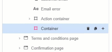
- Drag and drop it just above the Action Container.
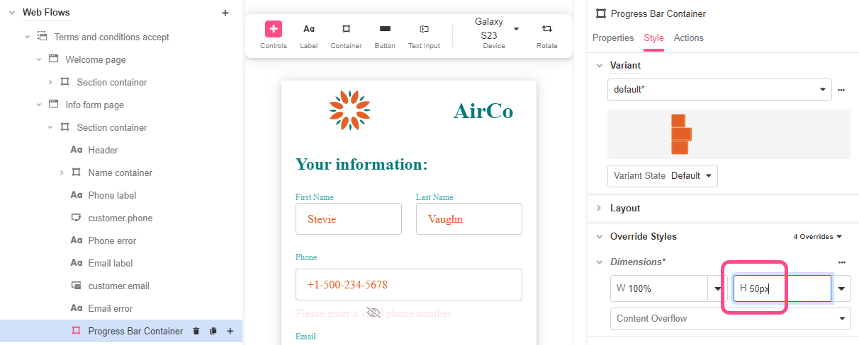
Since this Container will hold the Progress Bar, let’s make sure it has a set height so that it doesn’t disappear when there are no Web Controls in it.
- On the Inspector, go to Styles > Override Styles > Dimensions and enter “
50px” in the field with the letter H (Height). You can do this by double-clicking the field space:
-
In Override Style > Background, change its color. This will be the color that will show before the user enters their information. In this case, we are using textSecondary color.
[block:image]
{
"images": [
{
"image": [
"https://files.readme.io/f4d17b9-image.png",
null,
null
][ "https://files.readme.io/f4d17b9-image.png", null, null ],
"align": "center",
"sizing": "500px"
}
]
}
[/block] -
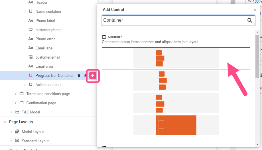
Nest a Container underneath the Progress Bar Container and rename it to “Progress Bar”.
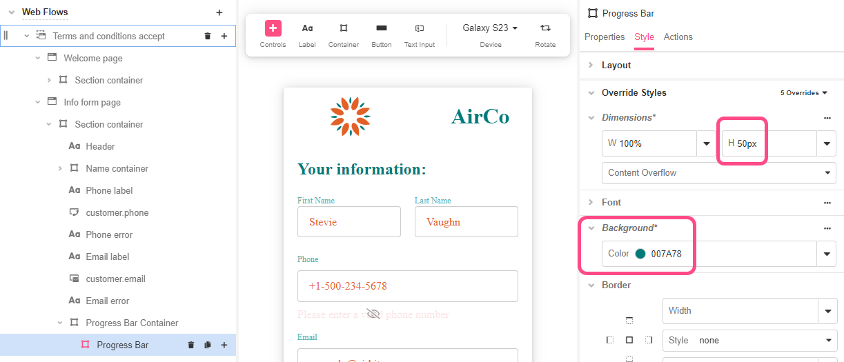
- Select the nested Container and go to Override Styles > Dimensions and enter “
50px” in the field with the letter H (Height) as a hardcoded standard to match the holding Container. Also, select textPrimary (#007a78) as background color. You'll notice this color contrasts our previously chosen color, this will make the progress bar more noticeable.
Once these Web Controls are set, we're going to animate changes to the progress bar's width. To configure that, let’s create a Variable to define that width.
- Go to Variables Tree and add a Variable of type Number at the Activity level.
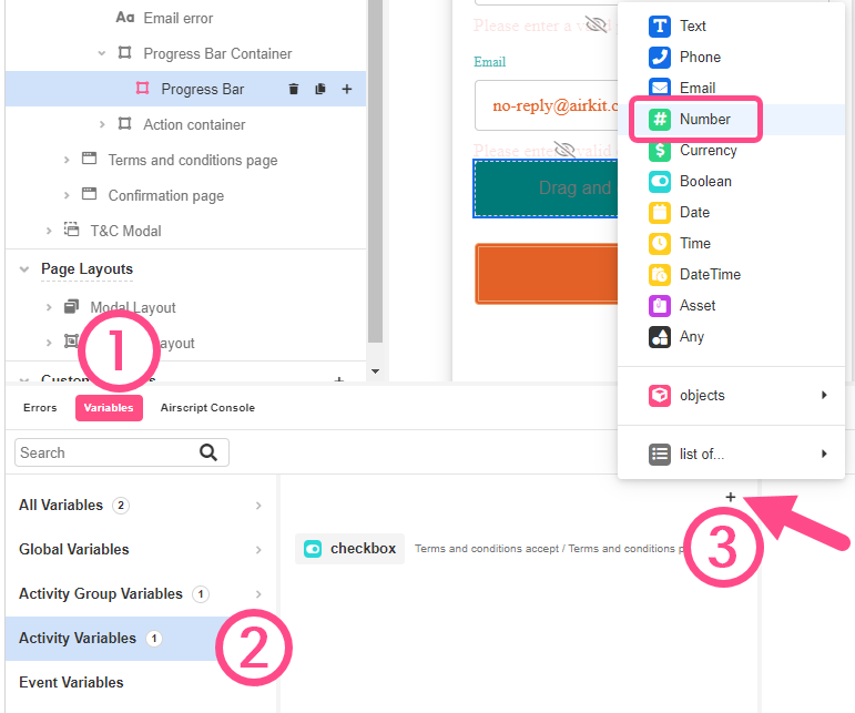
- Select the corresponding Web Page and change its name to
bar_filled.
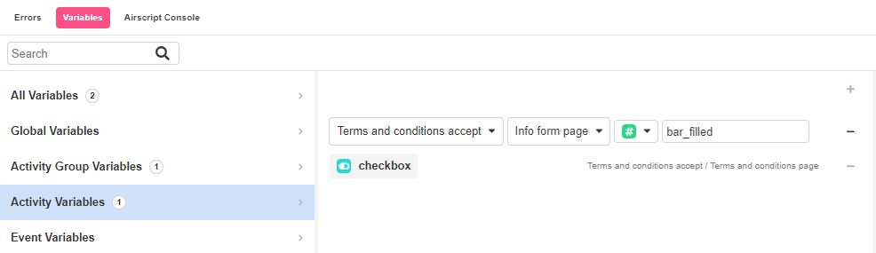
- For testing purposes, let’s add “50” as a value.
- With the inner Progress Bar Control selected, go to Override Styles > Dimensions and, under W (Width), enter the following Expression.
"{{FORMAT_NUMBER(activity.bar_filled, "")}}%"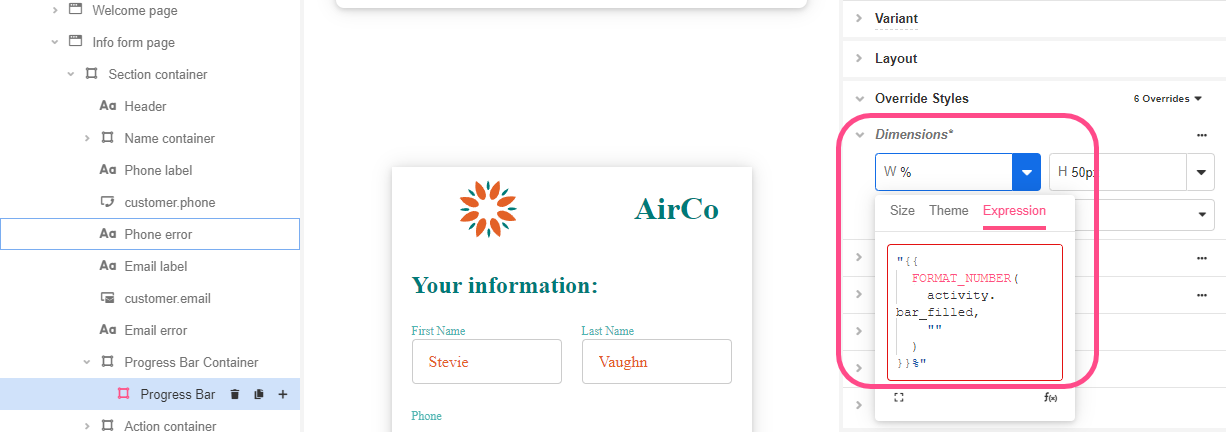
- Save the app and and note how this will change the appearance of the Containers in the Stage so that a portion of the Progress Bar Container is visible:
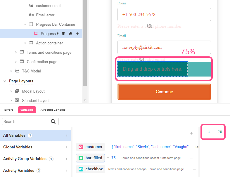
By using the FORMAT_NUMBER function to set the width of the progress bar, the appearance of the UI in the Stage changes according to the Variable in the Tree.
- On the Inspector, go to Style > Animations > Transitions, select Dimensions and assign it a time. In this case, we are choosing timingSlow to better appreciate the transition.
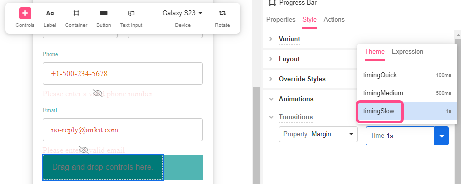
The values of timingQuick, timingMedium and timingSlowcan be confugure in Theme > Varaiables > Times
Configuring the progress bar with Airscript
Now we need to change the value of activity.bar_filled to reflect what percentage of the form has been filled out. To do so, we will create a User Defined Function.
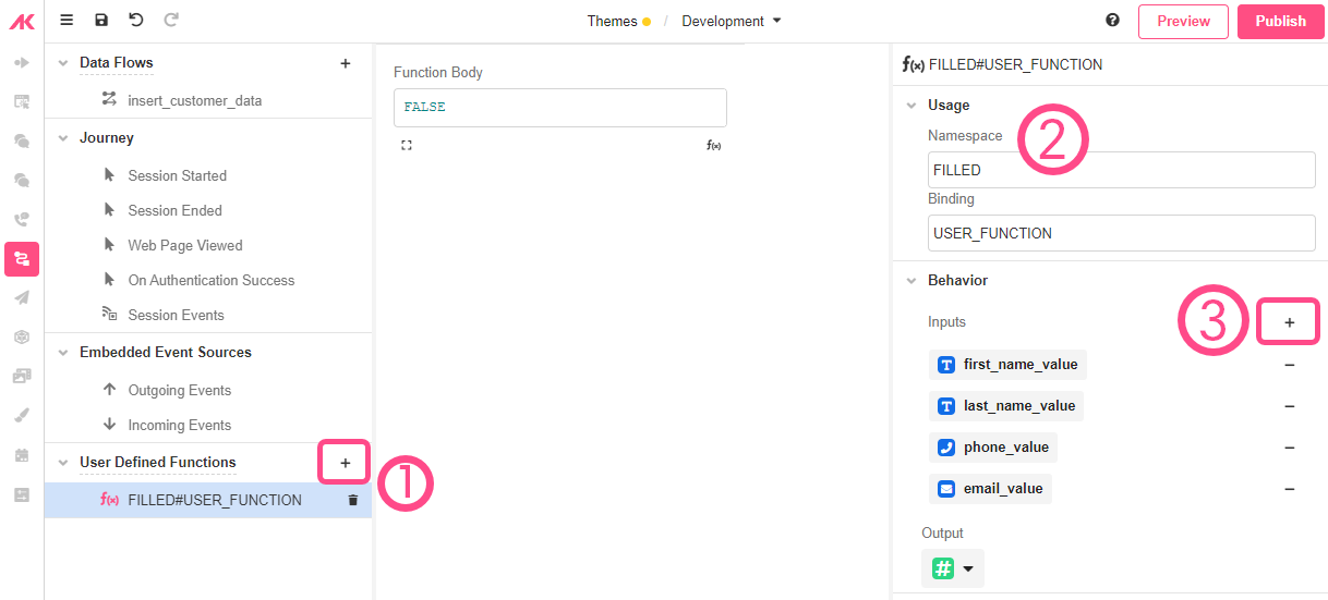
- Go to Connections Builder and click on the ‘+’ sign next to User Defined Functions.
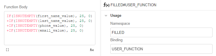
- In the Inspector, go to Usage > Namespace and rename it: FILLED
- On Behavior > Inputs, add the following Variables:
a. Of type Text:first_name_valueandlast_name_value
b. Of type Phone:phone_value
c. Of type Email:email_value - On Output, we are going to select
Number
Next, we’ll create a condition to see how many of the input Values are TRUE and how many are FALSE. This will validate whether the field is filled (TRUE) or not (FALSE) and animate or move the bar accordingly. To do so, we’ll use the IF and ISNOTEMPTY functions combined to get the summation. Considering that we have four fields, a percentage of 25 will be assigned to each. Therefore, for each field that is not empty, 25% of the bar will be filled and for each field that is empty, 0% of the bar will be filled.
- In Function Body, add the following summation of all Variables:
IF(ISNOTEMPTY(first_name_value), 25, 0)
+IF(ISNOTEMPTY(last_name_value), 25, 0)
+IF(ISNOTEMPTY(phone_value), 25, 0)
+IF(ISNOTEMPTY(email_value), 25, 0)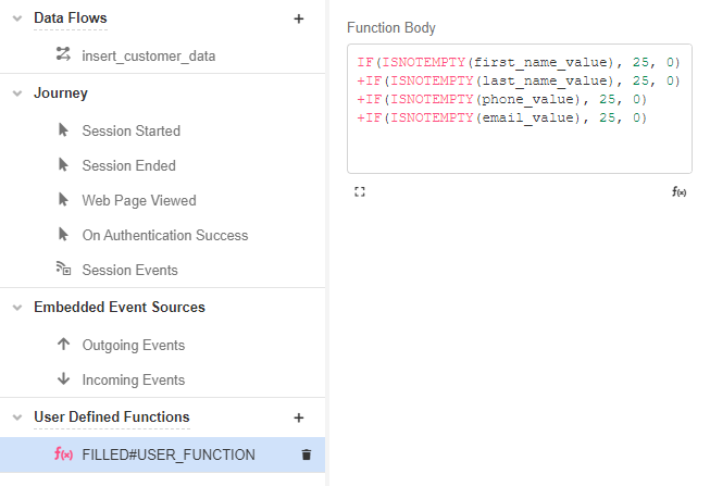
- In the Inspector, go to User > Namespace and name this function:
Checking against the fields
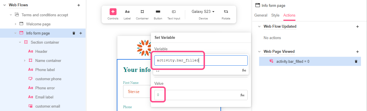
- Go to Web Flows Builder and select the Info form Page.
- Go to the Actions tab of the Inspector and on Web Page Viewed add a Set Variable Action.
- Complete it with the
activity.bar_filledVariable and set the initial Value to “0” so when a user first navigates the Web Page the progress bar is empty.
Then we’ll add an Action to each of the Input fields for when information is entered.
- In the Tree, select the
customer.first_nameInput field and go to the Actions tab of the Inspector.
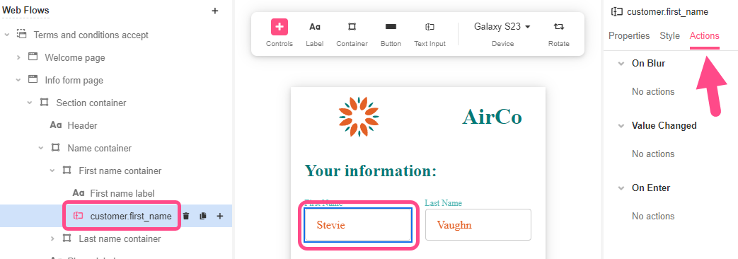
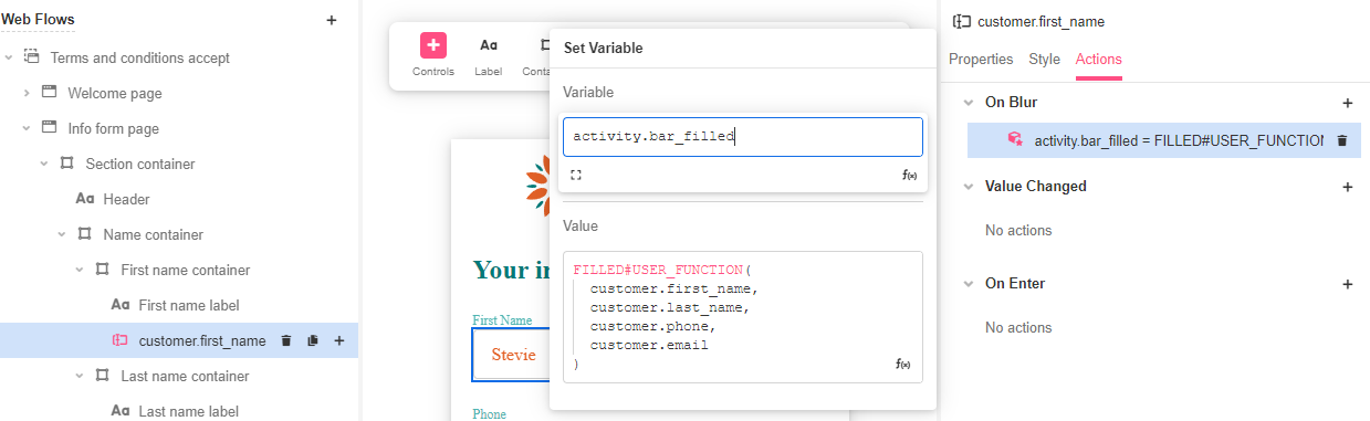
- In On Blur, add a Set Variable Action. Complete it with
activity.bar_filledas the Variable and the User Defined Function as the Value. This way, the User Defined Function are checked against the four Input Controls whether they are filled or empty. As information is entered in thecustomer.first_namefield, and the other three remain empty, the User Defined Function will only fill a quarter of the progress bar.
FILLED#USER_FUNCTION(
  customer.first_name,
  customer.last_name,
  customer.phone,
  customer.email
)
- Repeat the steps 1 to 5 to add the Set Variable action with the same Variable and Value on the other three Input fields:
customer.last_name,customer_phoneandcustomer_emailso that the same function runs each time the user completes a field.
For the
customer.phoneandcustomer.emailfields, we recommend adding this Set Variable action in Value Change as these fields count on their own validation, that way, we are making sure the user entered a valid phone and email before summiting the form.
Previewing the Progress Bar
- Go to App Preview.
- Start completing the fields and check how the progress bar will load on quarters. If an inputted value is erased, the progress bar will go back to the previous porcentage.
Having finished that part, we have ended our tutorial!
Updated 4 months ago