Custom Controls
Airkit provides a way for a Builder to create their own customized Web Controls which can then be used multiple times within an application. Simplistically, Custom Controls are an amalgamation of conventional, off-the-shelf Web Controls combined together to create Custom Controls. Creating Custom Controls allows for modularity of an application's Web Controls where components grouped together can be inserted rather than individual components of the Custom Control having to be repetitively inserted each time. Additionally, modifying the definition of the Custom Control will modify all instances of Custom Control allowing for ease of updating functionality.

Example of Custom Control
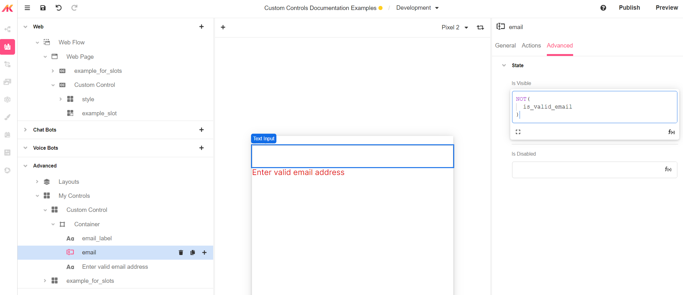
The below illustration shows an instance of a Custom Control that contains a Text Input which validates whether or not the input is a valid email address and displays a warning message if it isn't. This example consists of a Label, a Text Input and a Label that displays a warning if the inputted value is not a valid email.

The Custom Control saves the Builder from having to manually insert an email label, a text input and another label displaying each time - instead, another instance of the Custom Control can be created. This pattern makes it convenient for a Builder to build modular, reusable, Web Controls instead of adding each set of Web Controls manually and duplicating the desired logic.
Template Parameters
Like Web Pages, Custom Controls can have variables defined within them to store data. However, unlike Web Pages, care must be taken to ensure that the correct type of variable is defined (in addition to selecting the intended Data Type) depending on the intended use. It is important to note that this is not referring to the Data Type assigned to the variable.

Template Inputs > Template Variables
These are variables that can accept inputs from outside each instance of the Custom Controls. This is the desired variable type where data needs to be passed from the Web Page or Web Flow into the Custom Control.
In the below example, a variable named email_label has been created which expects a Text data type and if not passed any data, contains the Text of "Email:".
It should be noted that the Is read-only property determines whether or not the data within the variable can be modified after first receiving data.
- Is read-only (checked) - This allows for preset or placeholder logic or data to be stored in the variable. Data external to the Custom Control can be passed to this variable as a reference, and hence, it cannot be modified from within the Custom Control.
- Is read-only (unchecked) - This disallows preset or placeholder values to be stored in the variable. This setting allows the data outside the Custom Control stored in external variables to be modified. Note that expressions that are passed to the Custom Control and are not stored in an external variable cannot be modified.
Variable Access in Custom Controls
Sessionvariables are the only type of variables accessible in custom controls. If you wanted to pass anactivityoractivityGroupvariable into the custom control, you will need to define an input to the custom control and pass the value into the input.
Theme Inputs
Theme Inputs allow a Variant to be passed through to the Custom Control which can then be passed through to the individual Web Controls. Applying a Variant to a Web Control within a Custom Control is a three-step process.
First, the Theme Input variable must be defined along with the expected Data Type.

Second, the Theme Input variable must be passed to the desired Web Control which can be accessed using the input. namespace.

Third, the Variant Substitution must take place on the instance of the desired Custom Control under the style object.

By default, the Web Controls within a Custom Control will take on the selected Variant when defining the Web Control in the Custom Control.
Template Slots
Template Slots allow for Web Controls to be added within instances of a Custom Control.
As the name implies, the Template Slot behaves like a Container - other Web Controls can then be created within it. To achieve the aformentioned functionality, a builder must follow these three steps:
First, create the Template Slot variable when defining the Custom Control:

Second, add the Template Slot on the instance of the Custom Control.

Third, add the desired controls to the new Template Slot
Control Variables
Control Variables are useful when a Builder only seeks to store data pertaining only to functionality within the Custom Control that does not need to be accessed outside it.

An example of this would be a variable used to store whether or not the input on a text input is valid - this fact is unlikely to be relevant outside the Custom Control as it is only used to display a warning label within the Custom Control without serving any other purpose.
Control Variables can be preset with values that will be set for each instance of the Custom Control, but can never be modified from outside the scope of the Custom Control.
Creating an Email Validation Custom Control
Creating the Custom Control
When working with Custom Controls, its helpful to understand the difference between defining the Custom Control and instantiating a Custom Control. For those who are familiar with Object Orientated Programming, this pattern is similar to defining Classes and creating instances (Objects) of them.
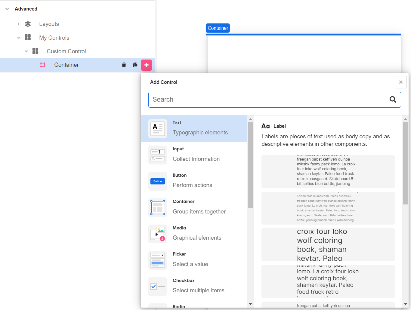
Custom Controls are defined in Studio under the Advanced Tab within the Tree.
To create a new Custom Control, within Web Flows Builder > Advanced > My Controls, click on the + to add a new Custom Control .

A new Custom Control will appear with a container, in which Web Controls can be defined . This is similar to to how Web Controls would usually be added to a Web Page.

After Custom Controls have been defined, instances can then be created in the same way as conventional Web Controls under the Custom category when adding Controls on a Web Page.
Email Validation Example
The following example shows the creation of a basic Custom Control which contains three Web Controls and some inputs:
-
A text input where an App User can enter an email address.
-
A customizable label just above the text input. By default this label, displays the text of "Email:". However, the Custom Control can also accept a Text input to change the displayed value to something like "User Email:", for example.
-
A label that only appears if the User-inputted value is not a valid email address which requests the App User to enter a valid email address
This Custom Control will also accept styling Variants so that the App Builder can ensure that it fits the application's styling.
First, add a Label to the Custom Control, followed by a Text Input and another Label. The Custom Control should then look like the following example.

Next, program the first Label to display the text of "Email:" and accept inputs for it to be customized for each instance. Select the Custom Control on the Tree and add a Template Variable and name it email_label and pass the value of "Email:" to it. It should be noted that the Is read-only value simply means that once the value has been set, it cannot be modified. Use the expression editor for the label within the Inspector to pass the email_label variable to it.
Next, add another Template Variable named email_input Template Variable and have this bound to the Email Input by selecting it on the Tree or Stage and setting the Data Binding to email_input.

.png)
Pass a name for the variable into the Name field and call it styling_input, for example.
.png)
Next, add a Control Variable to mark whether or not the value is a valid email address. Keep in mind that Control Variables cannot be modified from outside the Custom Control and should only be used for locally-needed values. Our case of is_valid_email is a good example of a value that only needs to be known locally within this Custom Control.
.png)
The text input should then be bound to the new email_input Template Variable by selecting the Text Input on the Stage or Tree and setting the Data Binding value to email_input. Note that Airkit's auto-complete will provide you with the list of available variables within the scope of the Custom Control.
.png)
Next, change the styling of the warning label so that the text appears red in color (2g)
Next, set the Is Visible property to change the text to be "Enter valid email address".

Next, program the Text Input with a Set Variable action the input On Blur (when the app user clicks away from the Text Input) with the code of IF(ISEMAIL(email_input), TRUE, FALSE)
 \
\ .png)
Once all of this has been set, multiple instances of this Custom Control can be instantiated within the Airkit App.
Custom Control Styling
Newly created Web Controls are set with the selected Variant upon definition. In many cases, Web Controls only have one, default Variant.
Custom Controls can also receive Variants within Theme Inputs (see above) which must be defined under Template Parameters > Theme Inputs. In the below example, a input variable of label_example has been defined for the Custom Control.
.png)
This allows for a styling Variant to be passed to each created instance of the Custom Control, as shown in the below example.
.png)
Updated 3 months ago