Themes and Control Variants
A theme consists of all the styling defaults that your application can call upon. A theme is made up of:
- Variables - define default color, size, font, and time values
- Control Variants - define sets of styling properties for specific Web Controls, like CSS classes
You can only ever have one theme tied to your application at any one time, though it can be useful to name themes when exporting them from and importing them to other applications, as this can help you keep track of precisely which theme you're working with at any given time. For more on importing and exporting themes, see Importing and Exporting Themes.
Styling changes can be made in both the Web Flows Builder and the Theme Builder. While the Theme Builder provides a convenient single place to view and edit all of a theme's components, changes and additions to Control Variants are typically made directly in the Web Builder.
Control Variants
A Control Variant is a set of styling properties for a specific control, similar to a class in CSS.
Every Web Control has associated Variants: cosmetic variations that appear differently but function identically. Variants are defined in the Theme Builder and used as defaults when stying Web Controls. For instance, within a single application, you might create two Variants of Button: a rectangular one in red, and a round one in blue. Any changes made to existing Variants also apply retroactively: existing Web Controls previously styled according to the old default will immediately take the form specified by the new default. This allows for consistent styling throughout the entirety of each application, and it also allows you to test how how different combinations of colors, fonts, and graphics look together before committing to an implementation.
Most Web Controls come out-of-the-box with at least a few pre-configured Variants. For instance, the Button Web Control has four: default, buttonSecondary, buttonText, and link:
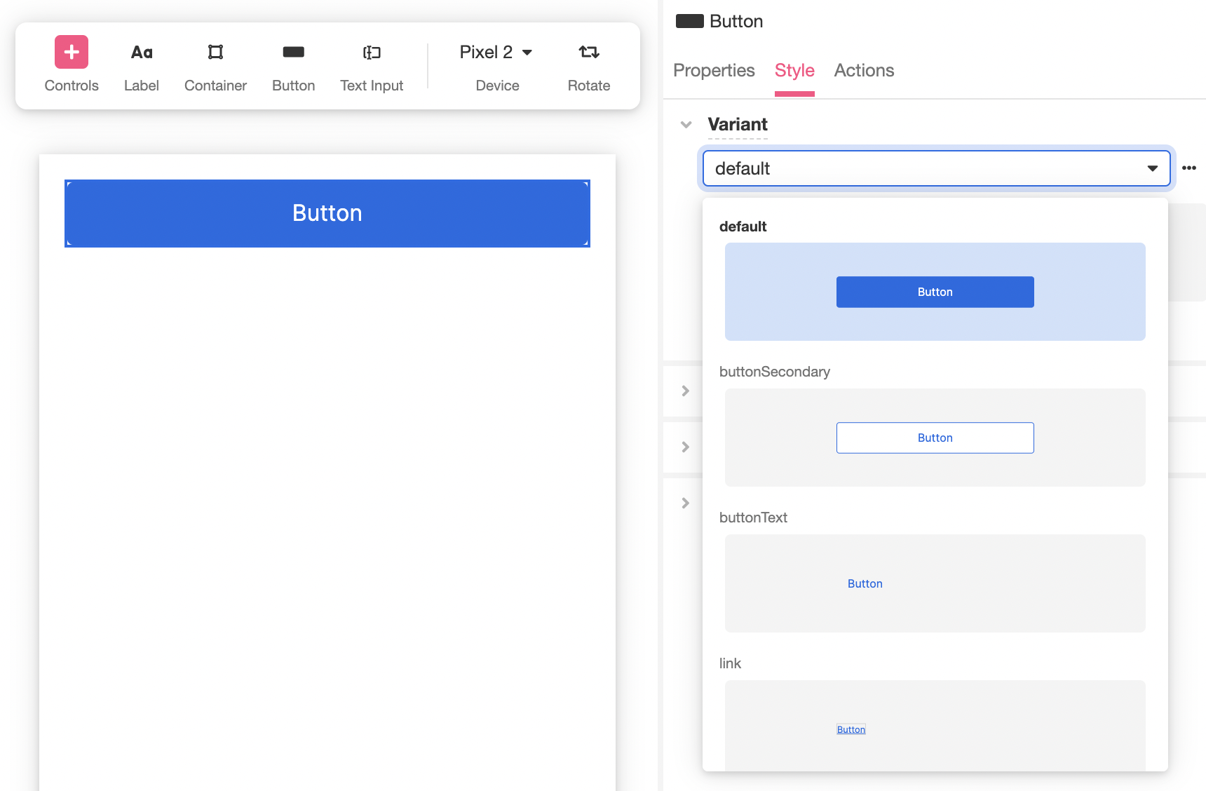
Once a Web Control has been added to a Web Page, you can change the Variant that defines its appearance by Inspecting the Web Control and selecting a Variant from the dropdown menu under Variant in the Style Tab.
Modifying Existing Variants
Modifying Existing Variants from the Web Flows Builder
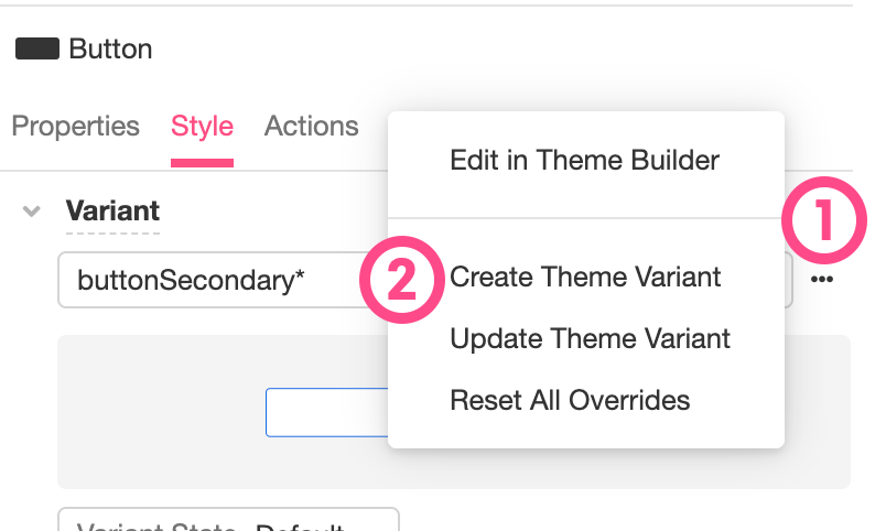
Once a Web Control has been added to a Web Page, you can change the styling properties of the Web Control by Inspecting it and making changes to a selected Variant by modifying the styling properties under the Style Tab. By default, these changes will be applied only to the individual instance being Inspected. However, once your changes are finalized, you can use them to update the selected Variant. This will apply your changes to all instances of the selected Variant throughout your application. To do so, click on the "..." icon to the right of the selected Variant under Style > Variant and then select "Update Theme Variant" from the menu that appears.
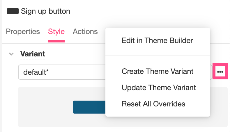
Alternatively, if you find you do not like the changes you have made and would like to revert the styling properties of the selected Web Control back to the Variant's initial defaults, you can select "Reset All Overrides".
Modifying Existing Variants in the Theme Builder
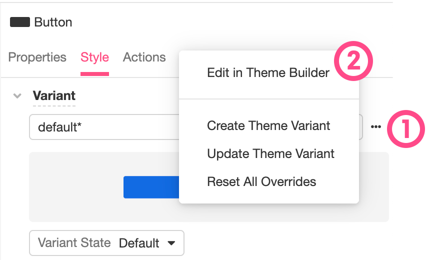
If you want to edit an existing Variant from the Theme Builder, you can toggle directly over to the Theme Builder using the Builder Bar. Alternatively, if you are already Inspecting the relevant Web Control in the Web Flows Builder, you can open the selected Variant in the Theme Builder for modification by clicking on the "..." icon to the right of the selected Variant under Style > Variant and then selecting "Edit in Theme Builder" from the menu that appears.
Upon Inspecting a Variant in the Theme Builder, changes to that Variant's appearance can be modified using the usual Web Control Styling Properties.
Any changes made to a Variant in this way will be immediately reflected throughout your application.
Adding New Variants
Adding new Variants from the Web Flows Builder
When working with Web Controls in the Web Flows Builder, it is possible to style the individual properties of an individual Web Control by making changes to the style fields found under the Style Tab of the Inspector. If you do not want to use these changes to redefine the base Variant (see above), it is often a good idea to save these styling configurations as a new Variant so that they can be reused.
To save the styling configurations you've used to style an individual Web Control, click on the "..." icon to the right of the selected Variant under Style > Variant and then select "Create Theme Variant" from the menu that appears:
This will open up a pop-up window, so that you can rename your new Variant something more intuitive. Once you have done so and clicked the Create Button, your new Variant will be available to reference throughout your application.
Adding new Variants in the Theme Builder
To add a new Variant without seeing how it looks in directly in your application flow first, you can toggle over to the Theme Builder, click on the '+' icon to the right of the Theme branch in the Tree, and then select the relevant Web Control from the select menu that appears:
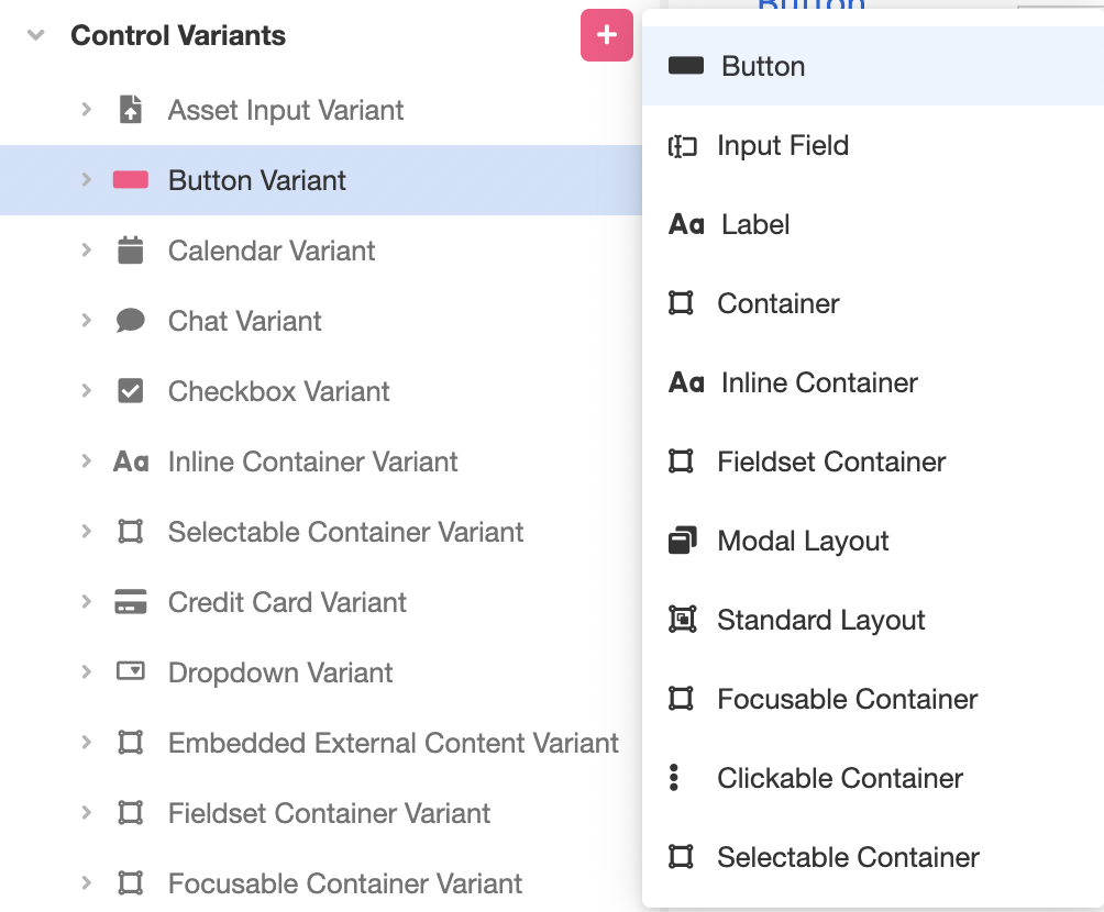
This will add a new Variant to the selected Web Control. Expanding the relevant Web Control in the Tree will reveal the newly-created Variant:
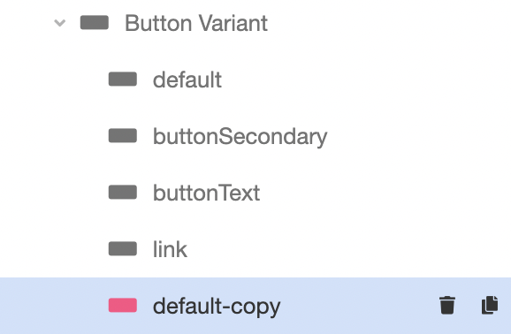
Out-of-the-box, this new Variant will be a duplicate of the primary default Variant. In the above example, for instance, the newly-created Button Variant was created with the designation default-copy and had the same initial styling configurations as default. It will not be, however, coupled with the default Variant. Changes made to default-copy will not impact default.
The name of a Variant can be changed by double-clicking on it in the Tree. Upon Inspecting a Variant in the Theme Builder, changes to that Variant's appearance can be modified using the usual Web Control Styling Properties.
Using a specific existing Variant as the base for a new Variant
When a new Variant is created by clicking on the '+' to the right of the Theme branch, as discussed above, the primary default will automatically be used as a base for the new Variant. It is also possible to use another existing Variant as the foundation of your new Variant.
To duplicate an existing Variant in the Theme Builder, select the Duplicate icon to the right of the desired Variant in the Tree. The following example, for instance, shows how to duplicate the Variant buttonSecondary:
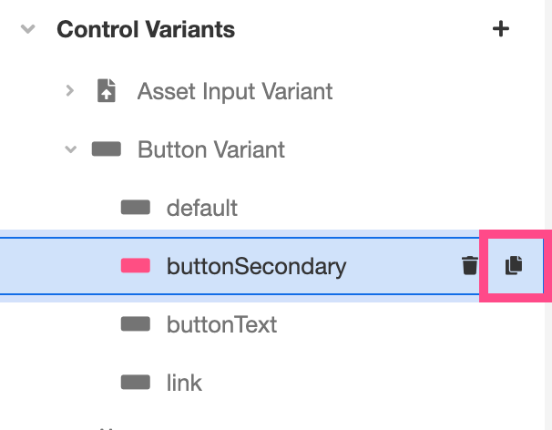
This will create a new Button Variant named buttonSecondary-copy, which will have the same initial styling configurations as buttonSecondary. It will not be, however, coupled with the buttonSecondary Variant. Changes made to buttonSecondary-copy will not impact buttonSecondary.
The name of a Variant can be changed by double-clicking on it in the Tree. Upon Inspecting a Variant in the Theme Builder, changes to that Variant's appearance can be modified using the usual Web Control Styling Properties.
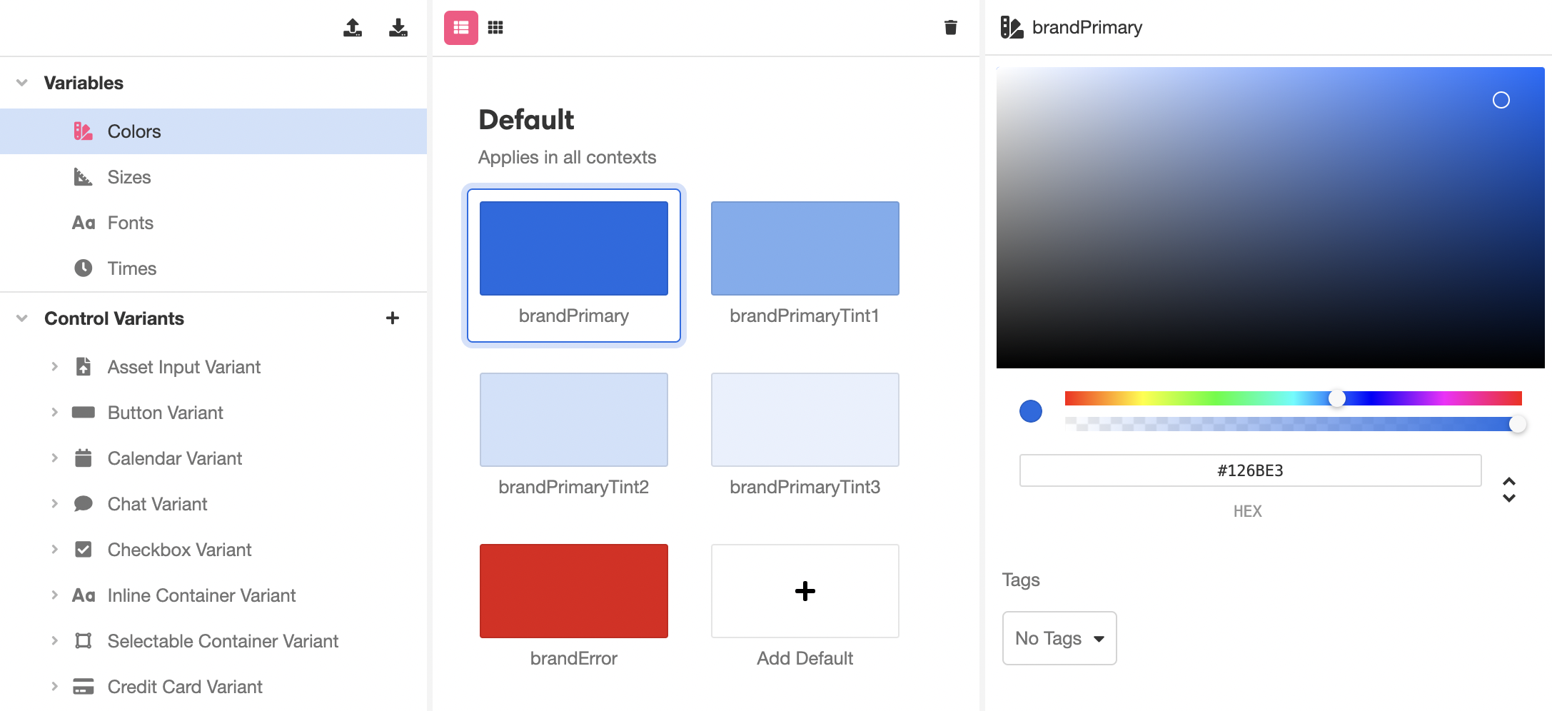
Variables
Variables define colors, sizes, fonts, and units of time that can be modified at once and reused. In addition to being available while creating UI in the Web Flows Builder, they are also often used to define Control Variants. For instance, the color defined by brandPrimary is used automatically to define the background color of the default Button Variant:
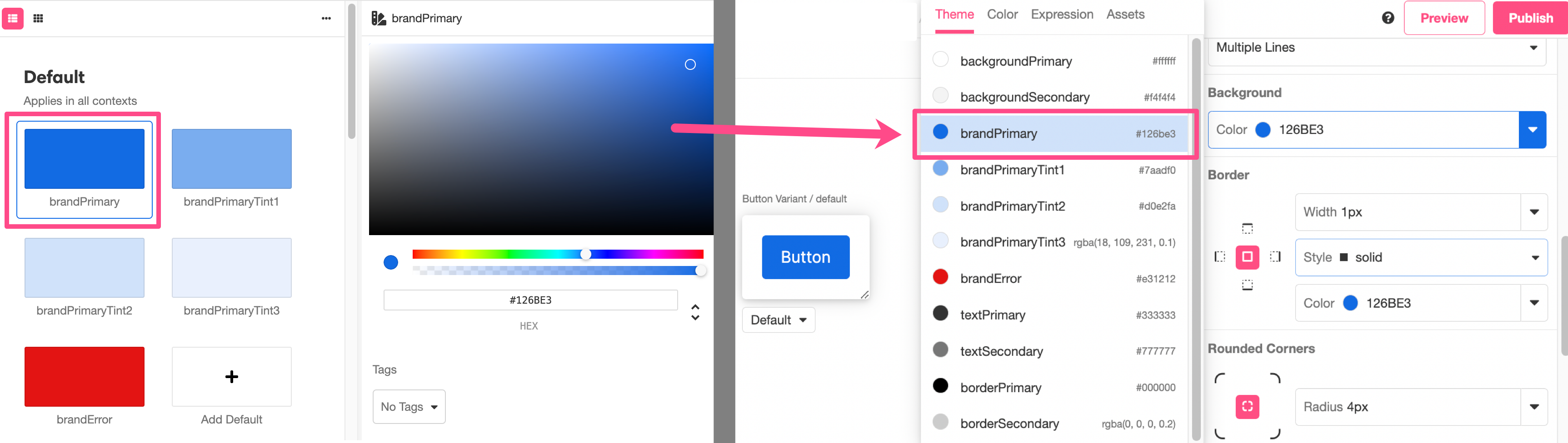
Any changes made to brandPrimary will be reflected in the default Button Variant.
To modify an existing variable, select it in the Stage and apply modifications in the Inspector. Changes made to a variable will be immediately reflected throughout the Studio.
Making new Variables
While the Theme Builder comes out-of-the-box with several variables that can be modified, it is also possible to make your own. This allows you to do things like keep track of a more detailed color palette, juggle multiple proprietary fonts, and store additional units of time that you might want to reuse in different kinds of Animations.
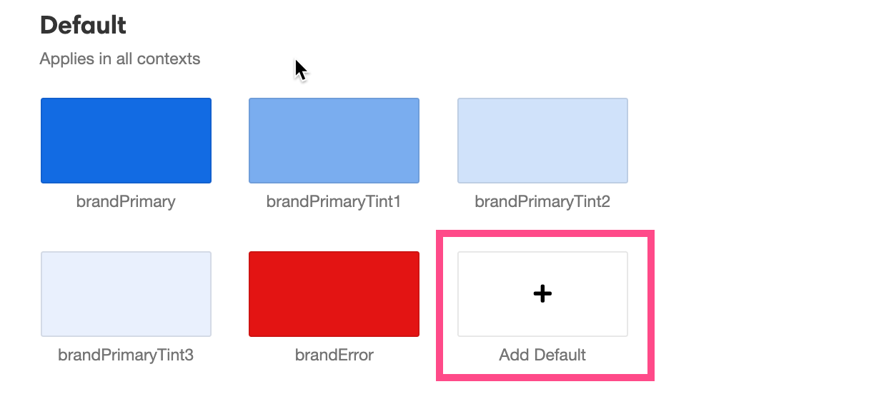
To create a new variable, click on the Add Default box in the Stage:
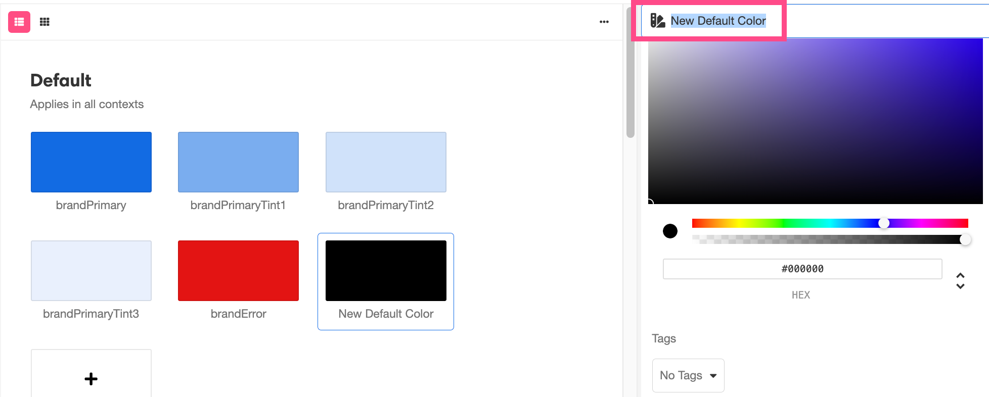
This will open a new variable for modification in the Inspector. To rename the variable, select the field that appears at the top of the Inspector:
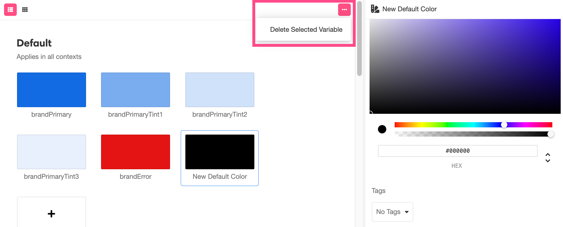
To delete a variable, click on the '-' icon to the top of the Stage and select Delete Selected Variable from the dropdown menu that appears:
Managing Tags
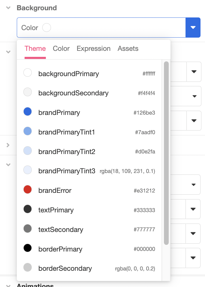
Tagging variables makes them appear at the top of selection menus as relevant. For instance, out of the box, backgroundPrimary and backgroundSecondary come tagged as Background Color. As a consequence, note how they appear in the selection menu while selecting a background color:
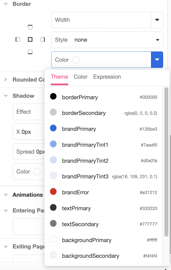
Compare this to where backgroundPrimary and backgroundSecondary appear in the selection menu when selecting a Border color:
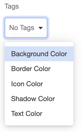
It is best practice to tag variables so as to keep them organized, particularly if you are using custom variables to keep track of multiple colors, sizes, fonts, or units of time. To add a tag to a variable, select a tag from the dropdown menu that appears under Tags in the Inspector:
A single variable can be associated with any number of tags.
Updated 4 months ago