Building the Web UI
You just created the Web Flow that users will be directed to upon starting their Session. Now let's build out the UI that will be contained in that Web Flow, that is to say the Web Pages.
This Contact Form Web Flow will include two Web Pages: A Contact Info Web Page and a Thank You Web Page.
Building the Contact Info Web Page
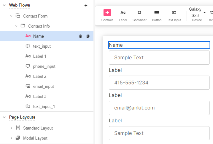
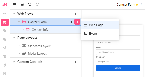
- In Web Flows Builder, double click on the recently added Web Flow and rename it to "Contact Form". Similarly, rename the nested Web Page to "Contact Info".
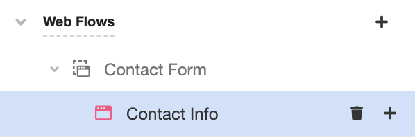
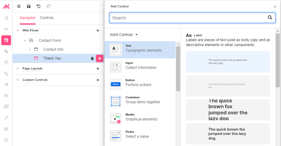
- Click on the '+' icon next to the "Contact Info" Web Page to add the Web Controls one by one. There are different types of Controls, each serving a specific purpose.

What are Web Controls?
Web Controls
Web Controls are basic UI building blocks that allow users to interact with a web app. They’re things like Buttons, input boxes, and Progress Bars. Much like how Web Pages are the component parts of Web Flows, Web Controls are the component parts of Web Pages.
Each Web Control is different, because each component part of a Web Page must interact with users in a different way. Labels, for instance, only need to be read, where as Text Input Boxes must be able to bind user input to a variable that can be called on at some point downstream.
All Web Controls:
- Effect the current page UI or functionality. (Most are visual but some act as containers or add invisible functionality to the web application.)
- Use properties to control their style and behavior.
- Are constructed in a "tree" structure that allows controls to contain children controls but always roll up to the page at the top level.
For a deeper dive into individual Web Controls, see the associated reference documents.
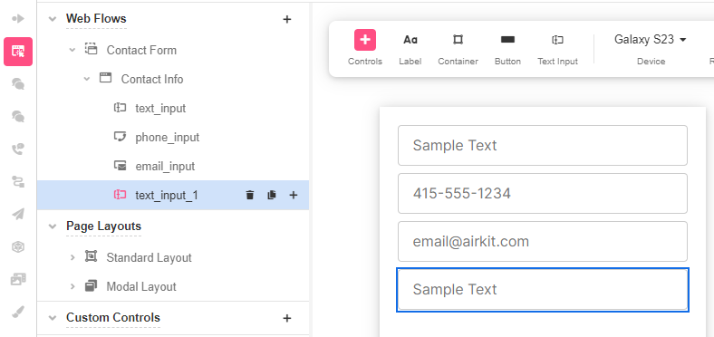
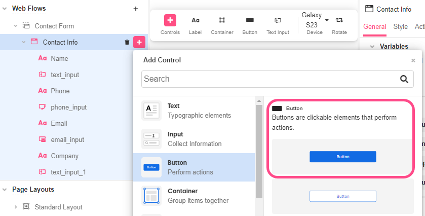
This Contact Form includes Input Controls, which are fields the users will later complete. The Input Controls on this Form are the following:
- Name - Text Input
- Phone - Phone Input
- Email - Email Input
- Company - Text Input
Choose the Text Input Control for the “Name” and "Company" fields, as users are expected to enter a text; choose the Phone Input Control for the “Phone” field, as users are expected to enter numbers following a phone format; and choose the Email Input Control for the "Email" field.
What is the difference between a Text Input Control, a Phone Input Control, and an Email Input Control?
Built-in validation
The Text Input Control, Phone Input Control, and Email Input Control all accept strings as user input. (In Airkit, both Phone and Email types are subcategories of Text.) However, while the Text Input Control accepts any and all strings as valid input and binds them to the associated variable, the Phone and Email Input Controls first run a test to confirm that the string the user gave was a properly-formatted phone number or email (respectively) before binding the input to the associated variable. If the string the user gave was not properly formatted, the associated variable will remain NULL.
What does it mean for a phone number or email to be properly formatted?
Airkit defines the Phone and Email data types so that they must fulfill certain criteria. For instance, a Phone must contain a country code as well as the appropriate number of digits, while an Email must contain the '@' symbol followed by a domain name that includes a recognized top-level domain.
Under the hood, the Phone Input Control uses the ISPHONE function to test if a user has given a valid Phone data type, and the Email Input Control uses the ISEMAIL function to test if a user has given a valid Email data type. See function documentation for more details on what the Phone and Email Input Controls will accept as valid.
Note that while this built-in validation process prevents your Airkit apps from saving inappropriately-formatted data, it does not automatically communicate any part of this validation process to users. If you want to include intuitive error messages in your applications, construct them according to the process outlined in Validation of Forms and User Data.
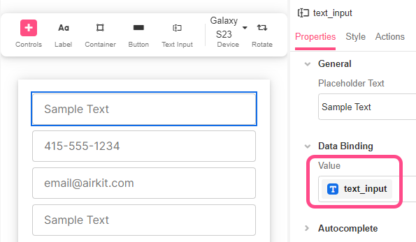
For each Input Control, a Variable is automatically created and binded to the Value of that input.
- Once the Controls are added, include a Label Control above each of them to show the user what input they are filling out.
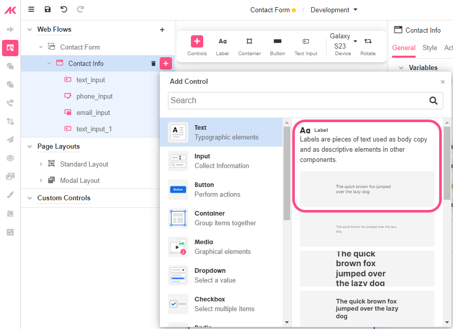
To edit the Label, double click on it in the Stage or change the Text property in the Inspector section. You can also change the style of the Label by choosing a Variant.
What is a Variant?
Variants
A Variant is a set of styling properties for a specific Web Control, similar to a class in CSS. If you're not familiar with CSS classes, you might compare Web Controls and Variants to dinnerware. Plates, cups, and forks are all like different web controls: they each have a particular function, and this is reflected in aspects of their appearance. However, not all plates look the same. A square red plate and a round blue plate are both capable of serving as plates and are simply styled differently. If you are deciding whether to set your table with your blue plates or your red plates, this is like choosing between different Variants of plates.
Every Web Control has associated Variants: cosmetic variations that appear differently but function identically. Variants can be edited in Theme Builder and then used as defaults when adding new Web Controls. For instance, within a single application, you might create two Variants of button: a rectangular one in red, and a round one in blue. Any changes made to existing Variants also apply retroactively: existing Web Controls previously styled according to the old default will immediately take the form specified by the new default. This allows for consistent branding throughout the entirety of each user's Journey, and it also makes it easy to see how different combinations of colors, fonts, and graphics look together.
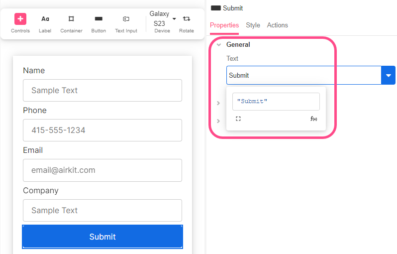
- Finally, add a Button Control. This will be later used to submit data collected from users to AirData.
Edit the name by double clicking on it or from the Text in the Inspector section.
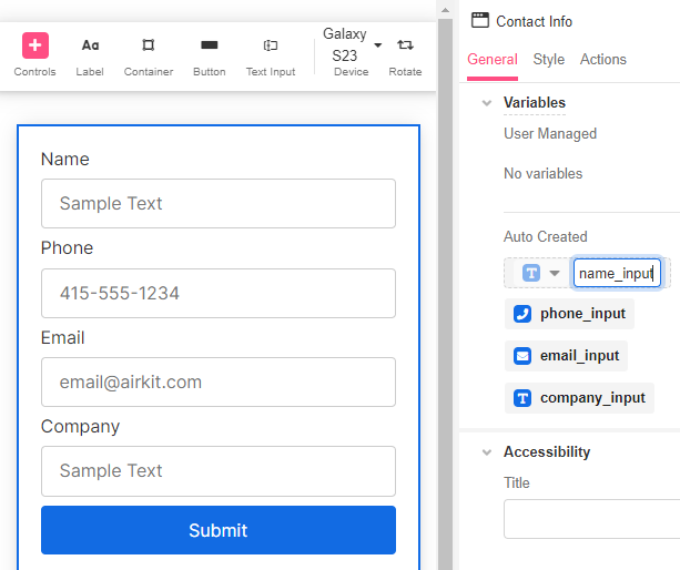
- Now that the Form is ready, click on the Web Page to check all the auto-created Variables that will store the input Values. If necessary, rename the Variables so they are easy to identify. For example, change
text_inputtoname_input.
Building the Thank You Page
Add a Thank You Web Page to the Web Flow for users to see after completing the Form.
- Click on the '+' icon next to the Web Flow and add the second Web Page. Double click on it to edit the name for a more descriptive one.
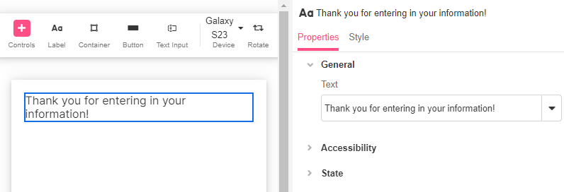
- Click on the '+' icon next to the new Web Page to add the Label Control.
- Type the message users will see on submitting the Form by editing the Label.
You've now built out the complete UI for your form.
Navigating between web pages
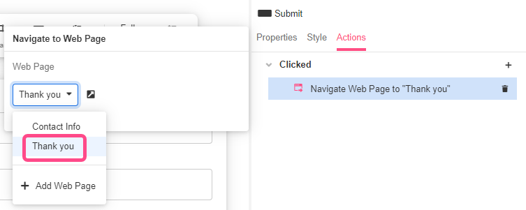
We are going to link an action to our Submit button to display a Thank you message after submitting the contact information.
- Click on the “Submit” button and go to the Actions tab in the Inspector and Click on the '+' icon. The Actions menu will be displayed.
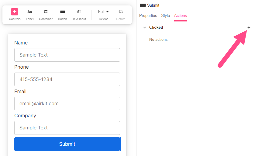
- Select the Navigate to Web Page action. Choose the Thank You Web Page so that users are directed there when clicking on the button.
- Save the app and it will be ready to be tested.
Previewing
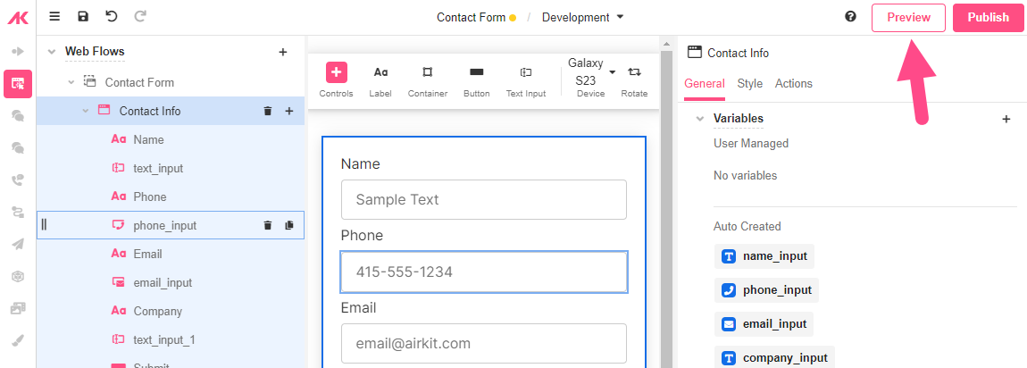
- To Preview, click on the Preview Button in the top right hand corner. This will open up a new tab and open up the App Preview.
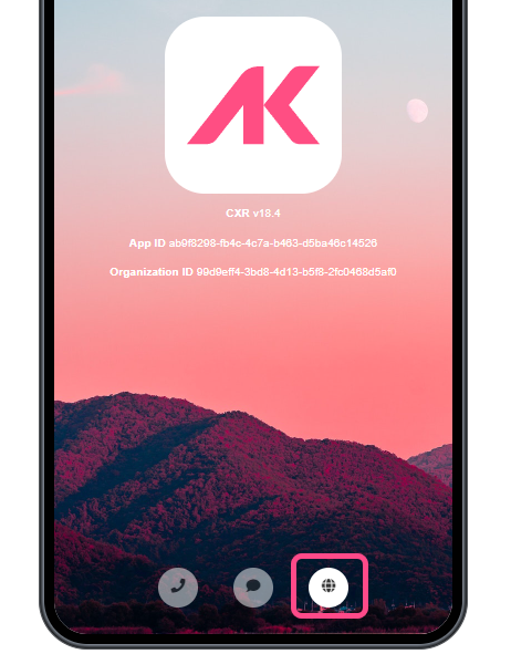
- Click on the web icon to launch the web experience
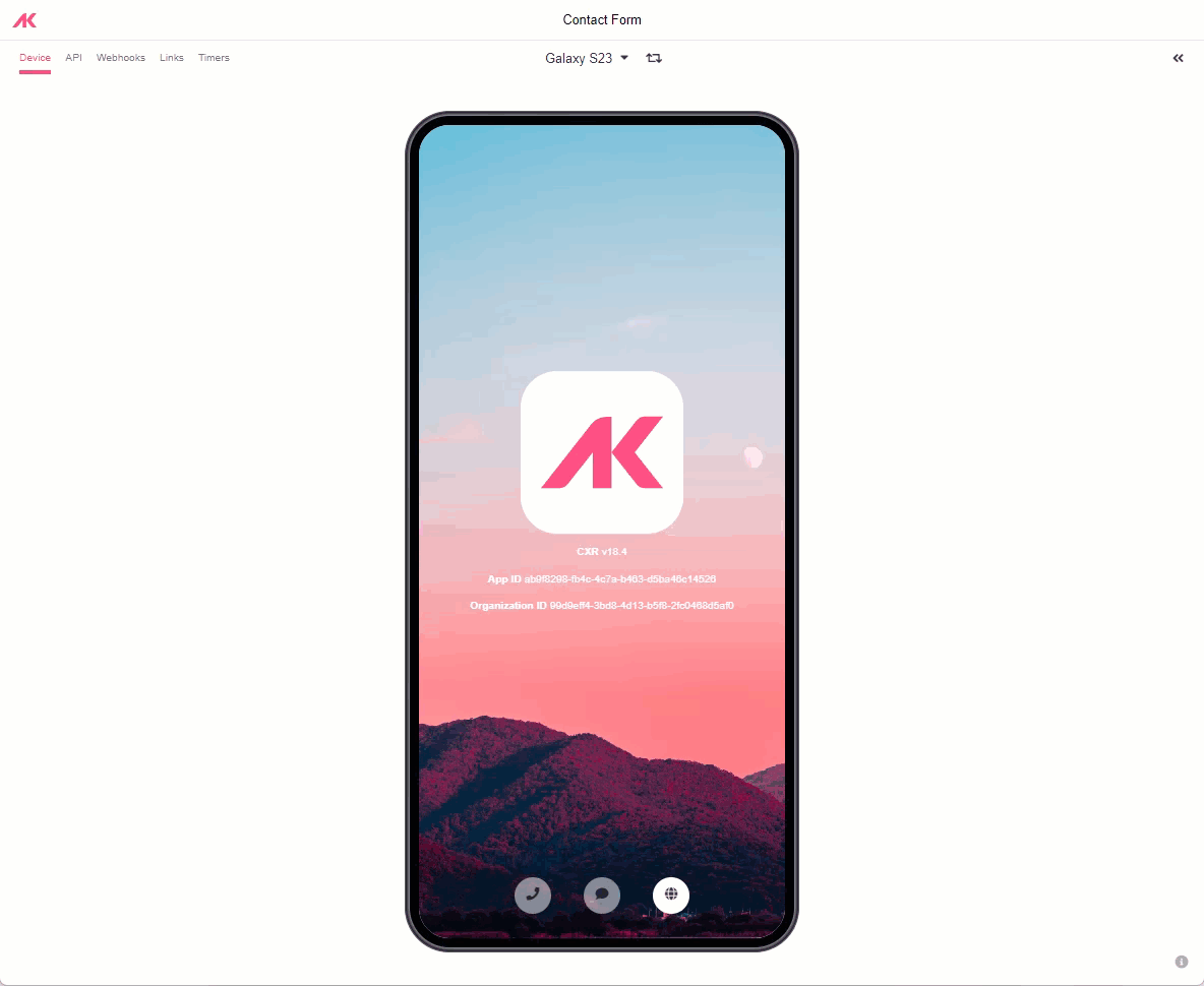
- You can also open up the state viewers to see the different states of your application
- Fill out the form and click on Submit, you should be navigated to the next web page!

Updated 3 months ago
Next, build out the database so that the information collected from users in this Contact Form can be stored in the back-end: