Changing the header
Creating custom headers is often an important part of branding an application flow. This template came out of the box with a single Image for a header, which we're going to change for a different Image and Label, corresponding to our example company, “AirCo”.
Uploading an image
First, we will start by uploading a new logo.
- In the Web Flows Builder, go to Page Layout > Standard Layout.
- Both the Mobile or the Desktop Layout are available for selection. Select Mobile and then select the Image Web Control under Page container > Header container.
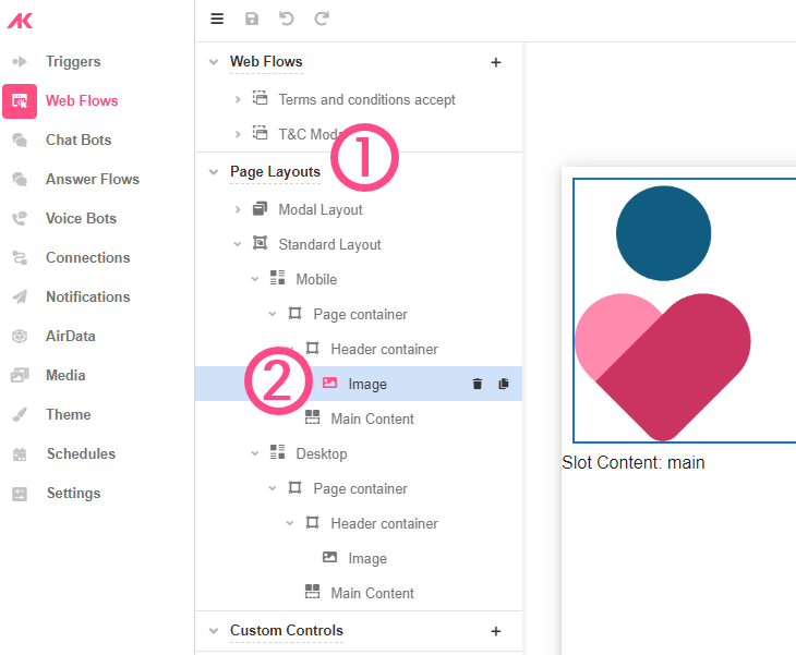
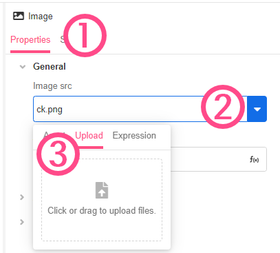
- In the Inspector:
- Go to Properties > General.
- Under Image src, use the dropdown menu to select the Upload tab and use this to upload your company logo.
Defining Page Layout
We used the Tree of Page Layouts to define what image will be used in our Layouts. However, Page Layouts allow you to not only define an image but the header that will appear in both the Mobile and Desktop Layouts. We will use the Page Layout to further customize the Header of our pages using the logo we uploaded and other configurations.
What are Mobile and Desktop Layouts?
Desktop Layout
Desktop Layouts consist of nested Containers, including a special one designated Main Content. This is the Container that holds the contents of the Web Page. Navigating to a new Web Page changes what the Main Content displays, but will not affect any other aspects of the whole Web Page Layout, which is applied to the application universally. This Layout applies when the device selected in Studio is Full (Full Web Page).
Mobile Layout
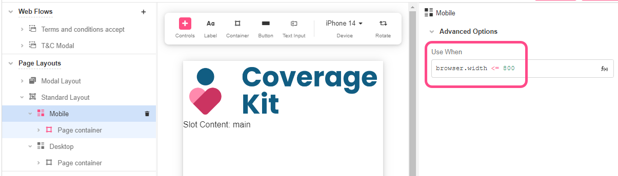
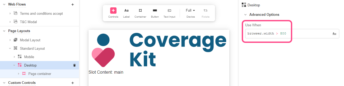
The Mobile Layout defines the layout of Web Pages on mobile devices. As the Desktop layout, it also has a the Main Content Container. By default, this is defined for screens with less than or equal to 800 pixels wide, although this is customizable.
For more information on Page Layouts, see Page Layouts.
Since Mobile and Desktop are two separate Layouts, we will need to configure both of them independently.
Configuring Mobile Layout
- Go to Mobile and check the dimensions in the Inspector. By default, the browser width is defined in 800px, but this can be customized depending on our use case.
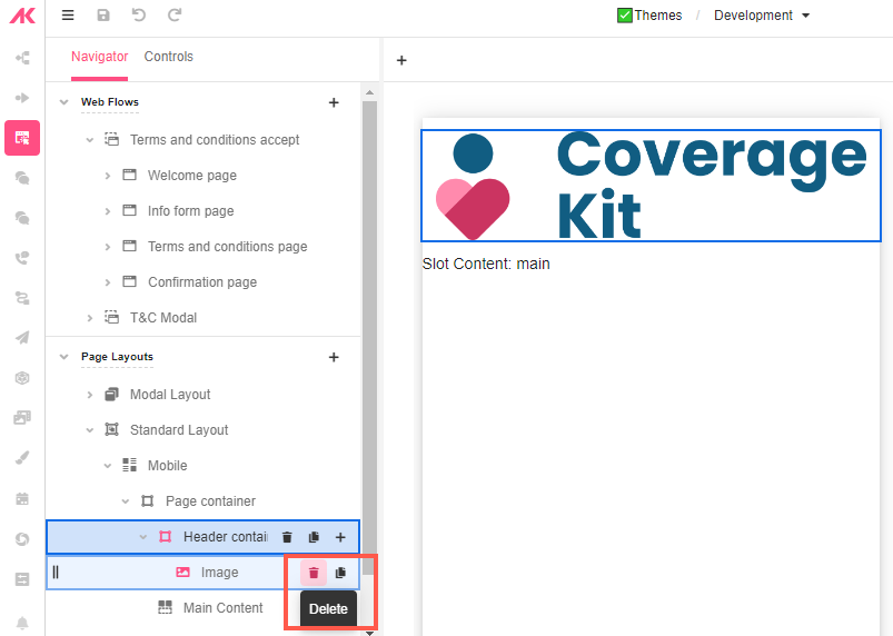
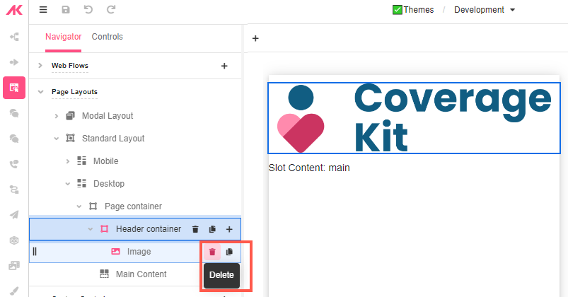
- Go to Page Container > Header Container and delete the default image.
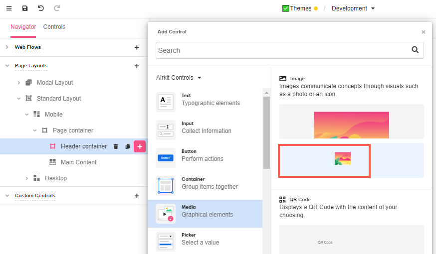
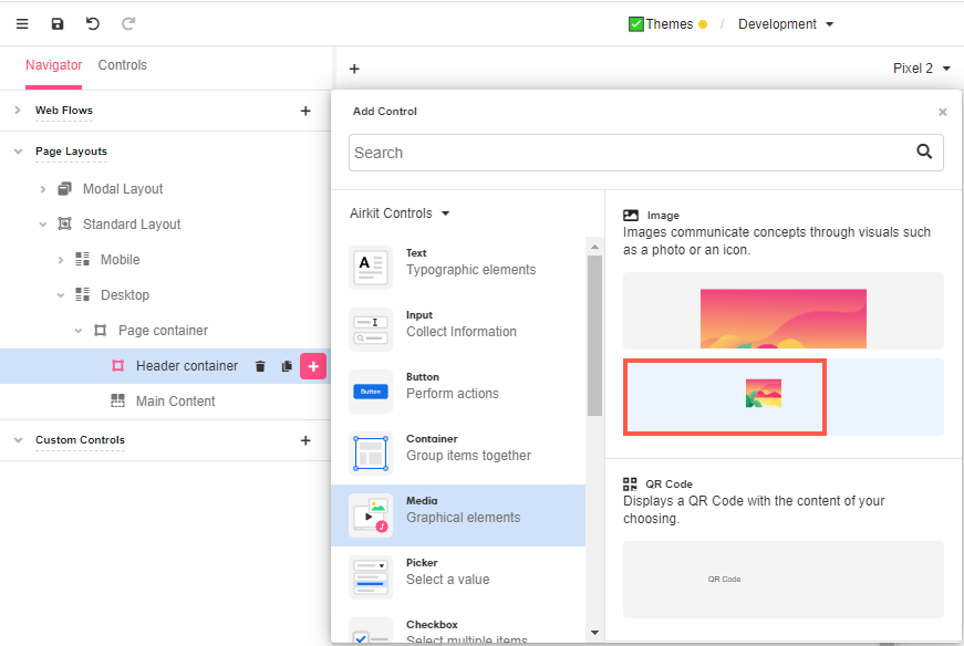
- Click on the ‘+’ icon next to the Header Container to add an Image Control from Media. We will select the second option of the Image Control to have a smaller image in our Web Page. Nevertheless, this size can be changed at any time.
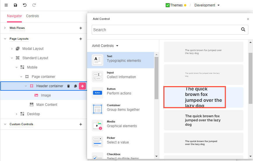
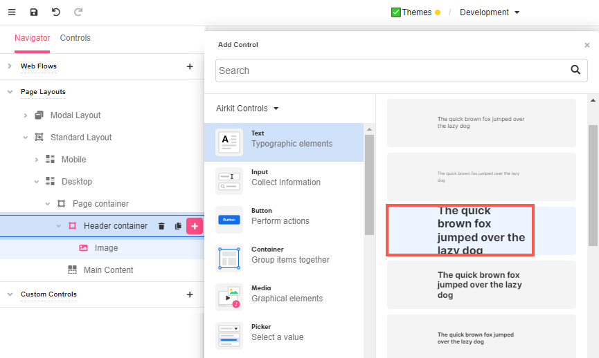
- Add a Label to the same Container.
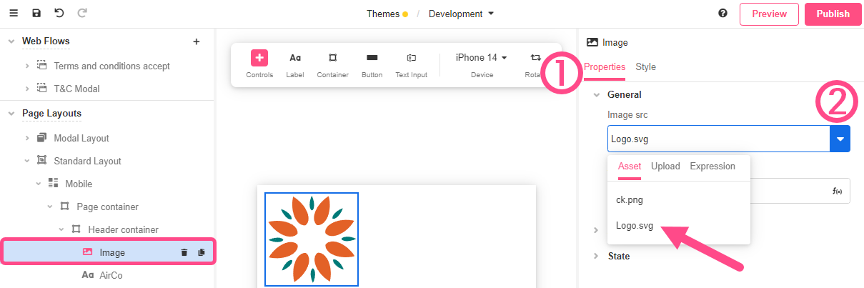
- With the Image Control selected, go to the Properties tab of the Inspector and, in General > Image src, you’ll find the newly uploaded image listed in Assets for you to select.
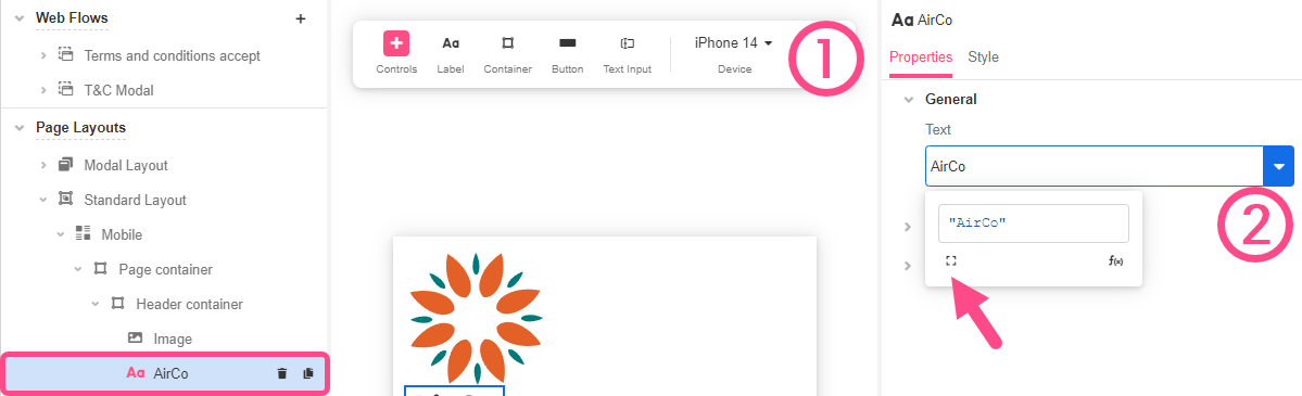
- With the Label Control selected, go to the Properties tab of the Inspector and, in General > Text, use the text field to edit the text directly or the dropdown arrow to edit the label as an Airscript. Add the company name “AirCo” as a text.
Configuring Desktop Layout
We are going to repeat the same process as we did with the Mobile Layout.
- Go to Desktop and check the dimensions in the Inspector. By default, the browser width is defined in 800px and this value can be change at any time.
The Mobile Layout takes precedence over the Desktop layout. If the Use When value is
TRUEfor both the Mobile and Desktop layout, the Mobile layout will be the one used. To avoid confusion, define the Use When values for Mobile and Desktop layouts as mutually exclusive.
- Go to Page Container > Header Container and delete the default image.
- Click on the ‘+’ icon next to the Header Container to add an Image Control from Media, as we did in the Mobile Layout.
- Add a Label to the same Container.
- With the Image Control selected, go to the General tab of the Inspector and, in Control Properties > URL, select the image of the logo from Assets.

- With the Label Control selected, go to the General tab of the Inspector and, in Control Properties > Text, add our example company’s name “AirCo”.

Styling the header
We can arrange the header in multiple ways. For the purpose of this exercise, we will arrange the elements in the Web Page in a specific manner, but there are several other ways that would rely on how creative you are or the way you need these elements to be displayed. Let’s make some adjustments, so the logo and the company name are organized in a horizontal way.
Make sure you make the following changes to the Header Containers both in the Mobile Layout and the Desktop Layout, as changes made to one will not be applied to the other. You might also find that you want to style one slightly differently from the other, as styling conventions that look good on small mobile screens might not look as good on larger desktop screens.
-
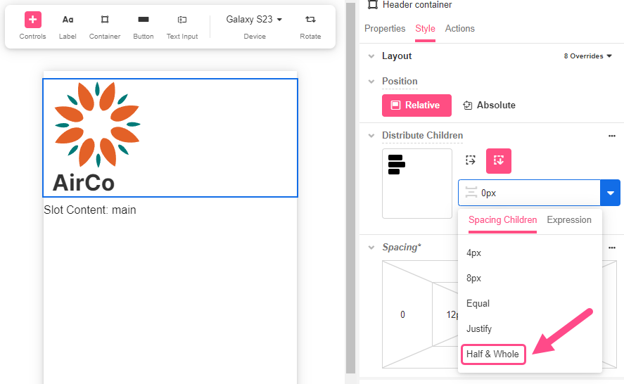
With the Header Container selected, go to Distribute Children and select Stack Horizontal. This way, both elements will be distributed side by side.
-
Align the Header Container so that it looks well centered.

- You can also change the spacing to your linking by selecting one of the options from the dropdown or providing a customized one in Expression. In this case, we are using Half & Whole to distribute the Controls evenly.
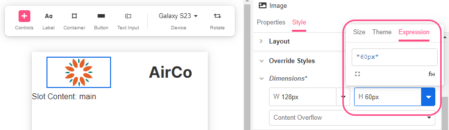
- Further adjustments can be made if we want, for example, the logo size can be smaller:
a. With the Image Control selected, go to the Style tab of the Inspector
b. Go to Override Styles > Dimensions.
c. Change both the width and height as needed using the Expression editor. We will set the image's height as60px.
-
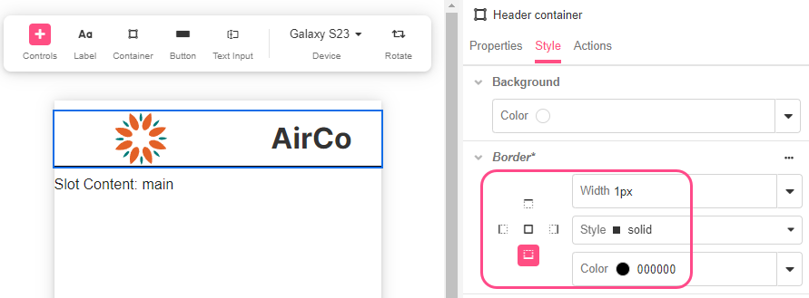
A separator from the header to the rest of the app can also be created by adding a border to the Header container:
a. Select the Header container and go to the Style tab of the Inspector.
b. Go to Override Style > Border and select a solid bottom line border.
c. Choose the textPrimary color and 1px for the border size.
-
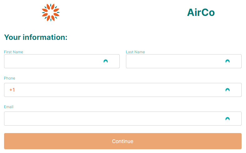
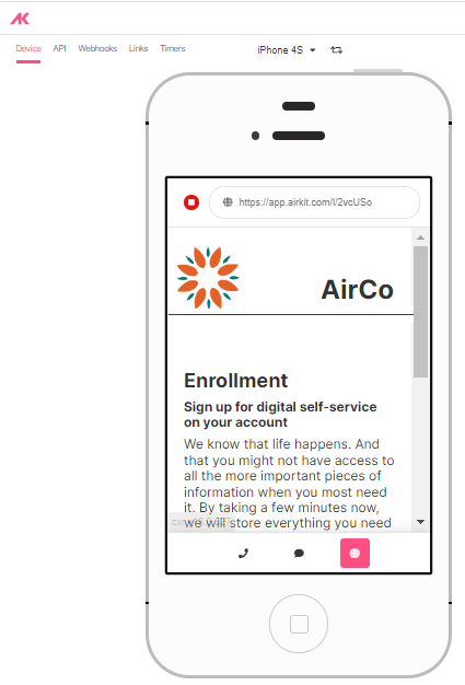
Go to App Preview to see the changes reflected in the app:

Updated 3 months ago