Accessibility in Airkit
What is Web Accessibility?
When a website is accessible, it is designed so that people with a diverse range of hearing, movement, sight, speech, physical, and cognitive abilities can effortlessly navigate it. Making websites accessible for everyone is essential to bring down communication and interaction barriers.
Web accessibility also benefits those without a specific disability, like people using devices with small screens or different input modes as well as older people with changing abilities due to aging. People with “temporary disabilities” such as a broken arm or people with “situational limitations” such as in bright sunlight also put accessibility accommodations to good use.
Airkit provides builders with the tools to create apps that are flexible and dynamic but above all, accessible; that’s why we are committed to constantly upgrading our product and delivering an inclusive digital experience.
Accessibility indicators in Airkit
Here, we describe the tools Airkit provides to build features that comply with WCAG 2.1 guidelines.
Role
Roles provide a semantic association to content or HTML object types, allowing assistive technologies, such as screen readers, to interact with such objects according to users' expectations about other objects of that type. A Role can be used to assign a type of HTML element inside the Web Page structure to have a specific attribute, or as we define it in this document, a specific type of role.
The same way as ARIA roles assign elements as something different than its native HTML element type, or that do not natively exist in HTML (or exist but lack a proper browser support), you can use several Roles in Airkit to be assigned as HTML elements so they work the same manner.
In Airkit, you can assign a role to your Labels and Containers, so users can jump through landmarks inside your App's Web Page. The available roles will change depending on the control you choose (Label or Container). You can learn more about roles by visiting WAI-ARIA 1.1.
ARIA Attributes
Accessible Rich Internet Applications (ARIA) are a technical specification that establishes a framework to enhance the accessibility and interoperability of web content and applications.
You can use four ARIA attributes in Airkit:
ARIA Label
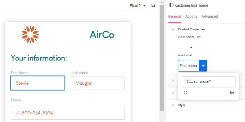
The ARIA label attribute defines a string value that labels an interactive element with its accessible name in cases where the default denomination in the user interface is missing, or does not accurately describe its contents, and there is no content visible in the DOM that can be associated with the object to give it meaning. This makes it easier for screen-readers to parse content.
The ARIA label property can be found in the following Web Controls in the Inspector section of the Studio under Properties > Accesibility:
- Button
- Checkbox
- Checkbox List
- Container
- Credit Card
- Currency Input
- Date Picker
- Dropdown List
- Email Input
- Embedded External Content (Container)
- File Upload
- Image
- Map
- Number Input
- Payment Request Button
- Phone Input
- Place Search Input
- Progress Bar
- Radio Button
- Radio Button List
- Scheduler
- Secure String Input
- Selectable Container
- Signature
- Text Area
- Text Input
- QR Code
ARIA Live
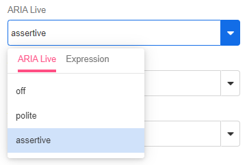
The ARIA Live attribute assigns dynamic elements on Web Pages to be recognized by assistive technologies. Dynamic elements do not require the whole Web Page to reload in order to change. Examples of potential dynamic elements include dynamic queries or non-interactive messages in form of labels with Airscript functions.
ARIA Live has two properties that can be used when assigning an ARIA Live attribute:
- Polite: this property indicates that assistive technologies will notify users of updates when they are idle, without interrupting their current task. It is the most commonly used property.
- Assertive: this property indicates that any updates made to the element are relevant enough to be notified immediately. This sort of property may interrupt the user's current task.
The ARIA Live property can be found in Label and Container Web Controls in the Inspector section of the Studio under Properties > Accessibility.
ARIA Atomic
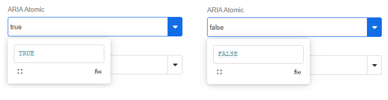
The ARIA Atomic attribute allows you to define if assistive technologies will recognize changes to the selected Web Control as changes to a whole element, even if only a part of it changed. This is most typically relevant for elements inside a Container.
ARIA Relevant
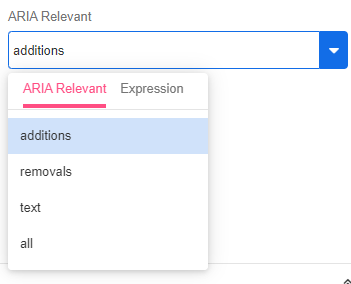
The ARIA Relevant attribute allows you to designate elements inside the Web Page that will trigger notifications by assistive technologies when they are modified.
There are four actions that will trigger notifications:
- additions: when text or content is added to the designated element.
- removals: when text or content is deleted from the designated element.
- text: when text is added inside the designated element.
- all: All of the abovementioned actions:
additions,removalsandtext.
Alt Text
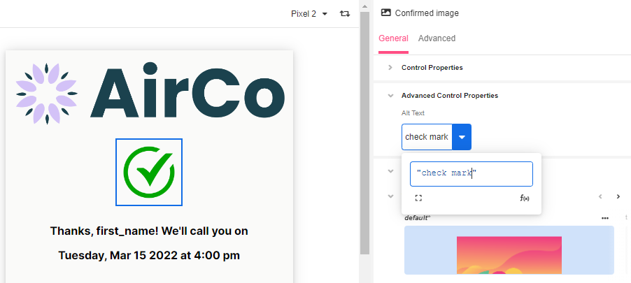
Alt Text is a snippet of text that describes the content of an image. Descriptive titles and captions allow programs designed for the visually impaired to scan and process the images.Without descriptive text, the program may skip the image altogether or offer a notice to the user that no description is offered.
This is also a beneficial tool for SEO and serves as text placeholder when images are slow or fail to load.
The Alt Text property can be found in the following Controls in the Inspector section of the Studio under General > Control Properties
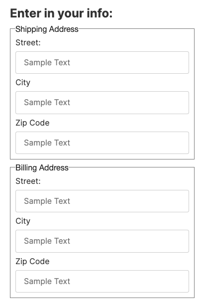
Fieldset Container
The fieldset container enables you to group and associate related controls. It can be used for Simple Checkbox Lists, Simple Radio Lists, Radio Buttons, or any controls that are needed to be grouped together. When grouped, these HTML elements can be identified by assistive technologies to perform accessibility actions.
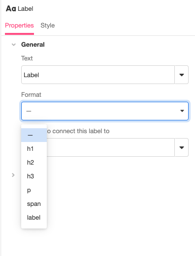
Label Format
You can set the HTML tag that wraps the label on the web page to be either a h1, h2, h3, p, span, or label.
When choosing Header 1 (h1), you have the option to make that header focusable. This will allow you to navigate through your App's Web Pages using a tab index. Selecting this option for all the Header 1 labels of your App's Web Pages is recommended as best practice.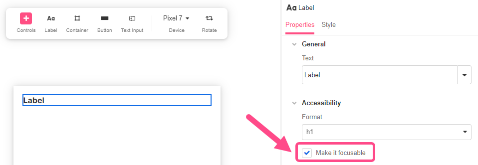
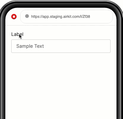
Associating labels to inputs
You can connect labels to their associated inputs using input ids, which will make inputs be focused when their associated label is clicked.
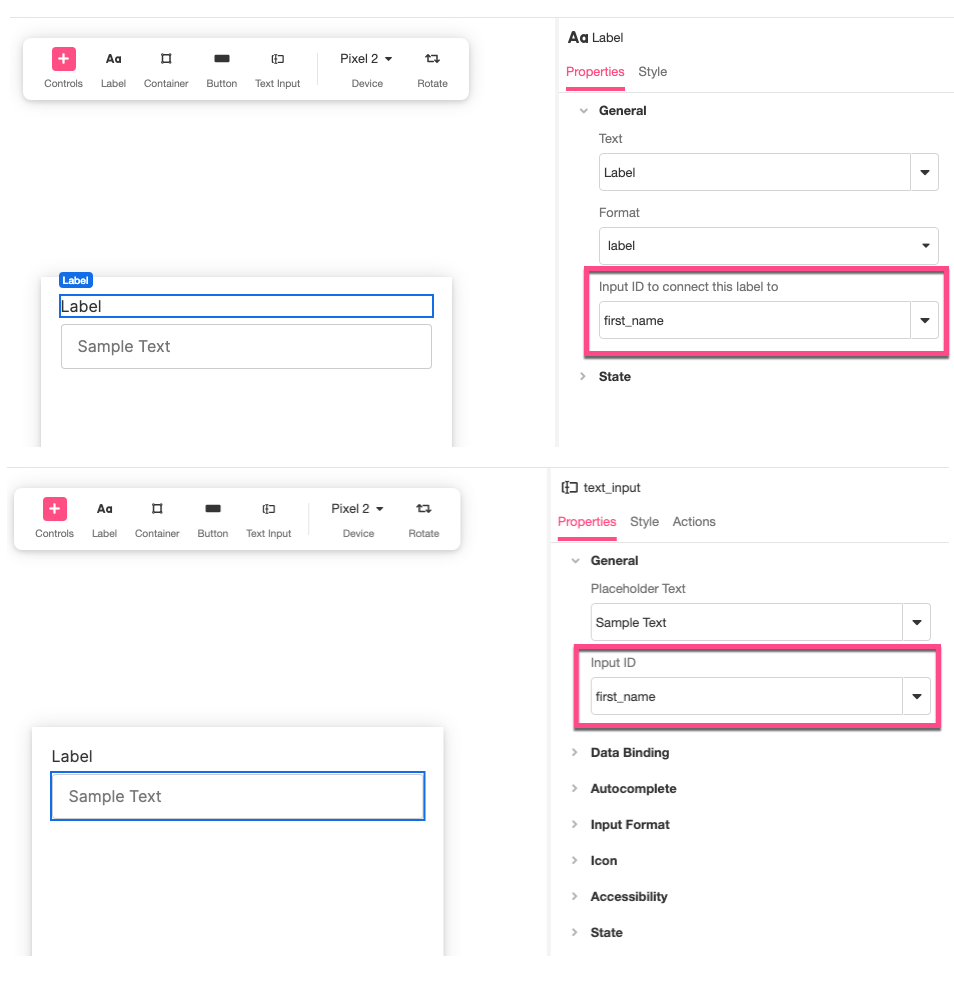
For a more detailed walkthrough of how to build this out, see Connecting Labels to Input Controls.
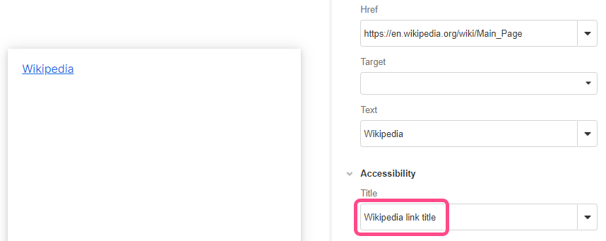
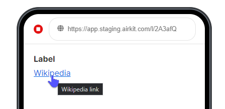
Hyperlink Title
You can assign a Title to a hyperlink to provide a customizable description of that hyperlink.
Keyboard navigation
Web controls automatically support keyboard navigation using the Tab key and controls also have different states that are configurable, such as the "Focused" state.
Focus
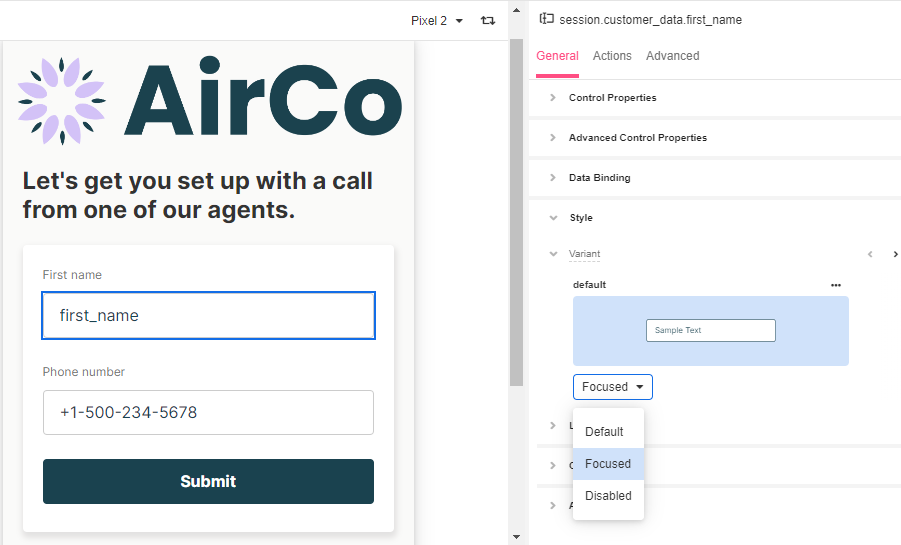
Focus makes reference to the Control on the screen (a field, a checkbox, a button, or link) that is currently receiving an input from the keyboard or clipboard. Focusable elements help users who do not or can not use the mouse to interact with the computer through the keyboard controls alone.
The following Controls support a focusable element:
- Button
- Checkbox
- Currency Input
- Date Picker
- Email Input
- Hyperlink
- Number Input
- Phone Input
- Place Search Input
- Secure String Input
- Text Area
- Text Input
Modals also have a focus property that allow users to move around using the Tab key without selecting an element outside of it.
Testing your app for accessibility
It is recommended to test your app accessibility by using a screen reader or an end-user equivalent setup. Being familiar with these mechanisms is also a must to flag usability issues. Tools such as Continuum Explorer Pro can help identify technical problems and provide a good report but bear in mind it won’t actually solve them.
Updated 4 months ago