Web Flows Builder
The Web Flows Builder provides the tools to build out the UI for web experiences, which encompass everything from the structural layout of web apps to what Actions will be taken in response to user input. This is the Builder in which Web Flows are made out of Web Pages, and where Web Pages are made out of component Web Controls.
Like most Builders, the layout of the Web Flows Builder maps comfortably onto the general structure of the Studio: to the immediate right of the Builder Bar is the Tree, to the right of which is the Stage, to the right of which is the Inspector:
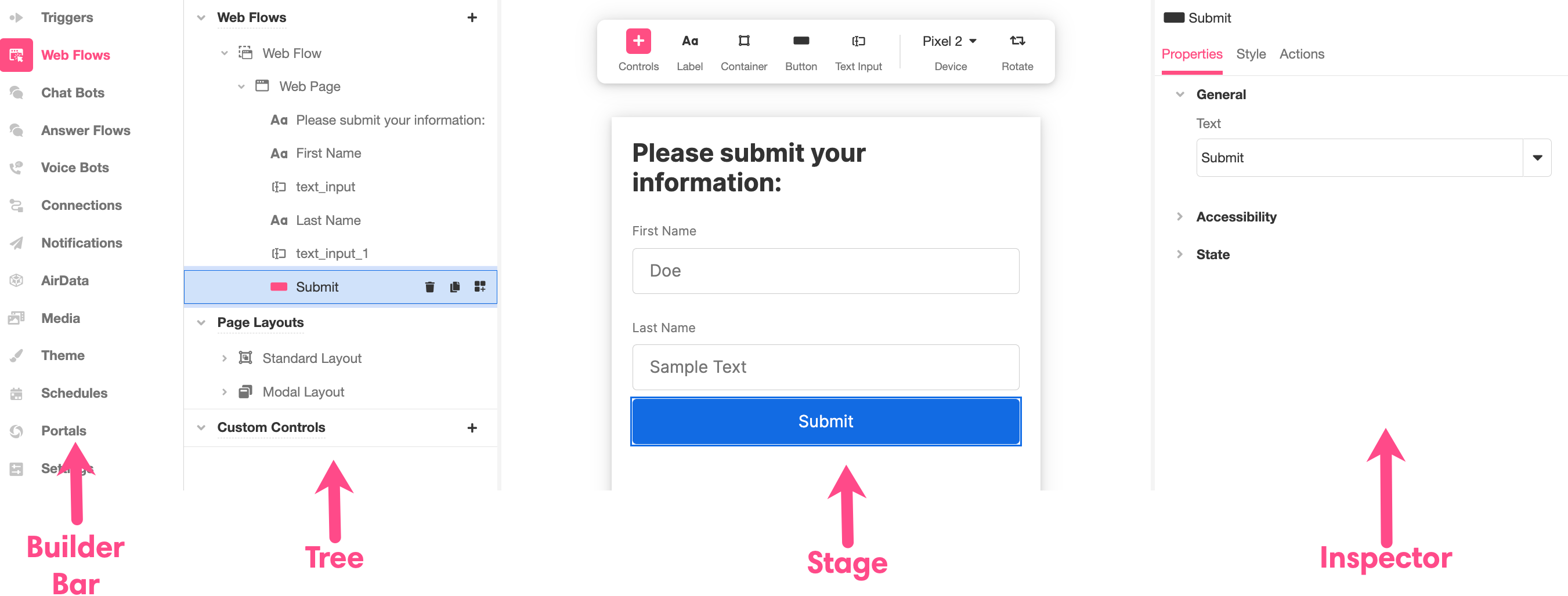
Tree
Displays an expandable and collapsible breakdown of the various components that have been built out as part of a web experience.
Web Flows
Displays and expandable and collapsible breakdown Web Flows, Web Pages, and Web Controls. This section also provides the option to add additional components: clicking the '+' icon that appears when you run your mouse over a listed component provides the option to add a subcomponent that will be nested directly under said branch.
These components and subcomponents are structured as follows:
-
Web Flows- typically designed around a specific work flow.
-
Web Pages - the individual pages that make up a Web Flow; users will typically only be able to see a single web page at a time.
- Web Controls - the basic building blocks used within web pages as UI components, such as Labels, Buttons, and Images.
-
Page Layouts
Where you define the global layout of an application. It can be used to create a header or footer for web apps and define how the application Container changes depending on screen size.
Custom Controls
Contains the tools to create custom Web Controls that can be reused across Web Flows.
Stage
Displays a visual representation of the aspect of the app being modified, making the impact of changes clear in real time. Exactly what is displayed in the Stage varies to better communicate the type of modifications being made. When examining a Web Flow, the Stage will display every Web Page within it. When examining a Web Page or a Web Control, only that Web Page will be displayed. When the Stage displays a single Web Page, clicking on an individual Web Control within the Stage opens up the interface to make edits to it in the Inspector. The following example shows how the interface in the Inspector changes as various Web Controls, a Label and a Button, are clicked on:

Toolbar
The toolbar at the top of the Stage can be used to add Web Controls directly to a Web Page. This can be done by:
- Clicking on a Web Control and adding it directly to the bottom of the Web Page, or
- Dragging and Dropping a Web Control to the desired location.
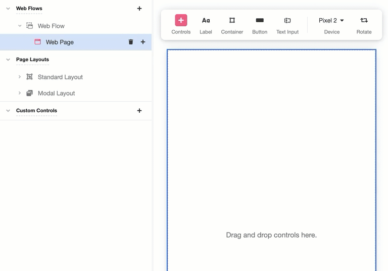
The Rotate button the top left of the Stage toolbar allows you to rotate the UI simulated in the Stage from Portrait to Landscape, while the Device dropdown menu to its immediate left allows you to change what device is being used to simulate accessing your Web Page in the Stage.
Inspector
Provides the tools to examine and modify the individual elements that make up an application as well as configure specific interactions. Precisely what those interactions are depends which element you're inspecting. For instance, the following example shows how the Inspector can be used to modify the text that appears in a Button:
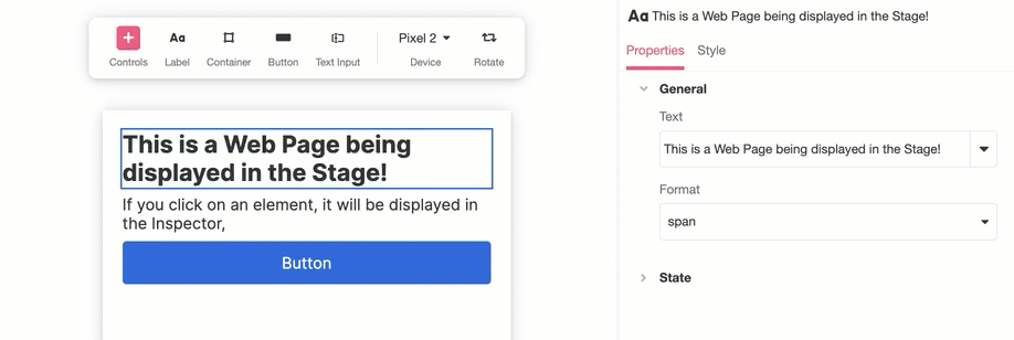
To better reflect the functionality of the Inspector, its layout changes subtly even when being used to examine relatively similar things. Consider Web Controls: there are changes that can be made to some Web Controls but not others. For example, the Inspector appears differently when examining a Button as compared to a Label, in part because Buttons can be clicked, triggering actions, whereas Labels can't.
In general, there are three tabs that may appear in the Web Flows Builder Inspector: Properties, Style, and Actions. Not every element allows access each tab while being inspected, because different elements allow different modifications.
Properties
Contains the fundamental information associated with the element being inspected. This includes information pertaining to variable binding, accessibility, and state management. If the element is a Web Control displays text, such as a Labels or Buttons, this is the tab used to edit the text displayed.
Style
Customizes styling. For more information on how to use this tab to customize the look and feel of your application, see Style Inspector Tab.
Actions
Associate Action Chains with the any Events associating with the element you're inspecting. For more on what Action Chains are and how to use them, see Action Inspector Tab.
Updated about 2 years ago